> ## Documentation Index
> Fetch the complete documentation index at: https://anvil.servicetitan.com/llms.txt
> Use this file to discover all available pages before exploring further.

# Confirmation

export const DoDont = ({text, type, children}) => {
  return <>
      {type === "do" && <div className="do-dont do">
          {children && <div className="do-dont-content">{children}</div>}
          <Check>
            <p>
              <strong>Do</strong>
              {text && <span className="m-inline-start-1">{text}</span>}
            </p>
          </Check>
        </div>}
      {type === "dont" && <div className="do-dont dont">
          {children && <div className="do-dont-content">{children}</div>}
          <Danger>
            <p>
              <strong>Don't</strong>
              {text && <span className="m-inline-start-1">{text}</span>}
            </p>
          </Danger>
        </div>}
      {type === "caution" && <div className="do-dont caution">
          {children && <div className="do-dont-content">{children}</div>}
          <Warning>
            <p>
              <strong>Caution</strong>
              {text && <span className="m-inline-start-1">{text}</span>}
            </p>
          </Warning>
        </div>}
    </>;
};

export const LiveCode = ({children, customHeight, clickToLoad, example, fullWidth, fullHeight, hideCodeInLiveCode, screenshot, screenshotOnly, showCode: showCodeProp}) => {
  const SCREENSHOTS_BASE = "https://servicetitan.github.io/anvil2-docs-live-code/screenshots";
  const STACKBLITZ_BASE = "https://stackblitz.com/github/servicetitan/anvil2-docs-live-code/tree/main/examples";
  const [showCodeBlock, setShowCodeBlock] = useState(showCodeProp ?? false);
  const [isLocalOverride, setIsLocalOverride] = useState(false);
  useEffect(() => {
    const examplePath = `/images/live-code-screenshots-tmp/${example}.png`;
    fetch(examplePath, {
      method: "HEAD"
    }).then(r => {
      if (r.ok) setIsLocalOverride(true);
    }).catch(() => {});
  }, [example]);
  const screenshotBase = isLocalOverride ? "/images/live-code-screenshots-tmp" : SCREENSHOTS_BASE;
  if (screenshotOnly) {
    return <Frame className="flex flex-col">
        <div className="flex dark:hidden" style={{
      justifyContent: "center",
      alignItems: "center",
      width: fullWidth ? "100%" : "50%",
      minHeight: fullHeight ? "284px" : undefined,
      background: "#FFFFFF"
    }}>
          <img srcset={`${screenshotBase}/${example}.png, ${screenshotBase}/${example}-2x.png 2x`} src={`${screenshotBase}/${example}.png`} alt={example} noZoom />
        </div>
        <div className="hidden dark:flex" style={{
      justifyContent: "center",
      alignItems: "center",
      width: fullWidth ? "100%" : "50%",
      minHeight: fullHeight ? "284px" : undefined,
      background: "#141414"
    }}>
          <img srcset={`${screenshotBase}/${example}-dark.png, ${screenshotBase}/${example}-dark-2x.png 2x`} src={`${screenshotBase}/${example}-dark.png`} alt={example} noZoom />
        </div>
      </Frame>;
  }
  if (screenshot) {
    return <Frame className="flex flex-col -mb-2">
        <div className="flex dark:hidden bg-white dark:bg-codeblock border border-gray-950/10 dark:border-white/10 dark:twoslash-dark rounded-2xl overflow-hidden" style={{
      justifyContent: "center",
      alignItems: "center",
      width: fullWidth ? "100%" : "50%",
      minHeight: fullHeight ? "284px" : undefined
    }}>
          <img srcset={`${screenshotBase}/${example}.png, ${screenshotBase}/${example}-2x.png 2x`} src={`${screenshotBase}/${example}.png`} alt={example} noZoom />
        </div>

        <div className="hidden dark:flex bg-white dark:bg-codeblock border border-gray-950/10 dark:border-white/10 dark:twoslash-dark rounded-2xl overflow-hidden" style={{
      background: "#141414",
      justifyContent: "center",
      alignItems: "center",
      width: fullWidth ? "100%" : "50%",
      minHeight: fullHeight ? "284px" : undefined
    }}>
          <img srcset={`${screenshotBase}/${example}-dark.png, ${screenshotBase}/${example}-dark-2x.png 2x`} src={`${screenshotBase}/${example}-dark.png`} alt={example} noZoom />
        </div>

        <div className="flex justify-end items-center text-xs py-2 px-1 gap-4">
          {!showCodeProp ? <button className="inline-flex justify-end items-center text-gray-700 dark:text-gray-50 hover:text-blue-500 dark:hover:text-blue-300 transition-colors group self-end gap-1 cursor-pointer" onClick={() => setShowCodeBlock(!showCodeBlock)} style={{
      appearance: "none"
    }}>
              <Icon icon="code" size="12px" className="group-hover:bg-blue-500 dark:group-hover:bg-blue-300" />
              <span>{showCodeBlock ? "Hide code" : "Show code"}</span>
            </button> : null}

          <a className="inline-flex justify-end items-center hover:text-blue-500 dark:hover:text-blue-300 transition-colors group self-end gap-1" href={`${STACKBLITZ_BASE}/${example}?file=src/App.tsx`} target="_blank" rel="noreferrer">
            <Icon icon="bolt" size="12px" className="group-hover:bg-blue-500 dark:group-hover:bg-blue-300" />
            <span>StackBlitz demo</span>
          </a>
        </div>

        <div className="grid transition-[grid-template-rows] duration-300 ease-in-out overflow-auto overflow-y-hidden overflow-x-auto" style={showCodeBlock ? {
      gridTemplateRows: "1fr"
    } : {
      gridTemplateRows: "0fr"
    }}>
          <div style={{
      minHeight: 0,
      overflowX: "auto",
      overflowY: "hidden",
      marginBlockStart: "-1.25rem",
      marginBlockEnd: "-1.5rem"
    }}>
            {children}
          </div>
        </div>
      </Frame>;
  } else {
    return <div style={{
      display: "flex",
      width: fullWidth ? "100%" : "50%",
      minHeight: customHeight ? customHeight : "316px",
      resize: "vertical",
      overflow: "auto"
    }}>
        <iframe title={example} style={{
      flex: 1,
      width: fullWidth ? "100%" : "50%",
      minHeight: customHeight ? customHeight : "316px"
    }} src={`${STACKBLITZ_BASE}/${example}?embed=1&hideNavigation=1&hideExplorer=1&terminalHeight=0&file=src/App.tsx${clickToLoad ? "&ctl=1" : ""}${hideCodeInLiveCode ? "&view=preview" : ""}`} allow="accelerometer; ambient-light-sensor; camera; encrypted-media; geolocation; gyroscope; hid; microphone; midi; payment; usb; vr; xr-spatial-tracking" sandbox="allow-forms allow-modals allow-popups allow-presentation allow-same-origin allow-scripts" />
      </div>;
  }
};

A crucial safety net for users. Confirmation messages let users double-check actions (especially irreversible ones) and set expectations for what happens next.

<Frame>
  <div className="w-full h-full bg-[#FFFFFF] p-2 rounded flex items-center justify-center">
    <img
      src="https://mintcdn.com/servicetitan/UmHUvEuYrbSv6t_f/images/docs/web/patterns/shared/example-of-confirmation-message-pattern-in-action.png?fit=max&auto=format&n=UmHUvEuYrbSv6t_f&q=85&s=66ab549c7a5af44206362aca00994efa"
      alt="Example of confirmation message pattern in
action"
      width="720"
      height="418"
      data-path="images/docs/web/patterns/shared/example-of-confirmation-message-pattern-in-action.png"
    />
  </div>
</Frame>

## Content Guidelines

For all confirmation messages, please refer to the [Confirmation Messages content pattern](/docs/web/content/confirmation-messages) for content guidelines and tips for structuring messages.

## Unsaved Changes

An "unsaved changes" confirmation pattern is typically used when the user has made changes to data or content within the current workflow but attempts to navigate away without saving those changes. This pattern helps improve the user experience and prevents data loss or mistakes.

This pattern should not be used if no changes have been made by the user.

<LiveCode example="confirmation-unsaved" screenshot fullWidth>
  ```tsx lines theme={null}
  import { Dialog, Flex, Button } from "@servicetitan/anvil2";

  function App() {
    return (
      <div style={{ minWidth: "23rem", minHeight: "14rem" }}>
        <Dialog open>
          <Dialog.Header>Discard unsaved changes?</Dialog.Header>
          <Dialog.Content>
            [Add description as needed...] This cannot be undone.
          </Dialog.Content>
          <Dialog.Footer>
            <Flex justifyContent="flex-end">
              <Flex gap="3">
                <Dialog.CancelButton>Cancel</Dialog.CancelButton>
                <Button appearance="danger">Discard Changes</Button>
              </Flex>
            </Flex>
          </Dialog.Footer>
        </Dialog>
      </div>
    );
  }

  export default App;
  ```
</LiveCode>

## Confirm an action

### Destructive

Use this pattern for confirming a destructive action, such as delete, disconnect, remove, disable, etc.

#### Simple Destructive Confirmation

Use when content is simple and text-only.

<LiveCode example="confirmation-destructive-simple" screenshot fullWidth>
  ```tsx lines theme={null}
  import { Dialog, Flex, Button } from "@servicetitan/anvil2";

  function App() {
    return (
      <div style={{ minWidth: "23rem", minHeight: "12.5rem" }}>
        <Dialog open>
          <Dialog.Header>[Action][Item]</Dialog.Header>
          <Dialog.Content>Dialog text for a description.</Dialog.Content>
          <Dialog.Footer>
            <Flex justifyContent="flex-end">
              <Flex gap="3">
                <Dialog.CancelButton>Cancel</Dialog.CancelButton>
                <Button appearance="danger">[Action][Item]</Button>
              </Flex>
            </Flex>
          </Dialog.Footer>
        </Dialog>
      </div>
    );
  }

  export default App;
  ```
</LiveCode>

##### Dos/Don'ts

<LiveCode example="confirmation-destructive-simple-do" screenshot fullWidth>
  ```tsx lines theme={null}
  import { Dialog, Flex, Button } from "@servicetitan/anvil2";

  function App() {
    return (
      <div style={{ minWidth: "23rem", minHeight: "14rem" }}>
        <Dialog enableScrollChaining open>
          <Dialog.Header>Merge GL accounts?</Dialog.Header>
          <Dialog.Content>
            2 GL accounts will be merged into the following account: Inventory.
          </Dialog.Content>
          <Dialog.Footer>
            <Flex justifyContent="flex-end">
              <Flex gap="3">
                <Dialog.CancelButton>Cancel</Dialog.CancelButton>
                <Button appearance="danger">Merge GL Accounts</Button>
              </Flex>
            </Flex>
          </Dialog.Footer>
        </Dialog>
      </div>
    );
  }

  export default App;
  ```
</LiveCode>

<Check>**Do**</Check>

<LiveCode example="confirmation-destructive-simple-dont-01" screenshot fullWidth>
  ```tsx lines theme={null}
  import { Dialog, Flex, Button } from "@servicetitan/anvil2";

  function App() {
    return (
      <div style={{ minWidth: "23rem", minHeight: "14rem" }}>
        <Dialog enableScrollChaining open>
          <Dialog.Header>Delete Profile?</Dialog.Header>
          <Dialog.Content>
            Are you sure you want to delete this profile? This action cannot be
            undone.
          </Dialog.Content>
          <Dialog.Footer>
            <Flex justifyContent="flex-end">
              <Flex gap="3">
                <Dialog.CancelButton>Cancel</Dialog.CancelButton>
                <Button appearance="danger">Confirm</Button>
              </Flex>
            </Flex>
          </Dialog.Footer>
        </Dialog>
      </div>
    );
  }

  export default App;
  ```
</LiveCode>

<Danger>**Don't**</Danger>

<LiveCode example="confirmation-destructive-simple-dont-02" screenshot fullWidth>
  ```tsx lines theme={null}
  import { Dialog, Flex, Button } from "@servicetitan/anvil2";

  function App() {
    return (
      <div style={{ minWidth: "23rem", minHeight: "14rem" }}>
        <Dialog enableScrollChaining open>
          <Dialog.Header>Remove Activity</Dialog.Header>
          <Dialog.Content>
            Are you sure you want to remove Travel AM activity?
          </Dialog.Content>
          <Dialog.Footer>
            <Flex justifyContent="flex-end">
              <Flex gap="3">
                <Dialog.CancelButton>Cancel</Dialog.CancelButton>
                <Button appearance="primary">Confirm</Button>
              </Flex>
            </Flex>
          </Dialog.Footer>
        </Dialog>
      </div>
    );
  }

  export default App;
  ```
</LiveCode>

<Danger>**Don't**</Danger>

* Use question format for title
* Ask the question in title, not description. Don’t phrase it as “Are you sure you want to...?”
* Use negative color for destructive action
* Match the CTA label with the title (e.g., "Delete Profile")

#### Complex Destructive Confirmation

This pattern is used in contexts where the content of the Dialog is more complex (e.g., long description, bullet points, multiple paragraphs, etc.).

<LiveCode example="confirmation-destructive-complex" screenshot fullWidth>
  ```tsx lines theme={null}
  import { Dialog, Flex, Button, Text, Combobox } from "@servicetitan/anvil2";
  import { useState } from "react";

  type Item = {
    id: number;
    name: string;
  };

  const items: Item[] = [
    { id: 1, name: "First item" },
    { id: 2, name: "Second item" },
    { id: 3, name: "Third item" },
    { id: 4, name: "Fourth item" },
    { id: 5, name: "Fifth item" },
    { id: 6, name: "Sixth item" },
    { id: 7, name: "Seventh item" },
    { id: 8, name: "Eighth item" },
    { id: 9, name: "Ninth item" },
    { id: 10, name: "Tenth item" },
  ];

  function App() {
    const [selectedItem, setSelectedItem] = useState<Item | null>();

    return (
      <div style={{ minWidth: "23rem", minHeight: "23.5rem" }}>
        <Dialog open>
          <Dialog.Header>[Action][Item]</Dialog.Header>
          <Dialog.Content>
            <Flex direction="column" gap="2" style={{ width: "100%" }}>
              <Text variant="body" size="medium">
                Description
              </Text>
              <ul>
                <li>Description...</li>
                <li>Description...</li>
                <li>Description...</li>
              </ul>
              <Combobox
                items={items}
                itemToString={(item) => (item ? item.name : "")}
                itemToKey={(item) => (item ? item.id : null)}
                selectedItem={selectedItem}
                onChange={setSelectedItem}
                filterOptions={{ keys: ["name"] }}
                style={{ width: "100%", maxWidth: "100%" }}
              >
                <Combobox.SearchField label="Select an item" />
                <Combobox.Content>
                  {({ items }) => (
                    <Combobox.List>
                      {items.map((item, i) => (
                        <Combobox.Item key={item.id} item={item} index={i}>
                          {item.name}
                        </Combobox.Item>
                      ))}
                    </Combobox.List>
                  )}
                </Combobox.Content>
              </Combobox>
            </Flex>
          </Dialog.Content>
          <Dialog.Footer>
            <Flex justifyContent="flex-end">
              <Flex gap="3">
                <Dialog.CancelButton>Cancel</Dialog.CancelButton>
                <Button appearance="danger">[Action][Item]</Button>
              </Flex>
            </Flex>
          </Dialog.Footer>
        </Dialog>
      </div>
    );
  }

  export default App;
  ```
</LiveCode>

##### Dos/Don'ts

<LiveCode example="confirmation-destructive-complex-do" screenshot fullWidth>
  ```tsx lines theme={null}
  import { Dialog, Flex, Button, Text, TextField } from "@servicetitan/anvil2";

  function App() {
    return (
      <div style={{ minWidth: "23rem", minHeight: "19rem" }}>
        <Dialog enableScrollChaining open>
          <Dialog.Header>Merge GL accounts?</Dialog.Header>
          <Dialog.Content>
            <Flex direction="column" gap="2">
              <Text>
                2 GL accounts will be merged into the following account: Inventory
              </Text>
              <TextField hint="Type MERGE to confirm" required />
            </Flex>
          </Dialog.Content>
          <Dialog.Footer>
            <Flex justifyContent="flex-end">
              <Flex gap="3">
                <Dialog.CancelButton>Cancel</Dialog.CancelButton>
                <Button appearance="danger">Merge GL Accounts</Button>
              </Flex>
            </Flex>
          </Dialog.Footer>
        </Dialog>
      </div>
    );
  }

  export default App;
  ```
</LiveCode>

<Check>**Do**</Check>

<LiveCode example="confirmation-destructive-complex-dont" screenshot fullWidth>
  ```tsx lines theme={null}
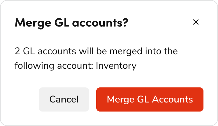
  import { Popover, Flex, Button, Text, TextField } from "@servicetitan/anvil2";

  function App() {
    return (
      <Flex
        gap="2"
        style={{
          paddingBlockStart: "16rem",
          paddingInlineEnd: "5rem",
        }}
      >
        <Button>Back</Button>
        <Popover open placement="top" disableShift disableFlip modal>
          <Popover.Button appearance="primary">Merge</Popover.Button>
          <Popover.Content>
            <Flex
              direction="column"
              gap="2"
              style={{ width: "200px", maxWidth: "100%" }}
            >
              <Text
                variant="headline"
                size="small"
                el="h4"
                style={{ color: "red" }}
              >
                Merge GL Accounts
              </Text>
              <Text>
                This will merge 2 GL accounts into the following account:
                Inventory.
              </Text>
              <Text>Type ‘Merge’ to confirm action</Text>
              <TextField />
            </Flex>
          </Popover.Content>
        </Popover>
      </Flex>
    );
  }

  export default App;
  ```
</LiveCode>

<Danger>**Don't**</Danger>

* Do not use a Popover for complex confirmation patterns as it has potential usability issues
* Use a danger Button instead of colored text

##### Edge Case

<LiveCode example="confirmation-destructive-edgecase-do" screenshot fullWidth>
  ```tsx lines theme={null}
  import { Dialog, Flex, Button, Combobox } from "@servicetitan/anvil2";
  import { useState } from "react";

  type Item = {
    id: number;
    name: string;
  };

  const items: Item[] = [
    { id: 1, name: "First item" },
    { id: 2, name: "Second item" },
    { id: 3, name: "Third item" },
    { id: 4, name: "Fourth item" },
    { id: 5, name: "Fifth item" },
    { id: 6, name: "Sixth item" },
    { id: 7, name: "Seventh item" },
    { id: 8, name: "Eighth item" },
    { id: 9, name: "Ninth item" },
    { id: 10, name: "Tenth item" },
  ];

  function App() {
    const [selectedItems, setSelectedItems] = useState<Item[] | null>([]);

    return (
      <div style={{ minWidth: "23rem", minHeight: "18rem" }}>
        <Dialog enableScrollChaining open>
          <Dialog.Header>Cancel Receipt?</Dialog.Header>
          <Dialog.Content>
            <Flex direction="column" gap="2">
              Select the reason why you are canceling this receipt.
              <Combobox
                multiple
                items={items}
                itemToString={(item) => (item ? item.name : "")}
                itemToKey={(item) => (item ? item.id : null)}
                selectedItems={selectedItems ?? []}
                onChange={setSelectedItems}
                filterOptions={{ keys: ["name"] }}
                style={{ width: "100%", maxWidth: "100%" }}
              >
                <Combobox.SearchField
                  label="Select a reason"
                  moreInfo="Please let us know why you are canceling"
                />
                <Combobox.Content>
                  {({ items }) => (
                    <Combobox.List>
                      {items.map((item, i) => (
                        <Combobox.Item key={item.id} item={item} index={i}>
                          {item.name}
                        </Combobox.Item>
                      ))}
                    </Combobox.List>
                  )}
                </Combobox.Content>
              </Combobox>
            </Flex>
          </Dialog.Content>
          <Dialog.Footer>
            <Flex justifyContent="flex-end">
              <Flex gap="3">
                <Dialog.CancelButton>Don&apos;t Cancel</Dialog.CancelButton>
                <Button appearance="danger">Cancel Receipt</Button>
              </Flex>
            </Flex>
          </Dialog.Footer>
        </Dialog>
      </div>
    );
  }

  export default App;
  ```
</LiveCode>

<Check>**Do**</Check>

* When the action itself contains the word “Cancel”, use a verb-noun pairing like "Cancel Receipt" in the CTA so users would know what happens if that's the only thing they read. Primary CTA should mirror the question in the header.
* Use "Don't Cancel" as the secondary action when the main CTA is "Cancel"

### Non-Destructive

Use this pattern when confirming a non-destructive action, such as activate, enable, continue, etc.

#### Simple Non-Destructive Confirmation

Use when content is simple and text-only.

<LiveCode example="confirmation-nondestructive-simple" screenshot fullWidth>
  ```tsx lines theme={null}
  import { Dialog, Flex, Button } from "@servicetitan/anvil2";

  function App() {
    return (
      <div style={{ minWidth: "23rem", minHeight: "12.5rem" }}>
        <Dialog open>
          <Dialog.Header>[Action][Item]</Dialog.Header>
          <Dialog.Content>Dialog text for a description.</Dialog.Content>
          <Dialog.Footer>
            <Flex justifyContent="flex-end">
              <Flex gap="3">
                <Dialog.CancelButton>Cancel</Dialog.CancelButton>
                <Button appearance="primary">[Action][Item]</Button>
              </Flex>
            </Flex>
          </Dialog.Footer>
        </Dialog>
      </div>
    );
  }

  export default App;
  ```
</LiveCode>

##### Dos/Don'ts

<LiveCode example="confirmation-nondestructive-simple-do" screenshot fullWidth>
  ```tsx lines theme={null}
  import { Dialog, Flex, Button } from "@servicetitan/anvil2";

  function App() {
    return (
      <div style={{ minWidth: "23rem", minHeight: "14rem" }}>
        <Dialog enableScrollChaining open>
          <Dialog.Header>Activate campaign?</Dialog.Header>
          <Dialog.Content>
            The campaign will be immediately activated.
          </Dialog.Content>
          <Dialog.Footer>
            <Flex justifyContent="flex-end">
              <Flex gap="3">
                <Dialog.CancelButton>Cancel</Dialog.CancelButton>
                <Button appearance="primary">Activate campaign</Button>
              </Flex>
            </Flex>
          </Dialog.Footer>
        </Dialog>
      </div>
    );
  }

  export default App;
  ```
</LiveCode>

<Check>**Do**</Check>

<LiveCode example="confirmation-nondestructive-simple-dont-01" screenshot fullWidth>
  ```tsx lines theme={null}
  import { Dialog, Flex, Button } from "@servicetitan/anvil2";

  function App() {
    return (
      <div style={{ minWidth: "23rem", minHeight: "14rem" }}>
        <Dialog enableScrollChaining open>
          <Dialog.Header>Confirmation activation</Dialog.Header>
          <Dialog.Content>
            The campaign will be immediately activated.
          </Dialog.Content>
          <Dialog.Footer>
            <Flex justifyContent="flex-end">
              <Flex gap="3">
                <Dialog.CancelButton>Cancel</Dialog.CancelButton>
                <Button appearance="danger">Confirm</Button>
              </Flex>
            </Flex>
          </Dialog.Footer>
        </Dialog>
      </div>
    );
  }

  export default App;
  ```
</LiveCode>

<Danger>**Don't**</Danger>

<LiveCode example="confirmation-nondestructive-simple-dont-02" screenshot fullWidth>
  ```tsx lines theme={null}
  import { Dialog, Flex, Button } from "@servicetitan/anvil2";

  function App() {
    return (
      <div style={{ minWidth: "23rem", minHeight: "15rem" }}>
        <Dialog enableScrollChaining open>
          <Dialog.Header>Confirmation</Dialog.Header>
          <Dialog.Content>
            You are about to recalculate estimate tax using the actual
            configuration from zone 1 tax zone. Are you sure?
          </Dialog.Content>
          <Dialog.Footer>
            <Flex justifyContent="flex-end">
              <Flex gap="3">
                <Dialog.CancelButton>Cancel</Dialog.CancelButton>
                <Button appearance="primary">Yes</Button>
              </Flex>
            </Flex>
          </Dialog.Footer>
        </Dialog>
      </div>
    );
  }

  export default App;
  ```
</LiveCode>

<Danger>**Don't**</Danger>

* Use primary (blue) button for non-destructive action
* Avoid using yes/no, primary CTA should mirror the question in the header.
* If button text is too long and space is limited, prioritize retaining the verb and noun while omitting adjectives
  * For example, "Recalculate Estimate Tax" can be shortened to "Recalculate Tax."

#### Complex Non-Destructive Confirmation

Use this pattern when content contains UI elements beyond plain text (e.g., card, table, etc.).

<LiveCode example="confirmation-nondestructive-complex" screenshot fullWidth>
  ```tsx lines theme={null}
  import { Dialog, Flex, Button, Text } from "@servicetitan/anvil2";

  function App() {
    return (
      <div style={{ minWidth: "23rem", minHeight: "23.5rem" }}>
        <Dialog open>
          <Dialog.Header>[Action][Item]</Dialog.Header>
          <Dialog.Content>
            <Flex direction="column" gap="2" style={{ width: "100%" }}>
              <Flex
                justifyContent="center"
                style={{
                  width: "100%",
                  border: "1px solid #ccc",
                  padding: "2rem",
                }}
              >
                <Text variant="eyebrow" size="small">
                  image, table, banner, etc.
                </Text>
              </Flex>
              <Text variant="body" size="medium">
                Description
                <ul style={{ marginTop: "0" }}>
                  <li>Description...</li>
                  <li>Description...</li>
                  <li>Description...</li>
                </ul>
              </Text>
            </Flex>
          </Dialog.Content>
          <Dialog.Footer>
            <Flex justifyContent="flex-end">
              <Flex gap="3">
                <Dialog.CancelButton>Cancel</Dialog.CancelButton>
                <Button appearance="primary">[Action][Item]</Button>
              </Flex>
            </Flex>
          </Dialog.Footer>
        </Dialog>
      </div>
    );
  }

  export default App;
  ```
</LiveCode>

##### Dos/Don'ts

<LiveCode example="confirmation-nondestructive-complex-do" screenshot fullWidth>
  ```tsx lines theme={null}
  import { Dialog, Flex, Button, Alert, Link, Text } from "@servicetitan/anvil2";

  function App() {
    return (
      <div style={{ minWidth: "35.5rem", minHeight: "30rem" }}>
        <Dialog enableScrollChaining open size="large">
          <Dialog.Header>Enable Autopilot?</Dialog.Header>
          <Dialog.Content>
            <Flex direction="column" gap="3">
              <Alert title="Note" status="warning" onClose={console.log}>
                If a 3rd party manages your digital ads, this will make changes to
                the bid strategy and could create confusion.{" "}
                <Link>Learn more</Link>
              </Alert>
              <Text>
                By enabling Autopilot, ServiceTitan will optimize your
                campaign&apos;s bid strategy to achieve the highest ROI. Please
                Click on “Enable Autopilot” if you wish to have ServiceTitan to
                run Autopilot.
              </Text>
              <Flex direction="column">
                <Text variant="eyebrow" size="small">
                  Campaign
                </Text>
                <Text variant="headline" size="small" el="h4">
                  Aging Equipment Memorial Day
                </Text>
                <Flex gap="3">
                  <Text>Google Ads</Text>
                  <Text>CPC</Text>
                </Flex>
              </Flex>
            </Flex>
          </Dialog.Content>
          <Dialog.Footer>
            <Flex justifyContent="flex-end">
              <Flex gap="3">
                <Dialog.CancelButton>Cancel</Dialog.CancelButton>
                <Button appearance="primary">Enable Autopilot</Button>
              </Flex>
            </Flex>
          </Dialog.Footer>
        </Dialog>
      </div>
    );
  }

  export default App;
  ```
</LiveCode>

<Check>**Do**</Check>

<LiveCode example="confirmation-nondestructive-complex-dont" screenshot fullWidth>
  ```tsx lines theme={null}
  import { Dialog, Flex, Button, Alert, Link, Text } from "@servicetitan/anvil2";

  function App() {
    return (
      <div style={{ minWidth: "35.5rem", minHeight: "30rem" }}>
        <Dialog enableScrollChaining open size="large">
          <Dialog.Header>Autopilot</Dialog.Header>
          <Dialog.Content>
            <Flex direction="column" gap="3">
              <Text>
                By enabling Autopilot, ServiceTitan will optimize your campaign’s
                bid strategy to achieve the highest ROI. Please click on “Yes,
                Confirm” if you wish to have ServiceTitan to run Autopilot.
              </Text>
              <Flex direction="column">
                <Text variant="eyebrow" size="small">
                  Campaign
                </Text>
                <Text variant="headline" size="small" el="h4">
                  Aging Equipment Memorial Day
                </Text>
                <Flex gap="3">
                  <Text>Google Ads</Text>
                  <Text>CPC</Text>
                </Flex>
              </Flex>
              <Alert title="Note" status="warning" onClose={console.log}>
                If a 3rd party manages your digital ads, this will make changes to
                the bid strategy and could create confusion.{" "}
                <Link>Learn more</Link>
              </Alert>
            </Flex>
          </Dialog.Content>
          <Dialog.Footer>
            <Flex justifyContent="flex-end">
              <Flex gap="3">
                <Dialog.CancelButton>Cancel</Dialog.CancelButton>
                <Button appearance="primary">Yes, Confirm</Button>
              </Flex>
            </Flex>
          </Dialog.Footer>
        </Dialog>
      </div>
    );
  }

  export default App;
  ```
</LiveCode>

<Danger>**Don't**</Danger>

* Use appropriate Dialog size according to content
* Alert should be displayed above content

## Congratulations/Success

A Congratulations/Success confirmation pattern is typically used when the user has successfully completed a task or workflow. The pattern helps improve the user experience by providing feedback to the user and can be an opportunity to delight the user.

#### Simple task

* Use when the user completed an easy, short, and common task (i.e., something that users do multiple times).
* The Toast appears after the task is completed and the page reloads.
* If the user navigated to a different page or Dialog to complete the task, the Toast appears after navigating the user to the page where they started the task.

<Frame>
  <div className="w-full h-full bg-[#FFFFFF] p-2 rounded flex items-center justify-center">
    <img
      src="https://mintcdn.com/servicetitan/KE7wVYXA9MgEh_Ye/images/docs/web/patterns/confirmation/success-toast-example.png?fit=max&auto=format&n=KE7wVYXA9MgEh_Ye&q=85&s=248107217c0d591ccda9090fcd48e84f"
      alt="Success Toast
example"
      width="1950"
      height="850"
      data-path="images/docs/web/patterns/confirmation/success-toast-example.png"
    />
  </div>
</Frame>

#### Complex task/workflow with no next steps

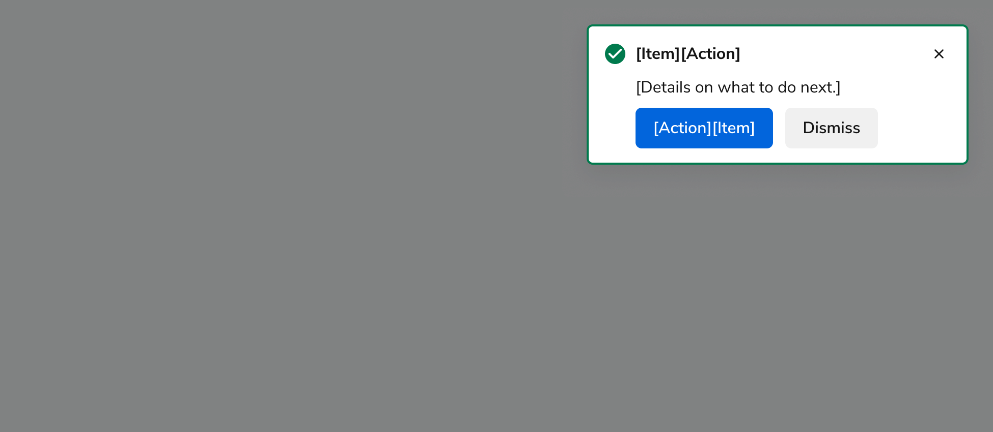
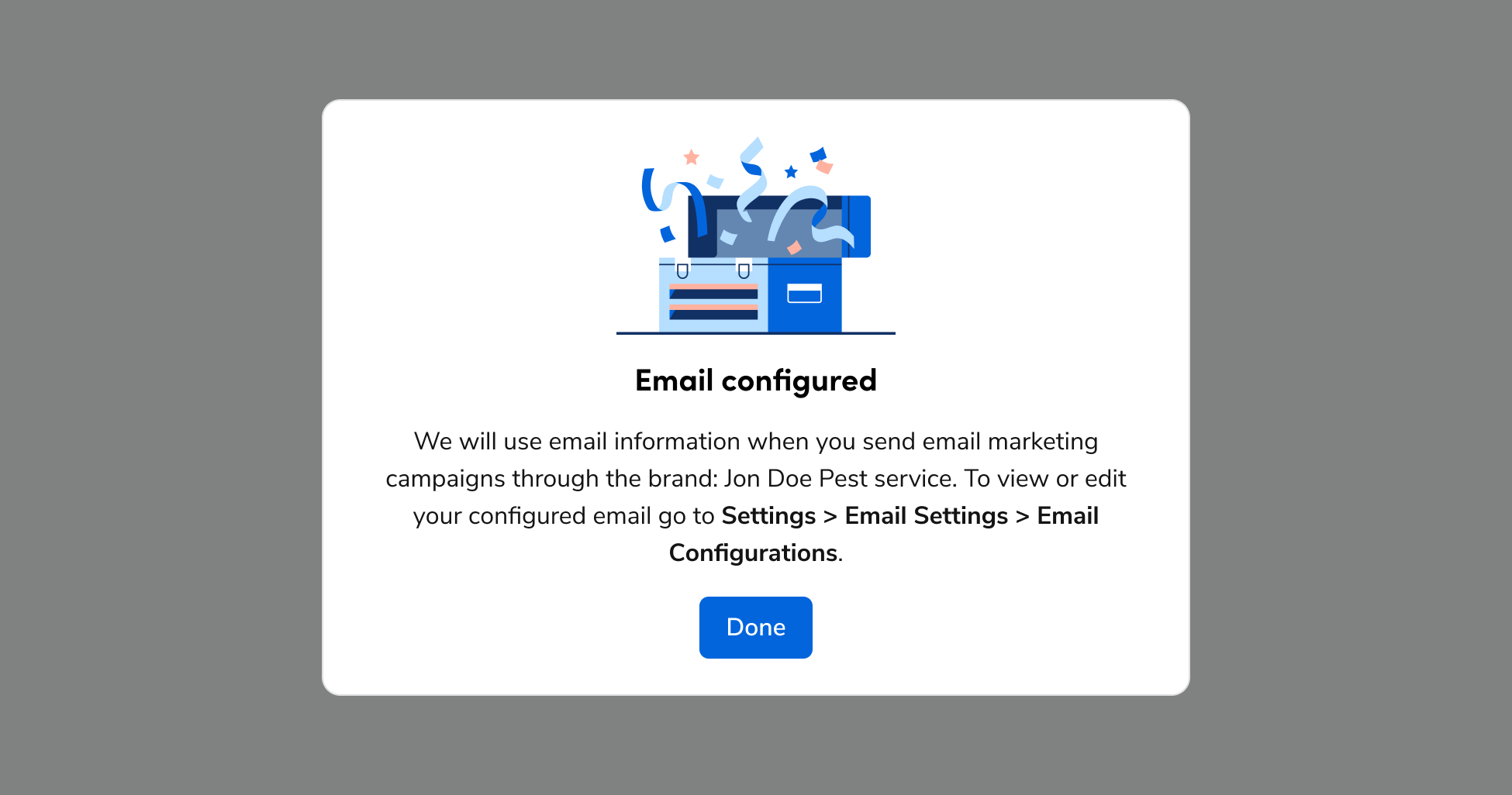
* Use when the user completed a more complex task or workflow and there are no next steps to complete. Note: The only CTA that should be used in this template is “Done”.
* Complex tasks and workflows are generally 3 or more steps, time intensive, and something the user does only once.
* Dialog appears after navigating the user back to the page where they started the task or workflow.
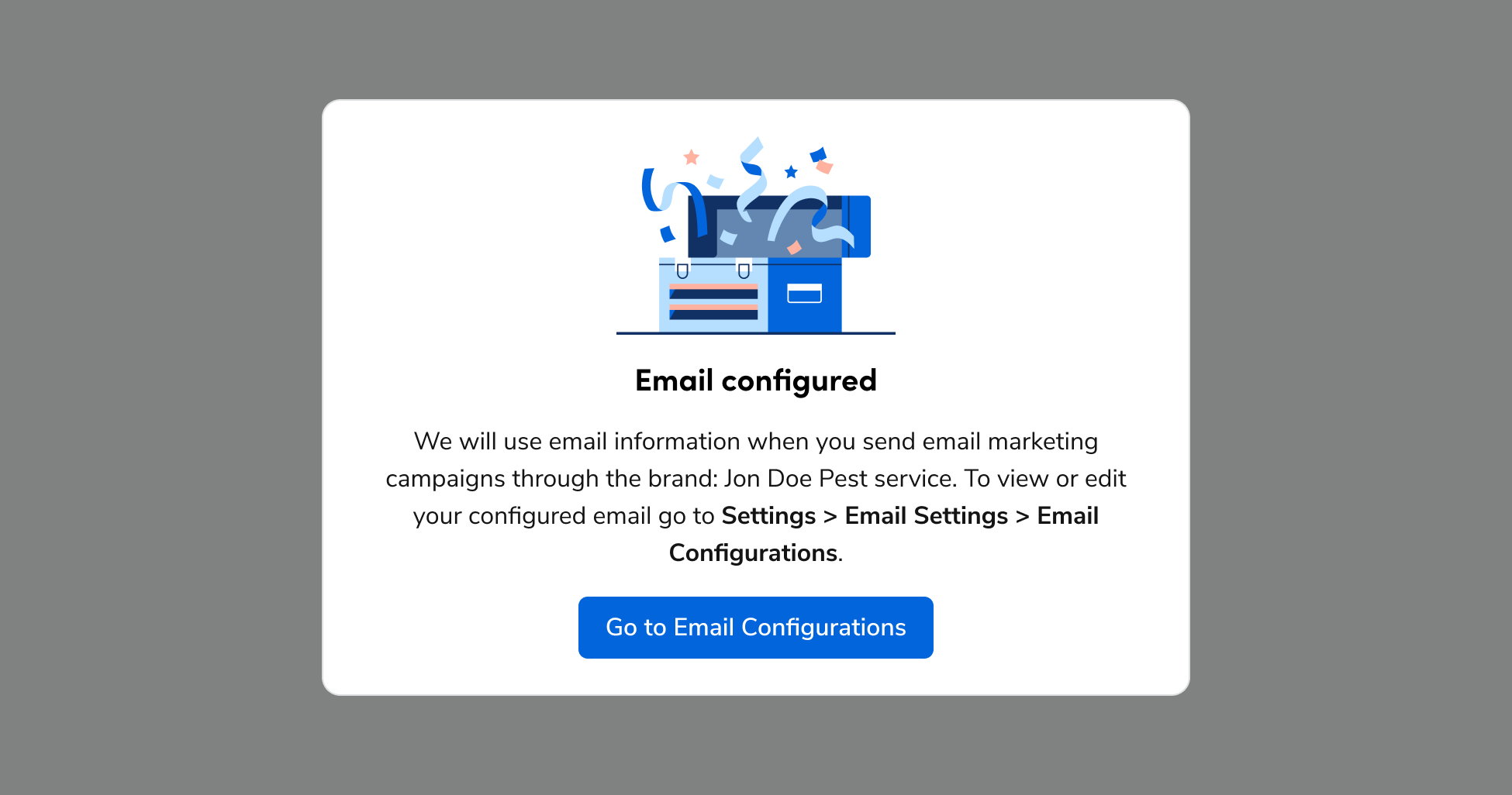
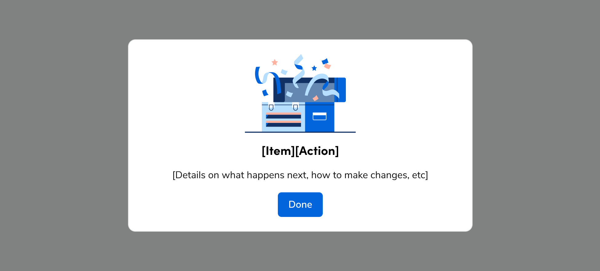
<Frame>
  <img
    src="https://mintcdn.com/servicetitan/KE7wVYXA9MgEh_Ye/images/docs/web/patterns/confirmation/template-example-for-complex-success-message-with-no-next-steps.png?fit=max&auto=format&n=KE7wVYXA9MgEh_Ye&q=85&s=2fa37e79571edecc2d2c09bf6d76517a"
    alt="Template example for complex success message with no next
steps"
    width="1950"
    height="882"
    data-path="images/docs/web/patterns/confirmation/template-example-for-complex-success-message-with-no-next-steps.png"
  />
</Frame>

##### Dos/Don'ts

<Frame>
  <div className="w-full h-full bg-[#FFFFFF] p-2 rounded flex items-center justify-center">
    <img
      src="https://mintcdn.com/servicetitan/KE7wVYXA9MgEh_Ye/images/docs/web/patterns/confirmation/success-dialog-complex-example-do-a.png?fit=max&auto=format&n=KE7wVYXA9MgEh_Ye&q=85&s=6b311e9007a077dd370c834ad5c061f9"
      alt="Success Dialog complex example DO
A"
      width="1950"
      height="1026"
      data-path="images/docs/web/patterns/confirmation/success-dialog-complex-example-do-a.png"
    />
  </div>
</Frame>

<Check>**Do**</Check>

<Frame>
  <div className="w-full h-full bg-[#FFFFFF] p-2 rounded flex items-center justify-center">
    <img
      src="https://mintcdn.com/servicetitan/KE7wVYXA9MgEh_Ye/images/docs/web/patterns/confirmation/success-dialog-dont-example-a.png?fit=max&auto=format&n=KE7wVYXA9MgEh_Ye&q=85&s=341433421e460ccd24757298c34a7790"
      alt="Success Dialog DONT example
A"
      width="1950"
      height="1026"
      data-path="images/docs/web/patterns/confirmation/success-dialog-dont-example-a.png"
    />
  </div>
</Frame>

<Danger>**Don't**</Danger>

* Use sentence case for title.
* Include only one CTA – “Done”. Note: if you want to include other CTAs, use the next template.
* Don’t include CTAs that perform actions or navigate the user to other pages. The user should already have been navigated to the next logical page before this Dialog appears.

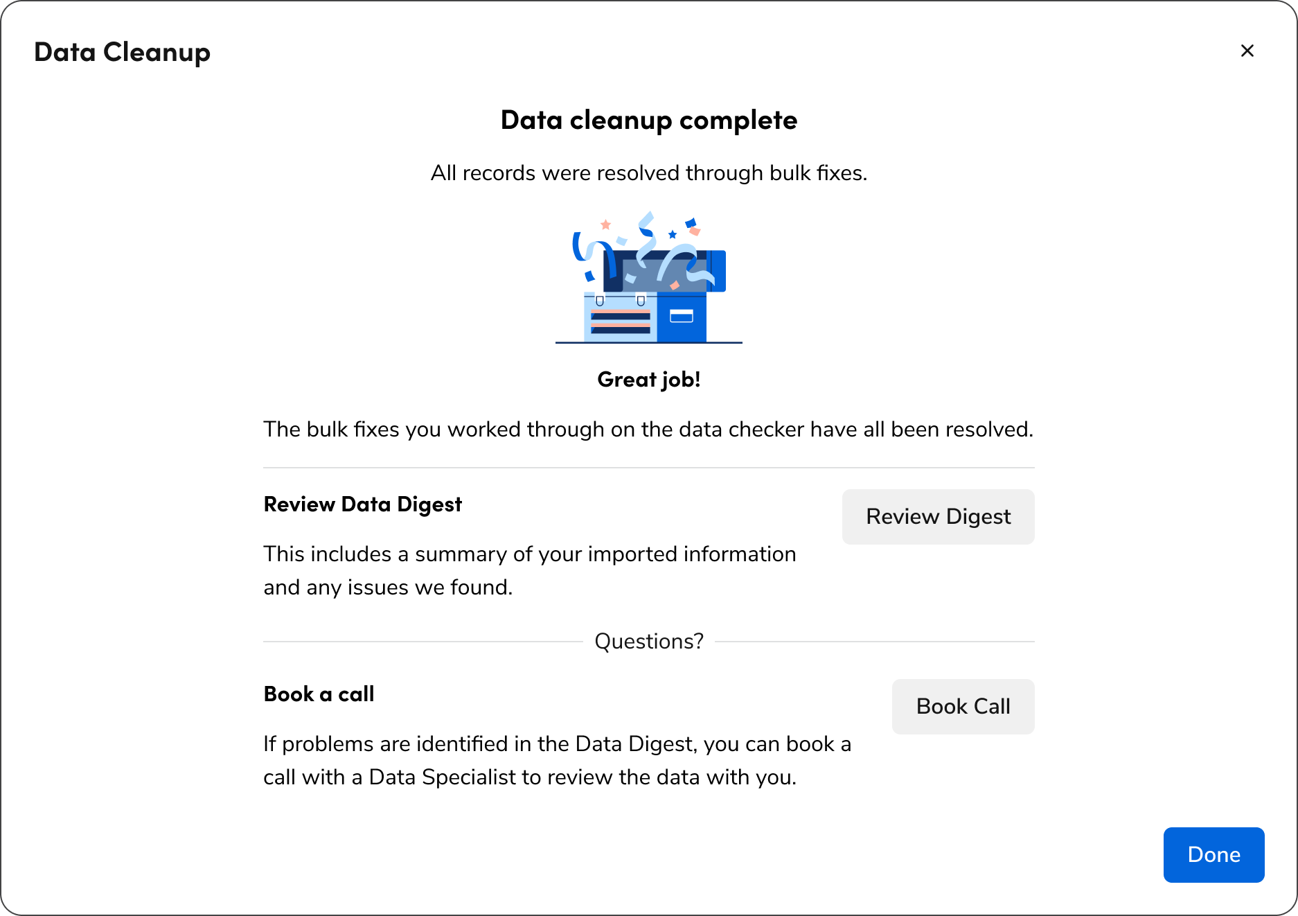
#### Complex task/workflow with related CTAs

Use this pattern for complex tasks or workflows (e.g., three or more steps, time-intensive, or one-time actions). These dialogs appear after navigating the user back to their starting page and offer next steps beyond "Done".

<Frame>
  <div className="w-full h-full bg-[#FFFFFF] p-2 rounded flex items-center justify-center">
    <img
      src="https://mintcdn.com/servicetitan/KE7wVYXA9MgEh_Ye/images/docs/web/patterns/confirmation/success-fsd-do-example-b.png?fit=max&auto=format&n=KE7wVYXA9MgEh_Ye&q=85&s=510e5b689f150f4333ff4a3e17cb4150"
      alt="Success FSD Do example
B"
      width="1874"
      height="1322"
      data-path="images/docs/web/patterns/confirmation/success-fsd-do-example-b.png"
    />
  </div>
</Frame>

<Check>**Do**</Check>

* Use a single column layout within a full-screen Dialog
* Include clear titles, explanations, and CTAs for each next step. Use a verb + noun pair as the button text for CTAs, like “Book Call” or “View Progress”.
* Don’t use a CTA that navigates the user back to where they started as this adds an unnecessary click. Automatically navigate the user there when they complete the flow and use the previous template as a success message instead.

#### Success as part of page content

* Use when the success message needs to be persistent and becomes a part of the page content.
* Alert appears immediately after the task or workflow is completed.

<LiveCode example="confirmation-success" screenshot fullWidth>
  ```tsx lines theme={null}
  import { Alert } from "@servicetitan/anvil2";

  function App() {
    return (
      <Alert status="success" title="[Process] [action]" onClose={console.log}>
        [Details such as date and time, next steps, etc.]
      </Alert>
    );
  }

  export default App;
  ```
</LiveCode>

##### Dos/Don'ts

<LiveCode example="confirmation-success-do" screenshot fullWidth>
  ```tsx lines theme={null}
  import { EditCard, Flex, Text, Alert } from "@servicetitan/anvil2";

  function App() {
    return (
      <EditCard flexGrow="1" headerText="Migration" state="complete">
        <Flex direction="column" gap="3">
          <Text variant="eyebrow" size="medium">
            Automatically create driving and working entries when dispatch and
            arrive are pressed.
          </Text>
          <Alert title="Successful Migration" status="success">
            Customer was successfully migrated on 10/12/2025, 09:30 PST
          </Alert>
        </Flex>
      </EditCard>
    );
  }

  export default App;
  ```
</LiveCode>

<Check>**Do**</Check>

* Include the Alert inline in the layout.
* Use when the success state and/or data around the completion of the flow needs to be documented for future views of the page. Include dates and times in the copy when applicable.
