;
}
};
Errors will always occur. This pattern provides general guidelines on how to surface the many types of errors and warnings that occur in the app.
## Getting Started
When writing an error or warning message, consider these questions:
* **What is the issue?**
* Knowing what the issue is (or knowing that we don't know) can help frame what to communicate to the user
* **What is the cause of the issue?**
* Common reasons could be user action, server/network issues, or not being able to find a resource
* **What can the user do to resolve the issue?**
* If it's the app fault, explain that. If it's user error, can you identify the most likely cause?
* **Is there a path a user can take to resolve the issue?**
* Whenever it is possible for a user to take action on the issue, a path should be given. For example, if using a Banner or Toast, provide a call to action in them
## Types of errors and warnings
### Anatomy of hint, error, and description text
Form fields should provide helpful information to the user for how they should fill out the field. To understand the anatomy of these elements, read the documentation for [Field Message](/docs/web/components/field-message/design).
### Page-level messages
This error type is used when an error applies to the entire page. They are represented as [Alerts](/docs/web/components/alert/design) that are placed below the page header.
```tsx lines theme={null}
import { Alert, Flex, Button } from "@servicetitan/anvil2";
function App() {
return (
You cannot post invoice #2345 because it has an outdated application for
payment. Please update all applications in this series and then try
again.{" "}
Please save the invoice to reflect the changes you made to the
Application for Payment.
);
}
export default App;
```
They can be used to:
* Summarize individual errors found on the rest of the page
* Inform the user of important, but non-critical information about the page
##### Errors and Tabs
When [Tabs](/docs/web/components/tab/design) are present, Alerts can be placed either below the Tab or above the Tab depending on how critical it is a user should know about the status. As a rule, place it below the Tabs. Don't represent status directly in the Tabs.
##### Copy Elements
* Bolded Headline
* Sentence explanation & next step
* 1-2 CTAs can be buttons or links (optional)
##### Copy Rules
* Headline should be title case if two words or less, otherwise sentence case
* Sentence(s) should be action focused, active voice, and include next steps for user to take. No links in body
* CTAs should be title case for two words or less, sentence case for more
### Form errors and validation
[Form](/docs/web/patterns/forms) errors are among the most common type of errors. Each individual component page provides specific styling and text location. It is recommended to also use an [Alert](/docs/web/components/alert/design) as a summary when multiple errors exist.
#### Validating on submit
This validation occurs after a user has hit a save or submit button. These errors are paired with [Alerts](/docs/web/components/alert/design) and individual form field errors.
```tsx lines theme={null}
import { TextField, Grid } from "@servicetitan/anvil2";
function App() {
return (
);
}
export default App;
```
#### Validating before submission
When format requirements exist for a field (such as the `@` in an email input), validating the form element after a user has left focus can help resolve errors.
#### When to use validation before submission:
* When a [Textfield](/docs/web/components/text-field/design) has known formatting requirements. If the requirement is ambiguous to a user (e.g., password requirements), add a [hint](/docs/web/patterns/forms#labels-and-help)
* In the initial user interaction, validate only after a user has left focus on the field and if the user entered anything
* When a user interacts with an errored field, validate after each keystroke. This helps the user identify when the user has met the field requirements
#### When to avoid validation before submission:
* While the user is still interacting with the field
* When a field was left empty by the user
* When it takes at least a second for the codebase to validate the field
##### Copy Elements
* Short fragment or sentence
##### Copy Rules
* Sentence case no punctuation
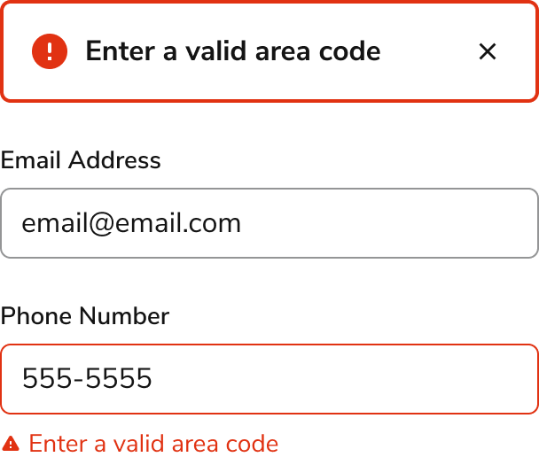
#### Alert Summary of Error(s)
It is recommended to add an [Alert](/docs/web/components/alert/design) at the top of a form that has errors. If the form is the main content of the page, it follows the page-level guidelines. Otherwise, it appears wherever the top of the form is.
* The [Alert](/docs/web/components/alert/design) should only appear after a validating on submit. Validations before submission do not need an [Alert](/docs/web/components/alert/design)
* The summary should list out each of the errors encountered on the page
* In general, the summary should not be used alone. Inline help should be added when possible
```tsx lines theme={null}
import { Alert, Grid, TextField } from "@servicetitan/anvil2";
function App() {
return (
Enter a last name
Enter a valid email address
Enter a valid area code
);
}
export default App;
```
##### Copy Elements
* Bolded Headline
* Sentence explanation & next step
##### Copy Rules
* Headline should be title case if two words or less, otherwise sentence case, no punctuation
* Sentence(s) should be action focused, active voice, and include next steps for user to take
* No links or buttons
### System and network errors
System errors can typically be described as 400 or 500 type errors. If there is a place for it on the page, it is preferred to integrate an Empty State into the section. Otherwise, using a [Toast](/docs/web/components/toast/design) is preferred over components such as the Alert or Announcement.
* When a system error is the apps fault, take responsibility
* If there is an HTTP response, place it at the end of the body content
* When using the Toast to present an error, it should persist on the page
* When it is possible to determine the solution, provide it to the user. For example, a 401 error resulting from not being logged in
##### Copy Elements
* Bolded Headline
* Sentence explanation (optional)
* Button CTA
##### Copy Rules
* Headline should be title case if two words or less, otherwise sentence case
* Sentence(s) should be action focused, active voice, and include next steps for user to take.
* CTAs should be title case for two words or less, sentence case for more
### Application errors and warnings
App-level messages are used to convey a status relevant to the entire experience, represented with an [Announcement](/docs/web/components/announcement/design). These are not used in specific products within the platform. Some examples might include a sandbox environment message and a scheduled downtime notice.
```tsx lines theme={null}
import { Announcement, Button } from "@servicetitan/anvil2";
function App() {
return (
);
}
export default App;
```
##### Copy Elements
* Sentences
* Button CTA
##### Copy Rules
* Full sentences with punctuation should be used
* CTA should be title case for two words or less, sentence case for more
### Empty state errors and warnings
Many different contexts for an empty state can exist, some of which can be tied to errors and warnings.
```tsx lines theme={null}
import { Flex, Icon, Text } from "@servicetitan/anvil2";
import { core } from "@servicetitan/anvil2/token";
import NotInterested from "@servicetitan/anvil2/assets/icons/material/round/not_interested.svg";
function App() {
return (
No results found
Try another search or create a new report by clicking the button above.
);
}
export default App;
```
##### Copy Elements
* Bolded Headline (optional)
* Sentence(s) explanation
* Button CTA (optional)
##### Copy Rules
* Headline should be title case if two words or less, otherwise sentence case
* Full sentences with punctuation should be used for body copy
* CTA should be title case for two words or less, sentence case for more
## Errors vs Warnings
Anvil provides the option of warning and error statuses across many of its components. Warnings, usually represented in yellow or orange, are a way of providing a less severe notification to users. They are useful when users should be informed of something, but aren’t necessarily required to take action on something.
### Examples where warnings are preferred
* If a user can correct the issue at a later point
* The system detects something might be wrong from a user input
* To signal that significant change may/will happen in the future
* To prevent future errors from occurring.
### Examples where errors are preferred
* If a user cannot proceed in a task without resolving the issue
* When server or network issues arise
* For form validation
## Preventive Measures
While we can’t prevent all errors, we can design interfaces that help minimize user mistakes
### Disabling submission
For simple layouts, the primary action can be disabled until all required fields are filled out, and paired with a [Tooltip](/docs/web/components/tooltip/design) to give the a user a hint. In complex layouts however, a submit-type button can help a user figure out what to do to proceed.
```tsx lines theme={null}
import { Button, Flex, Tooltip } from "@servicetitan/anvil2";
import Info from "@servicetitan/anvil2/assets/icons/material/round/info.svg";
function App() {
return (
Fill out all the fields in the form to proceed
);
}
export default App;
```
### Confirmation Dialog
Adding confirmations can be useful to avoiding mistakes. See the [Confirmation](/docs/web/patterns/confirmation) pattern for specific uses.
```tsx lines theme={null}
import { Dialog, Flex, Button } from "@servicetitan/anvil2";
function App() {
return (
);
}
export default App;
```
##### Copy Elements
* Bolded Headline
* Sentence explanation
* Button CTA
##### Copy Rules
* Headline should be sentence case
* Sentence(s) should be action focused, active voice, and include next steps for user to take. No links in body
* CTAs should be title case for two words or less, sentence case for more
### Required labeling
When form field elements are required, the \* can help users identify what they need to fill out.
```tsx lines theme={null}
import { TextField, Grid } from "@servicetitan/anvil2";
function App() {
return (
);
}
export default App;
```
## Anti-patterns
Some components could theoretically be used to display errors, but should be avoided.
* **Don’t use Dialogs or browser alerts to display errors or warnings.** Unless the content already existed in these overlays, these components should not be used to display errors. These components interrupt, adding an extra step to resolve errors
```tsx lines theme={null}
import { Dialog, Flex, Button } from "@servicetitan/anvil2";
function App() {
return (
);
}
export default App;
```
**Don't**
Alerts should be used over Dialogs for summaries.
* **Avoid overlay components to display error messages when an inline variation exists.** Tooltips and Popovers can prevent an end user from scanning the content of a page
* **Don’t validate form elements while a user is still interacting with it.** Many form elements do not start off validated correctly (e.g., typing out an email at the start will be missing the @)
* **Avoid Red Buttons to indicate an error.** Red buttons signify that an act is destructive (such as deleting a document or an action that cannot be undone). Other components should be used to signify the presence of an error
## Copy Guidelines
* **Content should be clear and easy to understand.** It should be encouraging without being overly apologetic or humorous
* **Avoid development jargon.** Users are unlikely to be familiar with the inner workings of the app or web development. Frame copy toward user actions and goals, not the underlying software cause of the problem
* **If it's known how to resolve the issue, the copy should explain it.** For example, "Enter a maximum price higher than the minimum price." is more helpful than "Enter a valid maximum price"
* When user action caused the error, avoid outright blame on them
* When the error is caused by the app, accept responsibility and apologize
## Additional resources
* The product content team has additional internal documentation on writing for [Error and other message types](https://servicetitan.atlassian.net/wiki/spaces/DTW/pages/263848031/Error+and+Other+Message+Types+-+Docs).
* [NN Group, How to Report Errors in Forms: 10 Design Guidelines](https://www.nngroup.com/articles/errors-forms-design-guidelines/)