> ## Documentation Index
> Fetch the complete documentation index at: https://anvil.servicetitan.com/llms.txt
> Use this file to discover all available pages before exploring further.

# Forms

export const LiveCode = ({children, customHeight, clickToLoad, example, fullWidth, fullHeight, hideCodeInLiveCode, screenshot, screenshotOnly, showCode: showCodeProp}) => {
  const SCREENSHOTS_BASE = "https://servicetitan.github.io/anvil2-docs-live-code/screenshots";
  const STACKBLITZ_BASE = "https://stackblitz.com/github/servicetitan/anvil2-docs-live-code/tree/main/examples";
  const [showCodeBlock, setShowCodeBlock] = useState(showCodeProp ?? false);
  const [isLocalOverride, setIsLocalOverride] = useState(false);
  useEffect(() => {
    const examplePath = `/images/live-code-screenshots-tmp/${example}.png`;
    fetch(examplePath, {
      method: "HEAD"
    }).then(r => {
      if (r.ok) setIsLocalOverride(true);
    }).catch(() => {});
  }, [example]);
  const screenshotBase = isLocalOverride ? "/images/live-code-screenshots-tmp" : SCREENSHOTS_BASE;
  if (screenshotOnly) {
    return <Frame className="flex flex-col">
        <div className="flex dark:hidden" style={{
      justifyContent: "center",
      alignItems: "center",
      width: fullWidth ? "100%" : "50%",
      minHeight: fullHeight ? "284px" : undefined,
      background: "#FFFFFF"
    }}>
          <img srcset={`${screenshotBase}/${example}.png, ${screenshotBase}/${example}-2x.png 2x`} src={`${screenshotBase}/${example}.png`} alt={example} noZoom />
        </div>
        <div className="hidden dark:flex" style={{
      justifyContent: "center",
      alignItems: "center",
      width: fullWidth ? "100%" : "50%",
      minHeight: fullHeight ? "284px" : undefined,
      background: "#141414"
    }}>
          <img srcset={`${screenshotBase}/${example}-dark.png, ${screenshotBase}/${example}-dark-2x.png 2x`} src={`${screenshotBase}/${example}-dark.png`} alt={example} noZoom />
        </div>
      </Frame>;
  }
  if (screenshot) {
    return <Frame className="flex flex-col -mb-2">
        <div className="flex dark:hidden bg-white dark:bg-codeblock border border-gray-950/10 dark:border-white/10 dark:twoslash-dark rounded-2xl overflow-hidden" style={{
      justifyContent: "center",
      alignItems: "center",
      width: fullWidth ? "100%" : "50%",
      minHeight: fullHeight ? "284px" : undefined
    }}>
          <img srcset={`${screenshotBase}/${example}.png, ${screenshotBase}/${example}-2x.png 2x`} src={`${screenshotBase}/${example}.png`} alt={example} noZoom />
        </div>

        <div className="hidden dark:flex bg-white dark:bg-codeblock border border-gray-950/10 dark:border-white/10 dark:twoslash-dark rounded-2xl overflow-hidden" style={{
      background: "#141414",
      justifyContent: "center",
      alignItems: "center",
      width: fullWidth ? "100%" : "50%",
      minHeight: fullHeight ? "284px" : undefined
    }}>
          <img srcset={`${screenshotBase}/${example}-dark.png, ${screenshotBase}/${example}-dark-2x.png 2x`} src={`${screenshotBase}/${example}-dark.png`} alt={example} noZoom />
        </div>

        <div className="flex justify-end items-center text-xs py-2 px-1 gap-4">
          {!showCodeProp ? <button className="inline-flex justify-end items-center text-gray-700 dark:text-gray-50 hover:text-blue-500 dark:hover:text-blue-300 transition-colors group self-end gap-1 cursor-pointer" onClick={() => setShowCodeBlock(!showCodeBlock)} style={{
      appearance: "none"
    }}>
              <Icon icon="code" size="12px" className="group-hover:bg-blue-500 dark:group-hover:bg-blue-300" />
              <span>{showCodeBlock ? "Hide code" : "Show code"}</span>
            </button> : null}

          <a className="inline-flex justify-end items-center hover:text-blue-500 dark:hover:text-blue-300 transition-colors group self-end gap-1" href={`${STACKBLITZ_BASE}/${example}?file=src/App.tsx`} target="_blank" rel="noreferrer">
            <Icon icon="bolt" size="12px" className="group-hover:bg-blue-500 dark:group-hover:bg-blue-300" />
            <span>StackBlitz demo</span>
          </a>
        </div>

        <div className="grid transition-[grid-template-rows] duration-300 ease-in-out overflow-auto overflow-y-hidden overflow-x-auto" style={showCodeBlock ? {
      gridTemplateRows: "1fr"
    } : {
      gridTemplateRows: "0fr"
    }}>
          <div style={{
      minHeight: 0,
      overflowX: "auto",
      overflowY: "hidden",
      marginBlockStart: "-1.25rem",
      marginBlockEnd: "-1.5rem"
    }}>
            {children}
          </div>
        </div>
      </Frame>;
  } else {
    return <div style={{
      display: "flex",
      width: fullWidth ? "100%" : "50%",
      minHeight: customHeight ? customHeight : "316px",
      resize: "vertical",
      overflow: "auto"
    }}>
        <iframe title={example} style={{
      flex: 1,
      width: fullWidth ? "100%" : "50%",
      minHeight: customHeight ? customHeight : "316px"
    }} src={`${STACKBLITZ_BASE}/${example}?embed=1&hideNavigation=1&hideExplorer=1&terminalHeight=0&file=src/App.tsx${clickToLoad ? "&ctl=1" : ""}${hideCodeInLiveCode ? "&view=preview" : ""}`} allow="accelerometer; ambient-light-sensor; camera; encrypted-media; geolocation; gyroscope; hid; microphone; midi; payment; usb; vr; xr-spatial-tracking" sandbox="allow-forms allow-modals allow-popups allow-presentation allow-same-origin allow-scripts" />
      </div>;
  }
};

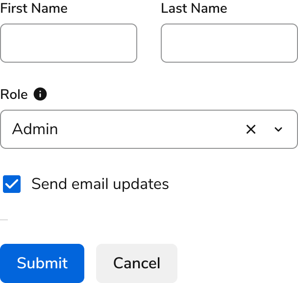
A form is a collection of related controls for users to provide data and configurations.

<Frame>
  <div className="w-full h-full bg-[#FFFFFF] p-2 rounded flex items-center justify-center">
    <img
      src="https://mintcdn.com/servicetitan/UmHUvEuYrbSv6t_f/images/docs/web/patterns/shared/overview-of-a-form.png?fit=max&auto=format&n=UmHUvEuYrbSv6t_f&q=85&s=28cc4ed8382ec03cd3b81f603209b34f"
      alt="Overview of a
Form"
      width="608"
      height="578"
      data-path="images/docs/web/patterns/shared/overview-of-a-form.png"
    />
  </div>
</Frame>

## Form Anatomy

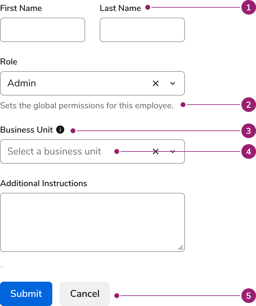
Forms are made up of many possible components, including many represented below.

<Frame>
  <div className="w-full h-full bg-[#FFFFFF] p-2 rounded flex items-center justify-center">
    <img src="https://mintcdn.com/servicetitan/KE7wVYXA9MgEh_Ye/images/docs/web/patterns/forms/anatomy-of-a-form.png?fit=max&auto=format&n=KE7wVYXA9MgEh_Ye&q=85&s=3603e59592170ab5748e29d04049f422" alt="Anatomy of a form" width="842" height="1006" data-path="images/docs/web/patterns/forms/anatomy-of-a-form.png" />
  </div>
</Frame>

1. Label

2. Description

3. More Information

4. Placeholder

5. Form Actions

## Suggested spacing

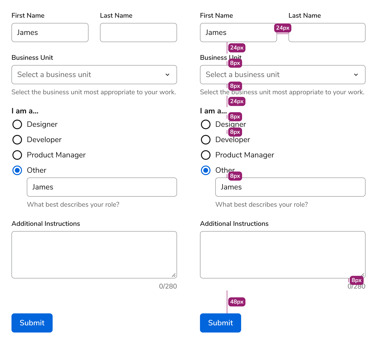
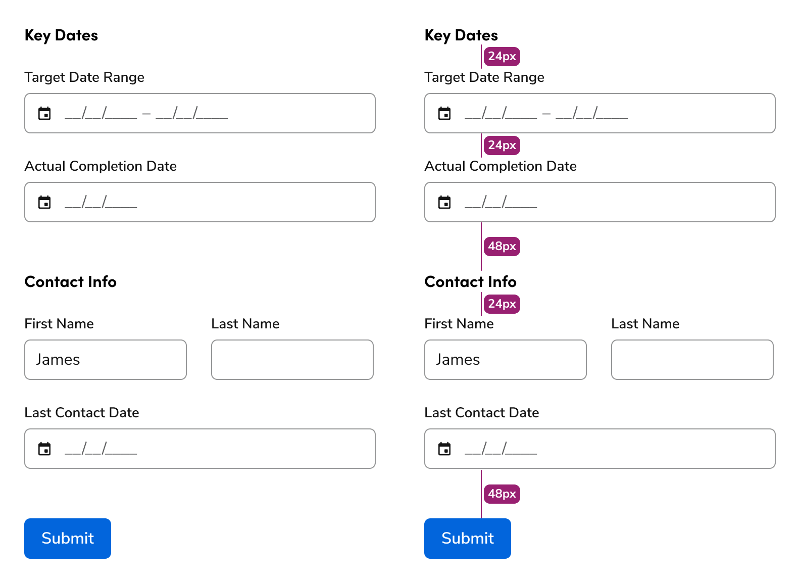
The following are suggested spacing for form elements. Spacing within the component is set by the system, while spacing between components is suggested.

<Frame>
  <div className="w-full h-full bg-[#FFFFFF] p-2 rounded flex items-center justify-center">
    <img
      src="https://mintcdn.com/servicetitan/UmHUvEuYrbSv6t_f/images/docs/web/patterns/forms/visualization-of-form-spacing.png?fit=max&auto=format&n=UmHUvEuYrbSv6t_f&q=85&s=d7f11badbcfca1ef2f79705843ce3b83"
      alt="Visualization of form
spacing"
      width="1576"
      height="1438"
      data-path="images/docs/web/patterns/forms/visualization-of-form-spacing.png"
    />
  </div>
</Frame>

##### Group spacing

<Frame>
  <div className="w-full h-full bg-[#FFFFFF] p-2 rounded flex items-center justify-center">
    <img
      src="https://mintcdn.com/servicetitan/UmHUvEuYrbSv6t_f/images/docs/web/patterns/forms/visualization-of-form-group-spacing.png?fit=max&auto=format&n=UmHUvEuYrbSv6t_f&q=85&s=5915142a1e5c001a013e206c3ec0e3b8"
      alt="Visualization of form group
spacing"
      width="1584"
      height="1154"
      data-path="images/docs/web/patterns/forms/visualization-of-form-group-spacing.png"
    />
  </div>
</Frame>

## Columns

<LiveCode example="forms-columns-01" screenshot fullWidth>
  ```tsx lines theme={null}
  import { Grid, TextField } from "@servicetitan/anvil2";

  function App() {
    return (
      <Grid gap="6">
        <Grid gap="6" templateColumns="1fr 1fr">
          <TextField label="First Name" />
          <TextField label="Last Name" />
        </Grid>
        <TextField label="Email Address" />
      </Grid>
    );
  }

  export default App;
  ```
</LiveCode>

<LiveCode example="forms-columns-02" screenshot fullWidth>
  ```tsx lines theme={null}
  import { Grid, TextField } from "@servicetitan/anvil2";

  function App() {
    return (
      <Grid gap="6">
        <TextField label="First Name" />
        <TextField label="Last Name" />
        <TextField label="Email Address" />
      </Grid>
    );
  }

  export default App;
  ```
</LiveCode>

<LiveCode example="forms-columns-03" screenshot fullWidth>
  ```tsx lines theme={null}
  import { Grid, TextField, Radio } from "@servicetitan/anvil2";

  function App() {
    return (
      <Grid gap="6" templateColumns="1fr 1fr">
        <TextField label="Your Name" />
        <TextField label="Email Address" />

        <Radio.Group legend="My function is">
          <Radio name="role" value="designer" label="Designer" />
          <Radio name="role" value="developer" label="Developer" />
          <Radio name="role" value="pm" label="Product Manager" />
        </Radio.Group>
        <Radio.Group legend="What support do you need?">
          <Radio name="support" value="software" label="Software" />
          <Radio name="support" value="hardware" label="Hardware" />
          <Radio name="support" value="report" label="Expense Report" />
          <Radio name="support" value="tools" label="Learning Tools" />
        </Radio.Group>
      </Grid>
    );
  }

  export default App;
  ```
</LiveCode>

As a rule, form elements should be limited to 1 column. Multi-column layouts can be used when there is sufficient space on the screen for it, and the elements are logically related to each other.

## Forms in Layouts

##### In a Dialog

As a rule, form element width should conform to the size of the Dialog’s set width.

<LiveCode example="forms-dialog-width" screenshot fullWidth>
  ```tsx lines theme={null}
  import { Button, Dialog, Grid, TextField } from "@servicetitan/anvil2";
  import { useState } from "react";

  function App() {
    const [open, setOpen] = useState(true);

    return (
      <div style={{ minWidth: "35.5rem", minHeight: "20.5rem" }}>
        <Button onClick={() => setOpen(true)}>Open to show Dialog example</Button>
        <Dialog size="large" open={open} onClose={() => setOpen(false)}>
          <Dialog.Header>Partner Information</Dialog.Header>
          <Dialog.Content>
            <Grid gap="6" style={{ width: "100%" }}>
              <Grid gap="6" templateColumns="1fr 1fr">
                <TextField label="First Name" />
                <TextField label="Last Name" />
              </Grid>
              <TextField label="Email Address" />
            </Grid>
          </Dialog.Content>
          <Dialog.Footer>
            <Button onClick={() => setOpen(false)}>Cancel</Button>
            <Button appearance="primary" onClick={() => setOpen(false)}>
              Save
            </Button>
          </Dialog.Footer>
        </Dialog>
      </div>
    );
  }

  export default App;
  ```
</LiveCode>

## Labels and Help

### What help elements should we use?

| Element     | When to use                                                                                  | Preference |
| ----------- | -------------------------------------------------------------------------------------------- | ---------- |
| Label       | Used in most situations. Provides essential information to a user in 1–3 words.              | 1st        |
| Hint Text   | Hints at what the input should be for the field.                                             | 2nd        |
| Description | Describes what the field is about and/or what impact it would make to what users care about. | 3rd        |
| More Info   | When providing supplemental information, or lengthy explanations.                            | 4th        |
| Placeholder | In general, avoid. May be used to hint at text field’s formatting.                           | 5th        |

### Labels should almost always be used

Most contexts for forms require a label. Some exceptions include when an icon can clearly explain the use case, such as a search input, or if a label exists elsewhere, such as a table column.

<LiveCode example="forms-label-do" screenshot fullWidth>
  ```tsx lines theme={null}
  import { TextField } from "@servicetitan/anvil2";

  function App() {
    return <TextField label="Email Address" />;
  }

  export default App;
  ```
</LiveCode>

<Check>**Do**</Check>

<LiveCode example="forms-label-dont" screenshot fullWidth>
  ```tsx lines theme={null}
  import { TextField } from "@servicetitan/anvil2";

  function App() {
    return <TextField placeholder="Email Address" />;
  }

  export default App;
  ```
</LiveCode>

<Danger>**Don't**</Danger>

### Use inline help for essential and supplementary information

Descriptions are strong at providing additional information necessary to complete a form.

<LiveCode example="forms-description-01" screenshot fullWidth>
  ```tsx lines theme={null}
  import { TextField } from "@servicetitan/anvil2";

  function App() {
    return (
      <TextField
        label="Password"
        type="password"
        hint="Must be at least 8 characters long."
      />
    );
  }

  export default App;
  ```
</LiveCode>

<LiveCode example="forms-description-02" screenshot fullWidth>
  ```tsx lines theme={null}
  import { TextField, Text, Link } from "@servicetitan/anvil2";
  import { core } from "@servicetitan/anvil2/token";

  function App() {
    return (
      <TextField
        label="Office Phone"
        description={
          <Text size="small" subdued>
            This is the number customers see when a call is made.{" "}
            <Link
              style={{ marginTop: core.primitive?.Size1?.value }}
              appearance="secondary"
            >
              Learn more
            </Link>
          </Text>
        }
      />
    );
  }

  export default App;
  ```
</LiveCode>

### Use more info for supplementary information

More info help can de-clutter a page by putting supplemental information behind an overlay element.

<LiveCode example="forms-moreinfo-01" screenshot fullWidth>
  ```tsx lines theme={null}
  import { TextField } from "@servicetitan/anvil2";

  function App() {
    return (
      <TextField
        label="Password"
        type="password"
        hint="Must be at least 8 characters long."
        moreInfo="If you are having trouble logging in, contact our customer support team."
      />
    );
  }

  export default App;
  ```
</LiveCode>

<LiveCode example="forms-moreinfo-02" screenshot fullWidth>
  ```tsx lines theme={null}
  import { Flex, Checkbox, Tooltip, Icon } from "@servicetitan/anvil2";
  import Info from "@servicetitan/anvil2/assets/icons/material/round/info.svg";
  import { useState } from "react";

  function App() {
    const [isFocused, setIsFocused] = useState(false);
    return (
      <Flex gap="1">
        <Checkbox
          id="cb3"
          label="Academy company admin"
          onFocus={() => setIsFocused(true)}
          onBlur={() => setIsFocused(false)}
        />
        <Tooltip
          open={isFocused}
          placement="right"
          fallbackPlacements={["bottom"]}
        >
          <Tooltip.Trigger style={{ alignSelf: "center" }}>
            {/* Don't need Icon to be focusable because Checkbox focus triggers it already */}
            <Icon
              svg={Info}
              onMouseEnter={() => setIsFocused(true)}
              onMouseLeave={() => setIsFocused(false)}
            />
          </Tooltip.Trigger>
          <Tooltip.Content>
            Can assign courses to employees, track Academy progress, and run
            reports
          </Tooltip.Content>
        </Tooltip>
      </Flex>
    );
  }

  export default App;
  ```
</LiveCode>

### Hints and Descriptions are preferred over more info

Hint text and description text always being visible on the page improves the usability of the content itself. More info can still be used however, particularly when the content density of the page is high.

### Relationship between Hint, Description, and Error text

##### Hint Text

Hint text primarily focuses on the expected format for an input. It appears before a user interacts with a form field or when the field is empty.

<LiveCode example="forms-relationship-hint" screenshot fullWidth>
  ```tsx lines theme={null}
  import { DateFieldSingle } from "@servicetitan/anvil2";

  function App() {
    return (
      <DateFieldSingle
        label="Appointment Date"
        description="Select the date you'd like to book your service."
      />
    );
  }

  export default App;
  ```
</LiveCode>

##### Description Text

Description text provides broader context about what the form field is about or what impact it would make. It appears after the Hint text. It helps users understand why they are providing this information and the implications of their input.

<LiveCode example="forms-relationship-description" screenshot fullWidth>
  ```tsx lines theme={null}
  import { TextField } from "@servicetitan/anvil2";

  function App() {
    return (
      <TextField
        label="Shipping Address"
        description="This address will be used to deliver your order"
      />
    );
  }

  export default App;
  ```
</LiveCode>

##### Error Text

Error text appears when a user's input fails validation. Hint text remains visible alongside the error to provide persistent contextual guidance. Error text clearly and concisely describes what went wrong and often suggests a way to correct the issue. Description text persists regardless. Multiple error messages and [warning messages](/docs/web/components/field-message/code) are also supported.

The combination of Hint, Error, Warning, and Description text should be kept concise, where Hint is typically one line and Description is at most three.

<LiveCode example="forms-relationship-error" screenshot fullWidth>
  ```tsx lines theme={null}
  import { TextField } from "@servicetitan/anvil2";

  function App() {
    return (
      <TextField
        label="Shipping Address"
        description="This address will be used to deliver your order"
        required
        error="Please enter your street address"
      />
    );
  }

  export default App;
  ```
</LiveCode>

### Placeholder text should generally be avoided

In general, placeholders should be omitted, as they have many downsides:

* Users lose the help content on typing, and after the element is filled out.
* Higher contrast text can confuse a user into believing the placeholder is a real value.
* They have inconsistent implementations in browsers.

<LiveCode example="forms-avoidplaceholder-dont" screenshot fullWidth>
  ```tsx lines theme={null}
  import { TextField, Icon } from "@servicetitan/anvil2";
  import Person from "@servicetitan/anvil2/assets/icons/material/round/person.svg";

  function App() {
    return (
      <TextField
        placeholder="Full name"
        prefix={
          (
            <Icon aria-label="search icon" svg={Person} size="large" />
          ) as unknown as string
        }
      />
    );
  }

  export default App;
  ```
</LiveCode>

<Danger>**Don't**</Danger>

<LiveCode example="forms-avoidplaceholder-do" screenshot fullWidth>
  ```tsx lines theme={null}
  import { SearchField } from "@servicetitan/anvil2";

  function App() {
    return <SearchField placeholder="Search equipment" />;
  }

  export default App;
  ```
</LiveCode>

<Check>**Do**</Check>

Placeholder usage in a search field is allowed.

### Reassure the user as they take action

Form help reminds and validates the user’s actions. It’s especially valuable when used with features that aren’t used often, have high stakes, or rely on a certain level of expertise and area knowledge, e.g., accounting concepts.

This helps the user feel confident about the outcome what they are about to do and reduce errors.

## Form Validation

To see how to handle errors in Forms, refer to our [Errors & Warning pattern](/docs/web/patterns/errors-and-warnings) documentation.

<LiveCode example="forms-validation" screenshot fullWidth>
  ```tsx lines theme={null}
  import { TextField } from "@servicetitan/anvil2";

  function App() {
    return (
      <TextField
        label="Password"
        type="password"
        hint="Must be at least 8 characters long."
        error="Password must be at least 8 characters."
      />
    );
  }

  export default App;
  ```
</LiveCode>

## Form Submission

Forms should only submit when the user explicitly clicks the submit button. Pressing the Enter key within a form field should not trigger form submission. This prevents accidental submissions, especially when users are still reviewing or completing other fields in the form.

<Check>**Do**</Check>

Require users to click the submit button to submit the form.

<Danger>**Don't**</Danger>

Allow pressing Enter in a text field to submit the form.

## Progressive Disclosure

Certain form elements can be displayed only after a relevant element has been selected. This can be useful in shortening a form without losing critical information. When these hidden elements are inline, indenting the element can visually reinforce its relation.

<LiveCode example="forms-disclosure" screenshot fullWidth>
  ```tsx lines theme={null}
  import { Radio, TextField } from "@servicetitan/anvil2";
  import { useState } from "react";

  function App() {
    const [radioState, setRadioState] = useState("other");

    return (
      <Radio.Group legend="I am a...">
        <Radio
          name="exampleRadioOther"
          value="software"
          label="Designer"
          checked={radioState === "software"}
          onChange={(_v) => setRadioState("software")}
        />
        <Radio
          name="exampleRadioOther"
          value="hardware"
          label="Developer"
          checked={radioState === "hardware"}
          onChange={(_v) => setRadioState("hardware")}
        />
        <Radio
          name="exampleRadioOther"
          value="report"
          label="Product Manager"
          checked={radioState === "report"}
          onChange={(_v) => setRadioState("report")}
        />
        <Radio
          name="exampleRadioOther"
          value="tools"
          label="Other"
          checked={radioState === "other"}
          onChange={(_v) => setRadioState("other")}
        />
        {radioState === "other" && (
          <div
            style={{ marginLeft: "2rem", marginTop: "-0.25rem", width: "15rem" }}
          >
            {" "}
            <TextField />{" "}
          </div>
        )}
      </Radio.Group>
    );
  }

  export default App;
  ```
</LiveCode>

## Button Alignment

##### Place form actions at the bottom

<LiveCode example="forms-buttonalignment-do" screenshot fullWidth>
  ```tsx lines theme={null}
  import { Grid, TextField, Flex, Button } from "@servicetitan/anvil2";
  import { core } from "@servicetitan/anvil2/token";

  function App() {
    return (
      <Grid gap="6">
        <Grid gap="6" templateColumns="1fr 1fr">
          <TextField label="First Name" />
          <TextField label="Last Name" />
        </Grid>
        <TextField label="Email Address" />

        <Flex
          gap="3"
          style={{
            marginTop: core.primitive?.Size6?.value,
          }}
        >
          <Button appearance="primary">Submit</Button>
          <Button>Cancel</Button>
        </Flex>
      </Grid>
    );
  }

  export default App;
  ```
</LiveCode>

<Check>**Do**</Check>

<LiveCode example="forms-buttonalignment-dont" screenshot fullWidth>
  ```tsx lines theme={null}
  import { Grid, TextField, Flex, Button } from "@servicetitan/anvil2";
  import { core } from "@servicetitan/anvil2/token";

  function App() {
    return (
      <Grid gap="6">
        <Flex
          gap="3"
          style={{
            marginBottom: core.primitive?.Size6?.value,
          }}
        >
          <Button appearance="primary">Submit</Button>
          <Button>Cancel</Button>
        </Flex>
        <Grid gap="6" templateColumns="1fr 1fr">
          <TextField label="First Name" />
          <TextField label="Last Name" />
        </Grid>
        <TextField label="Email Address" />
      </Grid>
    );
  }

  export default App;
  ```
</LiveCode>

<Danger>**Don't**</Danger>

##### Left alignment usage

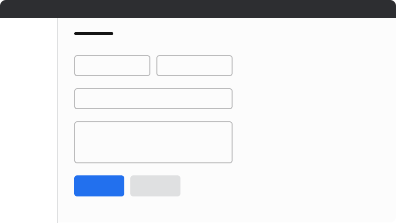
Left alignment is used when the form is on a typical page.

<Frame>
  <div className="w-full h-full bg-[#FFFFFF] p-2 rounded flex items-center justify-center">
    <img
      src="https://mintcdn.com/servicetitan/UmHUvEuYrbSv6t_f/images/docs/web/patterns/forms/example-of-a-left-aligned-button.png?fit=max&auto=format&n=UmHUvEuYrbSv6t_f&q=85&s=32dbaca8e41a076a9803d8f14d515544"
      alt="Example of a left aligned
button."
      width="790"
      height="445"
      data-path="images/docs/web/patterns/forms/example-of-a-left-aligned-button.png"
    />
  </div>
</Frame>

##### Right alignment usage

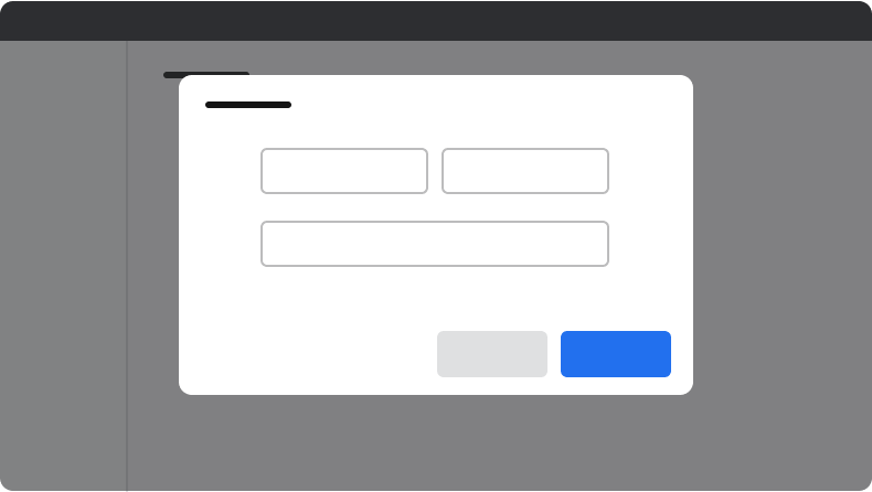
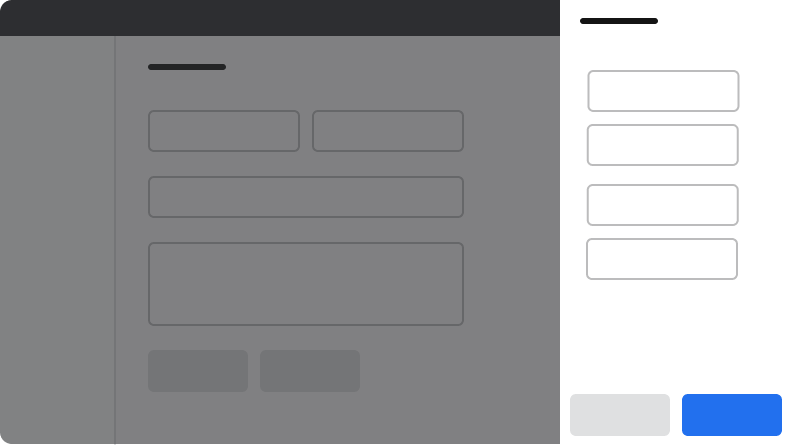
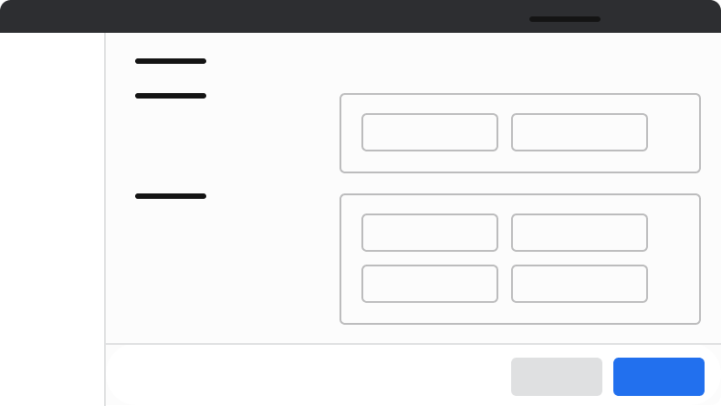
Right-aligned actions occur when the form element is contained in a Modal or Drawer, or when a page has a sticky footer.

<Frame>
  <div className="w-full h-full bg-[#FFFFFF] p-2 rounded flex items-center justify-center">
    <img
      src="https://mintcdn.com/servicetitan/UmHUvEuYrbSv6t_f/images/docs/web/patterns/forms/example-of-a-right-aligned-button-in-a-dialog.png?fit=max&auto=format&n=UmHUvEuYrbSv6t_f&q=85&s=b6bf92c0284174a27d878ba0810f8dbd"
      alt="Example of a right aligned button in a
Dialog."
      width="790"
      height="446"
      data-path="images/docs/web/patterns/forms/example-of-a-right-aligned-button-in-a-dialog.png"
    />
  </div>
</Frame>

<Frame>
  <div className="w-full h-full bg-[#FFFFFF] p-2 rounded flex items-center justify-center">
    <img
      src="https://mintcdn.com/servicetitan/UmHUvEuYrbSv6t_f/images/docs/web/patterns/forms/example-of-a-right-aligned-button-in-a-drawer.png?fit=max&auto=format&n=UmHUvEuYrbSv6t_f&q=85&s=9c22b852e4581703d33483c666e58c5f"
      alt="Example of a right aligned button in a
Drawer."
      width="790"
      height="446"
      data-path="images/docs/web/patterns/forms/example-of-a-right-aligned-button-in-a-drawer.png"
    />
  </div>
</Frame>

<Frame>
  <div className="w-full h-full bg-[#FFFFFF] p-2 rounded flex items-center justify-center">
    <img
      src="https://mintcdn.com/servicetitan/UmHUvEuYrbSv6t_f/images/docs/web/patterns/forms/example-of-a-right-aligned-button-in-a-page.png?fit=max&auto=format&n=UmHUvEuYrbSv6t_f&q=85&s=76a3f6822ade644757b7395eb8df4641"
      alt="Example of a right aligned button in a
Page."
      width="790"
      height="445"
      data-path="images/docs/web/patterns/forms/example-of-a-right-aligned-button-in-a-page.png"
    />
  </div>
</Frame>

## Form Titles

Titles should clearly communicate at a glance what the purpose of the form is.

* Job Dashboard
* Agreement Details
* Visits

<Check>**Do**</Check>

* General Info
* Details
* Other

<Danger>**Don't**</Danger>

## Labels

* Keeps labels 1–3 words long

* Use title case capitalization

* Email Address

* Phone Number

* First Name

<Check>**Do**</Check>

* What is your email address?
* My phone number is:
* First name

<Danger>**Don't**</Danger>

##### Required Labeling

Form elements can be additionally labeled as required (\*). The way to use this includes:

* Be consistent within the complete form. This overrides preference on individual sections / pages of a form.
* Use the required (\*) when optional fields are present.
* When all fields are required, the (\*) is not needed.
* If an existing form uses the (optional) label, consider refactoring the page to use the above required labeling standards.

<LiveCode example="forms-required" screenshot fullWidth>
  ```tsx lines theme={null}
  import { TextField } from "@servicetitan/anvil2";

  function App() {
    return <TextField label="Serial Number" required />;
  }

  export default App;
  ```
</LiveCode>

## Description

##### Use sentence case capitalization

##### Keep help text 1-2 lines as long as the element itself

Most contexts for forms require a label. Some exceptions include when an icon can clearly explain the use case, such as a search input, or if a label exists elsewhere, such as a table column.

<LiveCode example="forms-description-lines-do" screenshot fullWidth>
  ```tsx lines theme={null}
  import { TextField, Text, Link } from "@servicetitan/anvil2";

  function App() {
    return (
      <TextField
        label="Office Phone"
        description={
          <Text size="small" subdued>
            This is the number customers see when a call is made.{" "}
            <Link appearance="secondary">Learn more</Link>
          </Text>
        }
      />
    );
  }

  export default App;
  ```
</LiveCode>

<LiveCode example="forms-description-lines-dont" screenshot fullWidth>
  ```tsx lines theme={null}
  import { TextField } from "@servicetitan/anvil2";

  function App() {
    return (
      <TextField
        label="Office Phone"
        description="Employee contact number. When an employee clicks a customer’s number to make an outbound call, this is the number that ServiceTitan dials. This cannot be a ServiceTitan tracking number."
      />
    );
  }

  export default App;
  ```
</LiveCode>

## Hint

##### Model text inputs

Modeled text inputs are text field inputs that require text to be formatted in a specific way. Because modeled text inputs require a particular structure, always include examples that demonstrate how the user should enter the information.

* Use help text to include an instructional call to action and an example that shows the required text format
* If there’s not enough room to include both an instructional call to action and an example, then include only the example
* Use the word “Example” followed by a colon to introduce the example (instead of e.g.)

<LiveCode example="forms-hint-modeled-do-01" screenshot fullWidth>
  ```tsx lines theme={null}
  import { TextField } from "@servicetitan/anvil2";

  function App() {
    return <TextField label="Domain" hint="Example: domain.com" />;
  }

  export default App;
  ```
</LiveCode>

<Check>**Do**</Check>

<LiveCode example="forms-hint-modeled-dont-01" screenshot fullWidth>
  ```tsx lines theme={null}
  import { TextField } from "@servicetitan/anvil2";

  function App() {
    return (
      <TextField
        label="Domain"
        placeholder="name@domain.com"
        hint="Enter the domain you want to buy"
      />
    );
  }

  export default App;
  ```
</LiveCode>

<Danger>**Don't**</Danger>

<LiveCode example="forms-hint-modeled-do-02" screenshot fullWidth>
  ```tsx lines theme={null}
  import { TextField } from "@servicetitan/anvil2";

  function App() {
    return (
      <TextField
        label="Option 1"
        hint="Separate options with a comma.
    Example: XS, M, L, XL, XXL"
      />
    );
  }

  export default App;
  ```
</LiveCode>

<Check>**Do**</Check>

<LiveCode example="forms-hint-modeled-dont-02" screenshot fullWidth>
  ```tsx lines theme={null}
  import { TextField } from "@servicetitan/anvil2";

  function App() {
    return (
      <TextField label="Option 1" placeholder="Separate options with a comma" />
    );
  }

  export default App;
  ```
</LiveCode>

<Danger>**Don't**</Danger>

## More Information

##### Keep help text 1-2 lines

This is true even in a form with lots of more infos. Either find unique supplemental information to discuss, or remove the more info.

<LiveCode example="forms-moreinfo-lines" screenshot fullWidth>
  ```tsx lines theme={null}
  import { Textarea } from "@servicetitan/anvil2";

  function App() {
    return (
      <Textarea
        label="Item Description"
        moreInfo="Description will appear on invoices with this item"
      />
    );
  }

  export default App;
  ```
</LiveCode>

##### Don’t repeat the content of the label

This is true even in a form with lots of overlay help. Either find unique supplemental information to discuss, or remove the overlay help.

<LiveCode example="forms-moreinfo-repeat-dont" screenshot fullWidth>
  ```tsx lines theme={null}
  import { TextField } from "@servicetitan/anvil2";

  function App() {
    return (
      <TextField
        label="Office Phone"
        moreInfo="Enter your office phone number."
        defaultValue="(888) 123–4567"
      />
    );
  }

  export default App;
  ```
</LiveCode>

<Danger>**Don't**</Danger>

##### Don't surface essential information

Users have to recall overlay information when completing the form element. Hint text and descriptions let the user read it at all times.

<LiveCode example="forms-moreinfo-essential-dont" screenshot fullWidth>
  ```tsx lines theme={null}
  import { TextField } from "@servicetitan/anvil2";

  function App() {
    return (
      <TextField
        label="Password"
        moreInfo="Must be at least 8 characters long."
      />
    );
  }

  export default App;
  ```
</LiveCode>

<Danger>**Don't**</Danger>

## Placeholder Text

##### In general, avoid

In most use cases, the inline and overlay help are preferred picks to placeholder text. Placeholder text is low contrast, it disappears as soon as a user starts typing, is limited in space, and unreliable for screen readers.

##### Don’t use real examples

Real examples confuse user input. If an example is used, it should look clearly generic.

<LiveCode example="forms-placeholder-example-dont" screenshot fullWidth>
  ```tsx lines theme={null}
  import { TextField } from "@servicetitan/anvil2";

  function App() {
    return (
      <TextField
        label="Office Phone"
        moreInfo="Enter your office phone number."
        placeholder="(555) 867–5309"
      />
    );
  }

  export default App;
  ```
</LiveCode>

<Danger>**Don't**</Danger>

##### In empty Selects, can describe the action taken

This would be typically be worded as “Select \_\_\_”

<LiveCode example="forms-placeholder-select-action" screenshot fullWidth>
  ```tsx lines theme={null}
  import { Combobox, Grid } from "@servicetitan/anvil2";

  function App() {
    return (
      <Grid gap="6" style={{ minWidth: "384px" }}>
        <Combobox items={[]}>
          <Combobox.SearchField
            label="Business Unit"
            placeholder="Select a Business Unit"
          />
        </Combobox>

        <Combobox items={[]}>
          <Combobox.SearchField
            label="Technician"
            placeholder="Select a Technician"
          />
        </Combobox>

        <Combobox items={[]}>
          <Combobox.SearchField label="View by" />
        </Combobox>
      </Grid>
    );
  }

  export default App;
  ```
</LiveCode>