> ## Documentation Index
> Fetch the complete documentation index at: https://anvil.servicetitan.com/llms.txt
> Use this file to discover all available pages before exploring further.

# Notifications

export const LiveCode = ({children, customHeight, clickToLoad, example, fullWidth, fullHeight, hideCodeInLiveCode, screenshot, screenshotOnly, showCode: showCodeProp}) => {
  const SCREENSHOTS_BASE = "https://servicetitan.github.io/anvil2-docs-live-code/screenshots";
  const STACKBLITZ_BASE = "https://stackblitz.com/github/servicetitan/anvil2-docs-live-code/tree/main/examples";
  const [showCodeBlock, setShowCodeBlock] = useState(showCodeProp ?? false);
  const [isLocalOverride, setIsLocalOverride] = useState(false);
  useEffect(() => {
    const examplePath = `/images/live-code-screenshots-tmp/${example}.png`;
    fetch(examplePath, {
      method: "HEAD"
    }).then(r => {
      if (r.ok) setIsLocalOverride(true);
    }).catch(() => {});
  }, [example]);
  const screenshotBase = isLocalOverride ? "/images/live-code-screenshots-tmp" : SCREENSHOTS_BASE;
  if (screenshotOnly) {
    return <Frame className="flex flex-col">
        <div className="flex dark:hidden" style={{
      justifyContent: "center",
      alignItems: "center",
      width: fullWidth ? "100%" : "50%",
      minHeight: fullHeight ? "284px" : undefined,
      background: "#FFFFFF"
    }}>
          <img srcset={`${screenshotBase}/${example}.png, ${screenshotBase}/${example}-2x.png 2x`} src={`${screenshotBase}/${example}.png`} alt={example} noZoom />
        </div>
        <div className="hidden dark:flex" style={{
      justifyContent: "center",
      alignItems: "center",
      width: fullWidth ? "100%" : "50%",
      minHeight: fullHeight ? "284px" : undefined,
      background: "#141414"
    }}>
          <img srcset={`${screenshotBase}/${example}-dark.png, ${screenshotBase}/${example}-dark-2x.png 2x`} src={`${screenshotBase}/${example}-dark.png`} alt={example} noZoom />
        </div>
      </Frame>;
  }
  if (screenshot) {
    return <Frame className="flex flex-col -mb-2">
        <div className="flex dark:hidden bg-white dark:bg-codeblock border border-gray-950/10 dark:border-white/10 dark:twoslash-dark rounded-2xl overflow-hidden" style={{
      justifyContent: "center",
      alignItems: "center",
      width: fullWidth ? "100%" : "50%",
      minHeight: fullHeight ? "284px" : undefined
    }}>
          <img srcset={`${screenshotBase}/${example}.png, ${screenshotBase}/${example}-2x.png 2x`} src={`${screenshotBase}/${example}.png`} alt={example} noZoom />
        </div>

        <div className="hidden dark:flex bg-white dark:bg-codeblock border border-gray-950/10 dark:border-white/10 dark:twoslash-dark rounded-2xl overflow-hidden" style={{
      background: "#141414",
      justifyContent: "center",
      alignItems: "center",
      width: fullWidth ? "100%" : "50%",
      minHeight: fullHeight ? "284px" : undefined
    }}>
          <img srcset={`${screenshotBase}/${example}-dark.png, ${screenshotBase}/${example}-dark-2x.png 2x`} src={`${screenshotBase}/${example}-dark.png`} alt={example} noZoom />
        </div>

        <div className="flex justify-end items-center text-xs py-2 px-1 gap-4">
          {!showCodeProp ? <button className="inline-flex justify-end items-center text-gray-700 dark:text-gray-50 hover:text-blue-500 dark:hover:text-blue-300 transition-colors group self-end gap-1 cursor-pointer" onClick={() => setShowCodeBlock(!showCodeBlock)} style={{
      appearance: "none"
    }}>
              <Icon icon="code" size="12px" className="group-hover:bg-blue-500 dark:group-hover:bg-blue-300" />
              <span>{showCodeBlock ? "Hide code" : "Show code"}</span>
            </button> : null}

          <a className="inline-flex justify-end items-center hover:text-blue-500 dark:hover:text-blue-300 transition-colors group self-end gap-1" href={`${STACKBLITZ_BASE}/${example}?file=src/App.tsx`} target="_blank" rel="noreferrer">
            <Icon icon="bolt" size="12px" className="group-hover:bg-blue-500 dark:group-hover:bg-blue-300" />
            <span>StackBlitz demo</span>
          </a>
        </div>

        <div className="grid transition-[grid-template-rows] duration-300 ease-in-out overflow-auto overflow-y-hidden overflow-x-auto" style={showCodeBlock ? {
      gridTemplateRows: "1fr"
    } : {
      gridTemplateRows: "0fr"
    }}>
          <div style={{
      minHeight: 0,
      overflowX: "auto",
      overflowY: "hidden",
      marginBlockStart: "-1.25rem",
      marginBlockEnd: "-1.5rem"
    }}>
            {children}
          </div>
        </div>
      </Frame>;
  } else {
    return <div style={{
      display: "flex",
      width: fullWidth ? "100%" : "50%",
      minHeight: customHeight ? customHeight : "316px",
      resize: "vertical",
      overflow: "auto"
    }}>
        <iframe title={example} style={{
      flex: 1,
      width: fullWidth ? "100%" : "50%",
      minHeight: customHeight ? customHeight : "316px"
    }} src={`${STACKBLITZ_BASE}/${example}?embed=1&hideNavigation=1&hideExplorer=1&terminalHeight=0&file=src/App.tsx${clickToLoad ? "&ctl=1" : ""}${hideCodeInLiveCode ? "&view=preview" : ""}`} allow="accelerometer; ambient-light-sensor; camera; encrypted-media; geolocation; gyroscope; hid; microphone; midi; payment; usb; vr; xr-spatial-tracking" sandbox="allow-forms allow-modals allow-popups allow-presentation allow-same-origin allow-scripts" />
      </div>;
  }
};

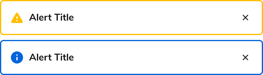
Notifications are essential in digital products to alert, warn, or give positive feedback. They give awareness and confidence to the user as they interact throughout the product.

<Frame>
  <div className="w-full h-full bg-[#FFFFFF] p-2 rounded flex items-center justify-center">
    <img
      src="https://mintcdn.com/servicetitan/UmHUvEuYrbSv6t_f/images/docs/web/patterns/shared/overview-of-a-notification.png?fit=max&auto=format&n=UmHUvEuYrbSv6t_f&q=85&s=fae746a0e54b8f62dd2a388477db91e8"
      alt="Overview of a
Notification"
      width="868"
      height="248"
      data-path="images/docs/web/patterns/shared/overview-of-a-notification.png"
    />
  </div>
</Frame>

## Message priority

When deciding what to use for a notification, you have to understand how important the message is to the user and/or the system.

| Component                                                | High | Medium | Low |
| -------------------------------------------------------- | ---- | ------ | --- |
| [Announcement](/docs/web/components/announcement/design) | ✓    |        |     |
| [Dialog](/docs/web/components/dialog/design)             | ✓    |        |     |
| [Toast](/docs/web/components/toast/design)               | ✓    | ✓      | ✓   |
| [Alert](/docs/web/components/alert/design)               |      | ✓      | ✓   |

Use one of the following criteria for determining notification priority:

### High priority

* Messages that persist across the entire app (system or account level)
* Messages that require an interruption and user action to proceed
* Messages that are important for users to see from ST’s perspective - new feature announcement etc.

### Medium priority

* Messages to indicate status of information on a page
* Messages to indicate status of actions taken, including additional information on how to proceed

### Low priority

* Messages to indicate status of actions taken, without needing additional information or actions

## Announcement

Announcement component can be used for high priority notification that is persistent across the entire application. Primary use cases are to notify things such as New Feature or System-Wide status such as "Server is down" or "Unable to connect to the internet" Announcements should not stack and only appear one at a time.

<LiveCode example="notifications-announcement" screenshot fullWidth>
  ```tsx lines theme={null}
  import { Announcement, Button } from "@servicetitan/anvil2";

  function App() {
    return (
      <Announcement title="Unable to connect to the internet" status="danger">
        <Button size="small">Retry</Button>
      </Announcement>
    );
  }

  export default App;
  ```
</LiveCode>

## Dialog

Dialog is a component that can be used for notification. It can be used for high priority notification that interrupts user until an action is taken. A primary use case is confirmation of deletion on critical information.

<LiveCode example="notifications-dialog" screenshot fullWidth>
  ```tsx lines theme={null}
  import { Dialog, Flex, Button } from "@servicetitan/anvil2";

  function App() {
    return (
      <div style={{ minWidth: "23rem", minHeight: "14rem" }}>
        <Dialog open>
          <Dialog.Header>Delete email?</Dialog.Header>
          <Dialog.Content>
            Are you sure you want to delete this email and it scheduling interval?
          </Dialog.Content>
          <Dialog.Footer>
            <Flex justifyContent="flex-end">
              <Flex gap="3">
                <Dialog.CancelButton>Cancel</Dialog.CancelButton>
                <Button appearance="danger">Delete</Button>
              </Flex>
            </Flex>
          </Dialog.Footer>
        </Dialog>
      </div>
    );
  }

  export default App;
  ```
</LiveCode>

## Toast

Toast component can be used as any priority notifications. The notification is not bound to the current page content, and it can notify users about another part of the app. By default, it can stack up to 5 and also queues after 5 showing visually. A primary use case is a notification to show the progress bar.

<LiveCode example="notifications-toast" screenshot fullWidth>
  ```tsx lines theme={null}
  import { toast, ProgressBar } from "@servicetitan/anvil2";
  import { useEffect, useRef } from "react";

  function App() {
    const firstRenderRef = useRef(true);

    useEffect(() => {
      if (firstRenderRef.current) {
        firstRenderRef.current = false;

        toast.success({
          title: "Successful import",
          message: (
            <ProgressBar label="" max="100" value="100" />
          ) as unknown as string,
          actions: {
            primary: {
              label: "View Import",
            },
          },
        });
        toast.info({
          title: "Import adjustments",
          message: (
            <ProgressBar label="In progress" value="30" />
          ) as unknown as string,
          actions: {
            primary: {
              label: "Cancel",
            },
          },
        });
      }
    }, []);

    return <div style={{ width: "100%", height: "100%" }}></div>;
  }

  export default App;
  ```
</LiveCode>

## Alert

Alert component is used for contextual notifications for items such as a page or a section on a page. It can be used for medium to low priority notification and ideally placed above the related content. A primary use case is to show error messages for a [form group](/docs/web/patterns/forms). Learn more about this on the [error pattern page](/docs/web/patterns/errors-and-warnings).

<LiveCode example="notifications-alert" screenshot fullWidth>
  ```tsx lines theme={null}
  import { Alert, Grid, TextField } from "@servicetitan/anvil2";

  function App() {
    return (
      <Grid gap="6">
        <Alert title="Enter a valid area code" status="danger" />
        <Grid gap="6" templateColumns="1fr 1fr">
          <TextField label="First Name" defaultValue="Jane" />
          <TextField label="Last Name" />
        </Grid>
        <TextField label="Email Address" defaultValue="emailservicetitan.com" />
        <TextField
          label="Phone Number"
          defaultValue="555-5555"
          hint="(xxx) xxx–xxxx"
          error="Enter a valid area code"
        />
      </Grid>
    );
  }

  export default App;
  ```
</LiveCode>

### Grouping multiple messages in one Alert

When multiple messages related to a single Alert exist, they can be combined into one summary Alert. This is usually done when multiple error messages need to be displayed.

<LiveCode example="notifications-alert-children" screenshot fullWidth>
  ```tsx lines theme={null}
  import { Alert, Grid, TextField } from "@servicetitan/anvil2";

  function App() {
    return (
      <Grid gap="6">
        <Alert
          title="Please fix the following elements and submit again"
          status="danger"
        >
          <ul style={{ margin: 0, paddingLeft: "1.5rem" }}>
            <li>Enter a last name</li>
            <li>Enter a valid email address</li>
            <li>Enter a valid area code</li>
          </ul>
        </Alert>
        <Grid gap="6" templateColumns="1fr 1fr">
          <TextField label="First Name" defaultValue="Jane" />
          <TextField label="Last Name" error="Enter a last name" />
        </Grid>
        <TextField
          label="Email Address"
          defaultValue="emailservicetitan.com"
          error="Enter a valid email address"
        />
        <TextField
          label="Phone Number"
          defaultValue="555-5555"
          hint="(xxx) xxx–xxxx"
          error="Enter a valid area code"
        />
      </Grid>
    );
  }

  export default App;
  ```
</LiveCode>

### Multiple Alerts

Multiple Alerts can be used at once, divided by category of information. Order should be based on importance.

<LiveCode example="notifications-alert-multiple" screenshot fullWidth>
  ```tsx lines theme={null}
  import { Alert, Grid, Flex, TextField, Link } from "@servicetitan/anvil2";

  function App() {
    return (
      <Grid gap="6">
        <Flex direction="column" gap="2">
          <Alert
            title="Please fix the following elements and submit again"
            status="danger"
          >
            <ul style={{ margin: 0, paddingLeft: "1.5rem" }}>
              <li>Enter a last name</li>
              <li>Enter a valid email address</li>
              <li>Enter a valid area code</li>
            </ul>
          </Alert>
          <Alert title="Tip on Widgets" status="info">
            <Flex>
              Unsure on how to configure Widgets? Check out our{" "}
              <Link>guide on how to foo bar</Link>.
            </Flex>
          </Alert>
        </Flex>
        <Grid gap="6" templateColumns="1fr 1fr">
          <TextField label="First Name" defaultValue="Jane" />
          <TextField label="Last Name" error="Enter a last name" />
        </Grid>
        <TextField
          label="Email Address"
          defaultValue="emailservicetitan.com"
          error="Enter a valid email address"
        />
        <TextField
          label="Phone Number"
          defaultValue="555-5555"
          hint="(xxx) xxx–xxxx"
          error="Enter a valid area code"
        />
      </Grid>
    );
  }

  export default App;
  ```
</LiveCode>