> ## Documentation Index
> Fetch the complete documentation index at: https://anvil.servicetitan.com/llms.txt
> Use this file to discover all available pages before exploring further.

# Peek

export const LiveCode = ({children, customHeight, clickToLoad, example, fullWidth, fullHeight, hideCodeInLiveCode, screenshot, screenshotOnly, showCode: showCodeProp}) => {
  const SCREENSHOTS_BASE = "https://servicetitan.github.io/anvil2-docs-live-code/screenshots";
  const STACKBLITZ_BASE = "https://stackblitz.com/github/servicetitan/anvil2-docs-live-code/tree/main/examples";
  const [showCodeBlock, setShowCodeBlock] = useState(showCodeProp ?? false);
  const [isLocalOverride, setIsLocalOverride] = useState(false);
  useEffect(() => {
    const examplePath = `/images/live-code-screenshots-tmp/${example}.png`;
    fetch(examplePath, {
      method: "HEAD"
    }).then(r => {
      if (r.ok) setIsLocalOverride(true);
    }).catch(() => {});
  }, [example]);
  const screenshotBase = isLocalOverride ? "/images/live-code-screenshots-tmp" : SCREENSHOTS_BASE;
  if (screenshotOnly) {
    return <Frame className="flex flex-col">
        <div className="flex dark:hidden" style={{
      justifyContent: "center",
      alignItems: "center",
      width: fullWidth ? "100%" : "50%",
      minHeight: fullHeight ? "284px" : undefined,
      background: "#FFFFFF"
    }}>
          <img srcset={`${screenshotBase}/${example}.png, ${screenshotBase}/${example}-2x.png 2x`} src={`${screenshotBase}/${example}.png`} alt={example} noZoom />
        </div>
        <div className="hidden dark:flex" style={{
      justifyContent: "center",
      alignItems: "center",
      width: fullWidth ? "100%" : "50%",
      minHeight: fullHeight ? "284px" : undefined,
      background: "#141414"
    }}>
          <img srcset={`${screenshotBase}/${example}-dark.png, ${screenshotBase}/${example}-dark-2x.png 2x`} src={`${screenshotBase}/${example}-dark.png`} alt={example} noZoom />
        </div>
      </Frame>;
  }
  if (screenshot) {
    return <Frame className="flex flex-col -mb-2">
        <div className="flex dark:hidden bg-white dark:bg-codeblock border border-gray-950/10 dark:border-white/10 dark:twoslash-dark rounded-2xl overflow-hidden" style={{
      justifyContent: "center",
      alignItems: "center",
      width: fullWidth ? "100%" : "50%",
      minHeight: fullHeight ? "284px" : undefined
    }}>
          <img srcset={`${screenshotBase}/${example}.png, ${screenshotBase}/${example}-2x.png 2x`} src={`${screenshotBase}/${example}.png`} alt={example} noZoom />
        </div>

        <div className="hidden dark:flex bg-white dark:bg-codeblock border border-gray-950/10 dark:border-white/10 dark:twoslash-dark rounded-2xl overflow-hidden" style={{
      background: "#141414",
      justifyContent: "center",
      alignItems: "center",
      width: fullWidth ? "100%" : "50%",
      minHeight: fullHeight ? "284px" : undefined
    }}>
          <img srcset={`${screenshotBase}/${example}-dark.png, ${screenshotBase}/${example}-dark-2x.png 2x`} src={`${screenshotBase}/${example}-dark.png`} alt={example} noZoom />
        </div>

        <div className="flex justify-end items-center text-xs py-2 px-1 gap-4">
          {!showCodeProp ? <button className="inline-flex justify-end items-center text-gray-700 dark:text-gray-50 hover:text-blue-500 dark:hover:text-blue-300 transition-colors group self-end gap-1 cursor-pointer" onClick={() => setShowCodeBlock(!showCodeBlock)} style={{
      appearance: "none"
    }}>
              <Icon icon="code" size="12px" className="group-hover:bg-blue-500 dark:group-hover:bg-blue-300" />
              <span>{showCodeBlock ? "Hide code" : "Show code"}</span>
            </button> : null}

          <a className="inline-flex justify-end items-center hover:text-blue-500 dark:hover:text-blue-300 transition-colors group self-end gap-1" href={`${STACKBLITZ_BASE}/${example}?file=src/App.tsx`} target="_blank" rel="noreferrer">
            <Icon icon="bolt" size="12px" className="group-hover:bg-blue-500 dark:group-hover:bg-blue-300" />
            <span>StackBlitz demo</span>
          </a>
        </div>

        <div className="grid transition-[grid-template-rows] duration-300 ease-in-out overflow-auto overflow-y-hidden overflow-x-auto" style={showCodeBlock ? {
      gridTemplateRows: "1fr"
    } : {
      gridTemplateRows: "0fr"
    }}>
          <div style={{
      minHeight: 0,
      overflowX: "auto",
      overflowY: "hidden",
      marginBlockStart: "-1.25rem",
      marginBlockEnd: "-1.5rem"
    }}>
            {children}
          </div>
        </div>
      </Frame>;
  } else {
    return <div style={{
      display: "flex",
      width: fullWidth ? "100%" : "50%",
      minHeight: customHeight ? customHeight : "316px",
      resize: "vertical",
      overflow: "auto"
    }}>
        <iframe title={example} style={{
      flex: 1,
      width: fullWidth ? "100%" : "50%",
      minHeight: customHeight ? customHeight : "316px"
    }} src={`${STACKBLITZ_BASE}/${example}?embed=1&hideNavigation=1&hideExplorer=1&terminalHeight=0&file=src/App.tsx${clickToLoad ? "&ctl=1" : ""}${hideCodeInLiveCode ? "&view=preview" : ""}`} allow="accelerometer; ambient-light-sensor; camera; encrypted-media; geolocation; gyroscope; hid; microphone; midi; payment; usb; vr; xr-spatial-tracking" sandbox="allow-forms allow-modals allow-popups allow-presentation allow-same-origin allow-scripts" />
      </div>;
  }
};

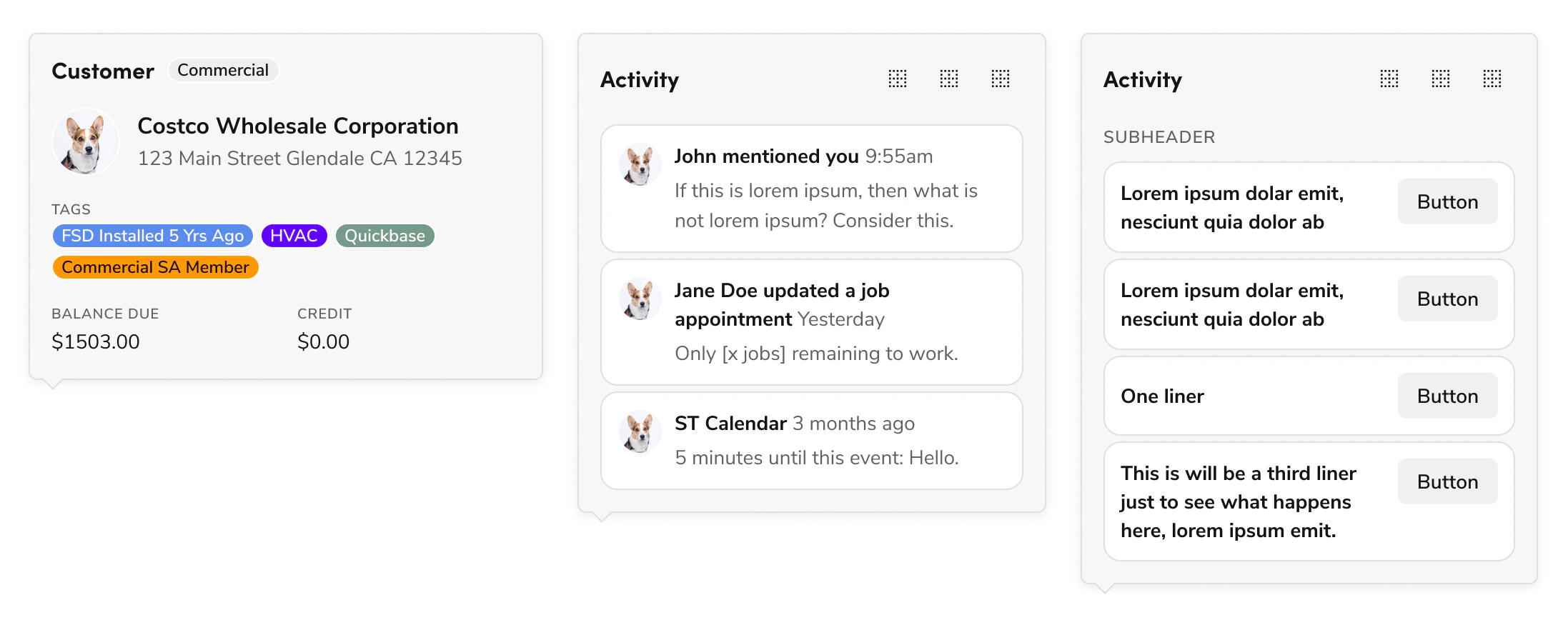
Peeks are product-specific lockups of popovers that appear on hover. They show a "peek" to the user of the info they would see on the page if they were to click through to the associated entity.

<Frame>
  <div className="w-full h-full bg-[#FFFFFF] p-2 rounded flex items-center justify-center">
    <img src="https://mintcdn.com/servicetitan/UmHUvEuYrbSv6t_f/images/docs/web/patterns/shared/examples-of-peeks.png?fit=max&auto=format&n=UmHUvEuYrbSv6t_f&q=85&s=3efdae917bef5f954b4e2c212fad5aa7" alt="Examples of peeks" width="2194" height="882" data-path="images/docs/web/patterns/shared/examples-of-peeks.png" />
  </div>
</Frame>

## Demo

<LiveCode example="peek-demo" screenshot fullWidth>
  ```tsx lines theme={null}
  import { Popover, Flex, Text, Chip, Avatar, Grid } from "@servicetitan/anvil2";

  function App() {
    return (
      <div
        style={{
          display: "flex",
          justifyContent: "center",
          placeItems: "center",
          paddingBlockStart: "16.5rem",
          paddingInlineEnd: "8rem",
        }}
      >
        <Popover
          openOnHover
          placement="top-start"
          disableShift
          disableFlip
          defaultOpen
        >
          <Popover.Button>Hover to see peek behavior</Popover.Button>
          <Popover.Content style={{ maxWidth: "360px" }}>
            <Flex direction="column" gap="4">
              <Flex gap="2">
                <Text variant="headline" size="small" el="h4">
                  Customer
                </Text>
                <Chip label="Commercial" size="small" />
              </Flex>
              <Flex gap="3">
                <Avatar name="Dog01" size="large" />
                <Flex direction="column">
                  <Text>
                    <b>Costco Wholesale Corporation</b>
                  </Text>
                  <Text subdued size="small">
                    123 Main Street Glendale CA 12345
                  </Text>
                </Flex>
              </Flex>
              <Flex direction="column" gap="1">
                <Text variant="eyebrow" size="small">
                  Tags
                </Text>
                <Flex wrap="wrap" gap="1">
                  <Chip
                    label="FSD Installed 5 Yrs Ago"
                    size="small"
                    color="#5A8CEF"
                  />
                  <Chip label="HVAC" size="small" color="#6100FF" />
                  <Chip label="Quickbase" size="small" color="#769A8A" />
                  <Chip
                    label="Commercial SA Member"
                    size="small"
                    color="#FF9900"
                  />
                </Flex>
              </Flex>
              <Grid templateColumns="repeat(2, 1fr)">
                <Flex direction="column">
                  <Text variant="eyebrow" size="small">
                    Balance due
                  </Text>
                  <Text size="small">$1,503.00</Text>
                </Flex>
                <Flex direction="column">
                  <Text variant="eyebrow" size="small">
                    Credit
                  </Text>
                  <Text size="small">$0.00</Text>
                </Flex>
              </Grid>
            </Flex>
          </Popover.Content>
        </Popover>
      </div>
    );
  }

  export default App;
  ```
</LiveCode>

## Usage Guidance

Peeks are triggered by hovering over an element such as text or an icon. That element should be an action or link that drives the user to where they can see the information contained in the Peek.

Peeks should be thought of as an enhancement for mouse-users. As a result they shouldn't display information that is integral to understanding the Peek target or for taking actions on the target. Peeks are a "peek" into what the user will see if they click on the action/link.

<LiveCode example="peek-usage" screenshot fullWidth>
  ```tsx lines theme={null}
  import { Popover, Flex, Text, Avatar } from "@servicetitan/anvil2";

  function App() {
    return (
      <div
        style={{
          display: "flex",
          justifyContent: "center",
          placeItems: "center",
          paddingBlockStart: "6rem",
          paddingInline: "4rem",
        }}
      >
        <Popover open placement="top" disableShift disableFlip>
          <Popover.Button>Jane Doe</Popover.Button>
          <Popover.Content>
            <Flex gap="3" justifyContent="center">
              <Avatar name="Dog01" size="large" />
              <Flex direction="column">
                <Text>
                  <b>Jane Doe</b>
                </Text>
                <Text subdued size="small">
                  Customer since 2018
                </Text>
              </Flex>
            </Flex>
          </Popover.Content>
        </Popover>
      </div>
    );
  }

  export default App;
  ```
</LiveCode>

#### Peeks should never convey exclusive information.

Any action or information contained in a Peek should be accessible elsewhere to the user, either on the current page or on the page that clicking the target would navigate them to.

<LiveCode example="peek-brief" screenshot fullWidth>
  ```tsx lines theme={null}
  import {
    Popover,
    Flex,
    Text,
    Button,
    Card,
    Grid,
    Avatar,
  } from "@servicetitan/anvil2";
  import BorderClear from "@servicetitan/anvil2/assets/icons/material/round/border_clear.svg";

  function App() {
    return (
      <div
        style={{
          display: "flex",
          justifyContent: "center",
          placeItems: "center",
          paddingBlockStart: "21rem",
          paddingInline: "7rem",
        }}
      >
        <Popover open placement="top" disableShift disableFlip>
          <Popover.Button>Recent Activity</Popover.Button>
          <Popover.Content style={{ maxWidth: "360px" }}>
            <Flex direction="column" gap="4">
              <Flex justifyContent="space-between">
                <Text variant="headline" size="small" el="h4">
                  Activity
                </Text>
                <Flex gap="1">
                  <Button
                    appearance="ghost"
                    size="small"
                    icon={BorderClear}
                    onClick={console.log}
                  />
                  <Button
                    appearance="ghost"
                    size="small"
                    icon={BorderClear}
                    onClick={console.log}
                  />
                  <Button
                    appearance="ghost"
                    size="small"
                    icon={BorderClear}
                    onClick={console.log}
                  />
                </Flex>
              </Flex>

              <Flex direction="column" gap="1">
                <Card padding="small">
                  <Grid templateColumns="1fr auto" gap="4">
                    <Avatar name="Dog01" size="large" />
                    <Flex direction="column" gap="1">
                      <Text size="small">
                        <b>John mentioned you</b>{" "}
                        <Text inline subdued size="small">
                          9:55am
                        </Text>
                      </Text>
                      <Text subdued size="small">
                        If this is lorem ipsum, then what is not lorem ipsum?
                        Consider this.
                      </Text>
                    </Flex>
                  </Grid>
                </Card>
                <Card padding="small">
                  <Grid templateColumns="1fr auto" gap="4">
                    <Avatar name="Dog01" size="large" />
                    <Flex direction="column" gap="1">
                      <Text size="small">
                        <b>Jane Doe updated a job appointment</b>{" "}
                        <Text inline subdued size="small">
                          Yesterday
                        </Text>
                      </Text>
                      <Text subdued size="small">
                        Only [x jobs] remaining to work.
                      </Text>
                    </Flex>
                  </Grid>
                </Card>
                <Card padding="small">
                  <Grid templateColumns="1fr auto" gap="4">
                    <Avatar name="Dog01" size="large" />
                    <Flex direction="column" gap="1">
                      <Text size="small">
                        <b>ST Calendar</b>{" "}
                        <Text inline subdued size="small">
                          3 months ago
                        </Text>
                      </Text>
                      <Text subdued size="small">
                        5 minutes until this event: Hello.
                      </Text>
                    </Flex>
                  </Grid>
                </Card>
              </Flex>
            </Flex>
          </Popover.Content>
        </Popover>
      </div>
    );
  }

  export default App;
  ```
</LiveCode>

#### Peeks content should be brief.

The larger your Peek is, the more it blocks other content on the page. Try and keep it small, even if there is more content that could be shown, such as here where you *could* display many more events.

<LiveCode example="peek-summary" screenshot fullWidth>
  ```tsx lines theme={null}
  import {
    Popover,
    Flex,
    Avatar,
    Text,
    Toolbar,
    Divider,
  } from "@servicetitan/anvil2";
  import Mail from "@servicetitan/anvil2/assets/icons/material/round/mail.svg";
  import Chat from "@servicetitan/anvil2/assets/icons/material/round/chat.svg";
  import Phone from "@servicetitan/anvil2/assets/icons/material/round/phone.svg";
  import Event from "@servicetitan/anvil2/assets/icons/material/round/event.svg";
  import History from "@servicetitan/anvil2/assets/icons/material/round/history.svg";

  function App() {
    return (
      <div
        style={{
          display: "flex",
          justifyContent: "center",
          placeItems: "center",
          paddingBlockStart: "8rem",
          paddingInline: "5rem",
        }}
      >
        <Popover open placement="top" disableShift disableFlip>
          <Popover.Button>Jane Doe</Popover.Button>
          <Popover.Content>
            <Flex gap="3">
              <Avatar name="Dog01" size="large" />
              <Flex direction="column">
                <Text>
                  <b>Jane Doe</b>
                </Text>
                <Text subdued size="small">
                  Customer since 2018
                </Text>
              </Flex>
            </Flex>
            <Toolbar
              associatedContent="playground toolbar"
              additionalItems={[
                <Toolbar.Button
                  key="settings"
                  onClick={() => console.log("Settings clicked")}
                >
                  Settings
                </Toolbar.Button>,
                <Toolbar.Button
                  key="help"
                  onClick={() => console.log("Help clicked")}
                >
                  Help
                </Toolbar.Button>,
              ]}
              overflow="collapse"
            >
              <Toolbar.Button
                icon={Mail}
                onClick={() => console.log("Email clicked")}
                aria-label="Email"
              />
              <Toolbar.Button
                icon={Chat}
                onClick={() => console.log("Chat clicked")}
                aria-label="Chat"
              />
              <Toolbar.Button
                icon={Phone}
                onClick={() => console.log("Call clicked")}
                aria-label="Call"
              />
              <Flex grow="1" style={{ height: "25px" }}>
                <Divider vertical />
              </Flex>
              <Toolbar.Button
                icon={Event}
                onClick={() => console.log("Schedule event clicked")}
                aria-label="Schedule event"
              />
              <Toolbar.Button
                icon={History}
                onClick={() => console.log("Jobs list clicked")}
                aria-label="Jobs list"
              />
              <Flex grow="1" style={{ height: "25px" }}>
                <Divider vertical />
              </Flex>
            </Toolbar>
          </Popover.Content>
        </Popover>
      </div>
    );
  }

  export default App;
  ```
</LiveCode>

#### Prioritize important information.

Peeks should only have a summary or quick actions relevant to its target, such as here where a user can call, email, or message the associated client.

<LiveCode example="peek-simple" screenshot fullWidth>
  ```tsx lines theme={null}
  import { Popover, Flex, Avatar, Text, Toolbar } from "@servicetitan/anvil2";
  import Phone from "@servicetitan/anvil2/assets/icons/material/round/phone.svg";
  import Mail from "@servicetitan/anvil2/assets/icons/material/round/mail.svg";
  import Location from "@servicetitan/anvil2/assets/icons/material/round/location_on.svg";

  function App() {
    return (
      <div
        style={{
          display: "flex",
          justifyContent: "center",
          placeItems: "center",
          paddingBlockStart: "12rem",
          paddingInline: "5.5rem",
        }}
      >
        <Popover open placement="top" disableShift disableFlip>
          <Popover.Button>Jane Doe</Popover.Button>
          <Popover.Content>
            <Flex gap="3">
              <Avatar name="Dog01" size="large" />
              <Flex direction="column">
                <Text>
                  <b>Jane Doe</b>
                </Text>
                <Text subdued size="small">
                  Customer since 2018
                </Text>
              </Flex>
            </Flex>
            <Toolbar
              associatedContent="playground toolbar"
              overflow="collapse"
              direction="vertical"
            >
              <Toolbar.Button
                icon={Phone}
                onClick={() => console.log("Call clicked")}
                aria-label="Call"
                justifyContent="start"
              >
                +1 (555) 555-5555
              </Toolbar.Button>
              <Toolbar.Button
                icon={Mail}
                onClick={() => console.log("Email clicked")}
                aria-label="Email"
                justifyContent="start"
              >
                janedoe@servicetitan.com
              </Toolbar.Button>
              <Toolbar.Button
                icon={Location}
                onClick={() => console.log("Address clicked")}
                aria-label="Address"
                justifyContent="start"
              >
                123 Main Street Glendale CA 91203
              </Toolbar.Button>
            </Toolbar>
          </Popover.Content>
        </Popover>
      </div>
    );
  }

  export default App;
  ```
</LiveCode>

#### Avoid complex interactions in the Peek.

If a more complex interaction is necessary, direct users to something that's better for handling interactions: traditional filtering, text fields, or drilldown flows. Another example of could be using a Dialog, or navigating the user to the page the target is related to. Simple actions, like the button clicks illustrated here for calling, messaging, or emailing the client, are fine.

<LiveCode example="peek-enhancement" screenshot fullWidth>
  ```tsx lines theme={null}
  import { Popover, Flex, Text, Chip, Avatar, Grid } from "@servicetitan/anvil2";

  function App() {
    return (
      <div
        style={{
          display: "flex",
          justifyContent: "center",
          placeItems: "center",
          paddingBlockStart: "16.5rem",
          paddingInline: "3.5rem",
        }}
      >
        <Popover open placement="top" disableShift disableFlip>
          <Popover.Button>Costco Wholesale Corporation</Popover.Button>
          <Popover.Content style={{ maxWidth: "360px" }}>
            <Flex direction="column" gap="4">
              <Flex gap="2">
                <Text variant="headline" size="small" el="h4">
                  Customer
                </Text>
                <Chip label="Commercial" size="small" />
              </Flex>
              <Flex gap="3">
                <Avatar name="Dog01" size="large" />
                <Flex direction="column">
                  <Text>
                    <b>Costco Wholesale Corporation</b>
                  </Text>
                  <Text subdued size="small">
                    123 Main Street Glendale CA 12345
                  </Text>
                </Flex>
              </Flex>
              <Flex direction="column" gap="1">
                <Text variant="eyebrow" size="small">
                  Tags
                </Text>
                <Flex wrap="wrap" gap="1">
                  <Chip
                    label="FSD Installed 5 Yrs Ago"
                    size="small"
                    color="#5A8CEF"
                  />
                  <Chip label="HVAC" size="small" color="#6100FF" />
                  <Chip label="Quickbase" size="small" color="#769A8A" />
                  <Chip
                    label="Commercial SA Member"
                    size="small"
                    color="#FF9900"
                  />
                </Flex>
              </Flex>
              <Grid templateColumns="repeat(2, 1fr)">
                <Flex direction="column">
                  <Text variant="eyebrow" size="small">
                    Balance due
                  </Text>
                  <Text size="small">$1,503.00</Text>
                </Flex>
                <Flex direction="column">
                  <Text variant="eyebrow" size="small">
                    Credit
                  </Text>
                  <Text size="small">$0.00</Text>
                </Flex>
              </Grid>
            </Flex>
          </Popover.Content>
        </Popover>
      </div>
    );
  }

  export default App;
  ```
</LiveCode>

#### Peeks should be enhancements.

Think of Peeks like an enhancement: they are a preview of the extra information the user gets if they click through the button or link, such as here where you can see the information you'd see if you clicked through to the next page.

## Options

#### Open on Hover (default)

Peeks appear on hover over a trigger element by default. They do *not* trigger on element focus.

#### Delay

Peeks use the Popover default delay, which can be modified with the `delay` prop. See [Popover documentation](/docs/web/components/popover/design) for more. We don’t recommend setting this to 0ms.

#### Open on Click

An alternative interaction for Peek when its inner content has exclusive interactions (meaning a user can only perform a step through a Peek). This option is considered an edge case.

## Other Additional Layouts

Find some other possible options for peek below:

<LiveCode example="peek-feed" screenshot fullWidth>
  ```tsx lines theme={null}
  import { Popover, Flex, Text, Button, Card, Grid } from "@servicetitan/anvil2";
  import BorderClear from "@servicetitan/anvil2/assets/icons/material/round/border_clear.svg";

  function App() {
    return (
      <div
        style={{
          display: "flex",
          justifyContent: "center",
          placeItems: "center",
          paddingBlockStart: "27.5rem",
          paddingInline: "8.5rem",
        }}
      >
        <Popover open placement="top" disableShift disableFlip>
          <Popover.Button>Trigger</Popover.Button>
          <Popover.Content style={{ maxWidth: "360px", paddingTop: "8px" }}>
            <Flex direction="column" gap="2">
              <Flex justifyContent="space-between">
                <Text variant="headline" size="small" el="h4">
                  Activity
                </Text>
                <Flex gap="1">
                  <Button
                    appearance="ghost"
                    size="small"
                    icon={BorderClear}
                    onClick={console.log}
                  />
                  <Button
                    appearance="ghost"
                    size="small"
                    icon={BorderClear}
                    onClick={console.log}
                  />
                  <Button
                    appearance="ghost"
                    size="small"
                    icon={BorderClear}
                    onClick={console.log}
                  />
                </Flex>
              </Flex>
              <Text variant="eyebrow" size="small">
                Subheader
              </Text>

              <Flex direction="column" gap="1">
                <Card>
                  <Grid
                    templateColumns="2fr 1fr"
                    gap="4"
                    style={{ width: "100%" }}
                  >
                    <Text size="small">
                      <b>Lorem ipsum dolar emit, nesciunt quia dolor ab</b>
                    </Text>
                    <Grid.Item justifySelf="safe end">
                      <Button size="small">Button</Button>
                    </Grid.Item>
                  </Grid>
                </Card>
                <Card>
                  <Grid
                    templateColumns="2fr 1fr"
                    gap="4"
                    style={{ width: "100%" }}
                  >
                    <Text size="small">
                      <b>Lorem ipsum dolar emit, nesciunt quia dolor ab</b>
                    </Text>
                    <Grid.Item justifySelf="safe end">
                      <Button size="small">Button</Button>
                    </Grid.Item>
                  </Grid>
                </Card>
                <Card>
                  <Grid
                    templateColumns="2fr 1fr"
                    gap="4"
                    style={{ width: "100%" }}
                  >
                    <Text size="small">
                      <b>One liner</b>
                    </Text>
                    <Grid.Item justifySelf="safe end">
                      <Button size="small">Button</Button>
                    </Grid.Item>
                  </Grid>
                </Card>
                <Card>
                  <Grid
                    templateColumns="2fr 1fr"
                    gap="4"
                    style={{ width: "100%" }}
                  >
                    <Text size="small">
                      <b>
                        This is will be a third liner just to see what happens
                        here, lorem ipsum emit.
                      </b>
                    </Text>
                    <Grid.Item justifySelf="safe end">
                      <Button size="small">Button</Button>
                    </Grid.Item>
                  </Grid>
                </Card>
              </Flex>
            </Flex>
          </Popover.Content>
        </Popover>
      </div>
    );
  }

  export default App;
  ```
</LiveCode>

#### Activity Feed with Action Buttons

An example that demonstrates a sensible maximum height for a peek.

<LiveCode example="peek-empty" screenshot fullWidth>
  ```tsx lines theme={null}
  import { Popover, Text, Flex, Icon } from "@servicetitan/anvil2";
  import BorderClear from "@servicetitan/anvil2/assets/icons/material/round/border_clear.svg";

  function App() {
    return (
      <div
        style={{
          display: "flex",
          justifyContent: "center",
          placeItems: "center",
          paddingBlockStart: "18rem",
          paddingInline: "7rem",
        }}
      >
        <Popover open placement="top" disableShift disableFlip>
          <Popover.Button>Trigger</Popover.Button>
          <Popover.Content style={{ maxWidth: "300px", paddingTop: "8px" }}>
            <Text variant="headline" size="large" el="h3">
              Header Text
            </Text>
            <Flex
              style={{ minHeight: "200px" }}
              placeItems="center"
              direction="column"
              justifyContent="center"
              gap="4"
            >
              <Icon svg={BorderClear} size="large" />
              <Text subdued size="small" style={{ textAlign: "center" }}>
                This is a potential empty state message, if you needed one.
              </Text>
            </Flex>
          </Popover.Content>
        </Popover>
      </div>
    );
  }

  export default App;
  ```
</LiveCode>

#### Empty Peek

An example empty peek that hints at the type of information the peek would have if there were content.

## Behaviors

#### Trapping focus

By default Peeks do not trap focus, but this can be enabled on Popover with the `modal` prop.

#### Suggested max-width, max-height

By default Popover lacks a max-height and max-width. For Peek, we suggest limiting the Popover (excluding the caret) to 360px wide and 540px tall.

<LiveCode example="peek-maxwidthmaxheight" screenshot fullWidth>
  ```tsx lines theme={null}
  import { Popover, Flex, Text } from "@servicetitan/anvil2";

  function App() {
    return (
      <div
        style={{
          display: "flex",
          justifyContent: "center",
          placeItems: "center",
          paddingBlockStart: "32.5rem",
          paddingInline: "8rem",
        }}
      >
        <Popover open placement="top" disableShift disableFlip>
          <Popover.Button>Trigger</Popover.Button>
          <Popover.Content>
            <Flex
              style={{
                backgroundColor: "var(--color-purple-100)",
                borderColor: "var(--color-purple-400)",
                borderStyle: "dashed",
                borderWidth: "1px",
                borderRadius: "6px",
                maxWidth: "296px",
                minHeight: "476px",
                padding: "20px",
              }}
              direction="column"
              gap="4"
              alignSelf="stretch"
              justifyContent="center"
            >
              <Text
                size="small"
                style={{
                  textAlign: "center",
                  color: "var(--color-purple-400)",
                }}
              >
                Inner Popover content suggested max dimensions (16px padding):
              </Text>
              <Text
                size="small"
                style={{
                  textAlign: "center",
                  color: "var(--color-purple-400)",
                }}
              >
                328px width
              </Text>
              <Text
                size="small"
                style={{
                  textAlign: "center",
                  color: "var(--color-purple-400)",
                }}
              >
                508px height
              </Text>
            </Flex>
          </Popover.Content>
        </Popover>
      </div>
    );
  }

  export default App;
  ```
</LiveCode>

### Keyboard Navigation and Accessibility

For detailed information on how keyboard interactions and accessibility work for Peek, refer to the [Popover](/docs/web/components/popover/design#keyboard-interactions) documentation.

## Peek Ownership

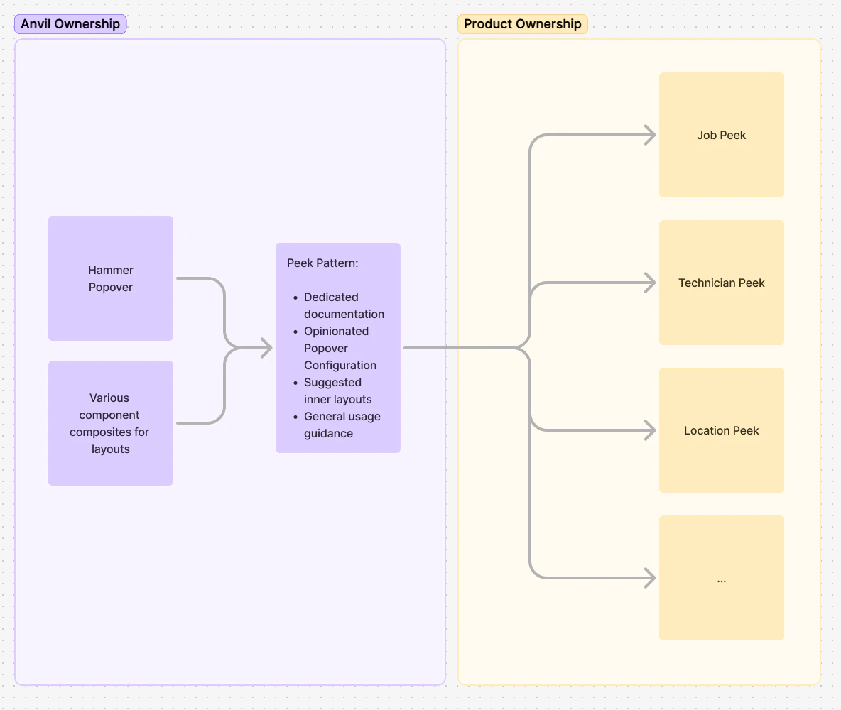
Peek is provided as a pattern, meaning that it isn't as prescriptive as a component. The suggested layouts are intended as grab-and-go options for your product team to use based on your products' needs.

<Frame>
  <div className="w-full h-full bg-[#FFFFFF] p-2 rounded flex items-center justify-center">
    <img
      src="https://mintcdn.com/servicetitan/UmHUvEuYrbSv6t_f/images/docs/web/patterns/peek/ownership-diagram-for-peek-where-product-owners-own-individual-peeks.png?fit=max&auto=format&n=UmHUvEuYrbSv6t_f&q=85&s=7887db977ea1c64503248cd74e360998"
      alt="Ownership diagram for Peek, where product owners own individual
peeks"
      width="1184"
      height="1000"
      data-path="images/docs/web/patterns/peek/ownership-diagram-for-peek-where-product-owners-own-individual-peeks.png"
    />
  </div>
</Frame>