
Anatomy
The Stepper consists of four primary elements that work together to show a user’s progress through multiple steps.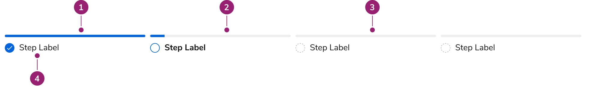
- Completed step
- Current step
- Not started step
- Step label
Options
The Stepper supports horizontal orientation and configurable step count to accommodate various progress tracking scenarios.Horizontal
Steppers are horizontal by default.Step Count
Steppers support 2–6 steps.Behavior
The Stepper responds to different screen sizes with responsive behaviors while handling label overflow.Visual States
Default
Overflow
Labels wrap when they exceed available space.Responsive
Smaller screens use the mobile variant.Usage Guidelines
Use the Stepper when users need to be guided through a linear series of steps to complete a task.When not to use
- For navigation, use a navigation-focused component instead of a Stepper
- Non-linear progression, i.e., steps that can be completed in any order
Alternatives
Stepper vs Edit Card
Steppers move through a linear progression of steps. Edit Cards can be used for both linear and unrelated blocks of content. Steppers are typically scoped to the whole view, e.g., a fullscreen Dialog, while an Edit Card can be scoped within smaller sections of a view, e.g., part of a Drawer screen. Steppers can only give summaries of the flow indirectly, typically on the final step of a flow, while an Edit Card can show a summary in most of its states. Steppers and Edit Cards may be used together if a particular flow is complex enough.Stepper vs Tab
Tabs help organize information about a subject on the page, while a Stepper helps complete a flow. They can’t substitute for each other, although both could be used on the same page.How to Use
Always have one Step active in incomplete Steppers
The active step is always the step the user is specifically on. By default this is the first step.Do
Always use Buttons to navigate the Stepper
The Stepper alone should never be the only means of navigating between steps. Actions to go forward and back should be provided somewhere in the experience.Do
Linear steps
Steppers should follow a linear sequence, meaning a user must complete the steps in a specific order.Returning to, and editing previous steps
When users return to previous steps in an incomplete flow, the Stepper itself will prevent users from returning back. The component does not alter user responses, the consequences of users editing prior steps is on the implementor. Some options to consider include:- Clearing all subsequent steps when a user edits a previous step
- Identifying which changes impact downstream inputs, and warning users about the changes. No impact changes do not influence future steps.
Number of steps
Steppers support 2–6 steps. If a flow requires more than 6 steps, consider breaking it up into smaller chunks.Don’t
Avoid conditionally generated steps
Within an established Stepper, user decisions within the flow should not change the number of steps, i.e., if a flow starts with 5 steps, it should always end with 5 steps.Keyboard Interaction
Users can navigate the Stepper using standard keyboard controls.| Key | Interaction |
|---|---|
| Tab | Navigates linked steps in normal Tab order |
| Enter | Selects the focused linked step |