

For development, import
Slider from @servicetitan/anvil2/beta. For design, find it in the Slider file.Beta FeatureThis feature is currently in beta, and needs to be imported from
@servicetitan/anvil2/beta.While we hope to minimize breaking changes, they may occur due to feedback we receive or other improvements. These will always be documented in the changelog and communicated in Slack.Please reach out in the #ask-designsystem channel with any questions or feedback!Anatomy
Slider consists of seven elements that work together to select a value along a scale.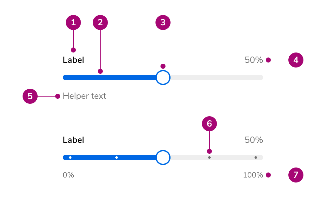
- Label - Names the value being set, with an optional more info icon
- Track - The scale from the lowest to the highest value; the fill shows the selected amount or range
- Thumb - The handle users drag or move with the keyboard; a range slider has two
- Value readout (Optional) - Shows the current value, formatted, opposite the label
- Helper text (Optional) - Description, hint, warning, or error text below the slider
- Marks (Optional) - Dots on the track at selectable values, with optional labels underneath
- Min and max labels (Optional) - The lowest and highest values, under the ends of the track
Options
Slider supports the following configurations to fit single values, ranges, and fixed sets of choices.Marks
Marks show users which values are available. Labeled marks name important points on the scale.Increment sets
Set the increment to match how precise the value needs to be. Use a dot at every step only with coarse increments, such as every 10 or every 25 on a 0 to 100 scale, so the dots stay readable. With finer increments, leave out the dots or mark only the values users need for orientation.Restricted to marks
Restrict selection to the marks when only specific, unevenly spaced values are valid. The thumb moves from mark to mark.Range
A range slider has two thumbs that select a start and end value. The fill covers the selected range. Range sliders can keep a minimum distance between the thumbs. Without one, the thumbs can meet at the same value but never cross.Value tooltip
The value tooltip shows the current value above the thumb. Use it when the value readout is hidden or far from the thumb, or when precise values matter while dragging.Named values
Values can be shown as words rather than numbers. The same text appears in the readout, the tooltip, and screen reader announcements. When every value has a labeled mark, hide the readout so the selected value does not appear twice.Without fill
Remove the fill when the value is a position rather than an amount, such as a point in time.States
Slider supports disabled, read-only, and error states.- Disabled - The fill, thumb, and value fade and the fill turns gray. The label and helper text stay readable.
- Read-only - Shows the value as the end of the fill, with no thumb and no dots. Users can still focus the slider to hear its value.
- Error - The fill, thumb border, and focus ring turn red, and the error message appears below.
With a number field
Place a Number Field next to the Slider when users need to drag or type an exact value. Hide the slider’s value readout, since the field shows the value. For a range, place two Number Fields below the Slider, joined by an en dash.Behavior
Slider responds to dragging, clicking the track, and keyboard input.Dragging and clicking
Dragging a thumb moves it in increments along the track. Clicking anywhere on the track moves the nearest thumb to that point, which gives users an alternative to dragging. The whole 40px row around the track responds to touch and clicks, so the target stays large while the track stays thin.Feedback
The thumb lifts with a shadow on hover and focus, and lifts further while pressed. A focus ring appears only during keyboard use; it stays hidden after dragging or clicking until a key is pressed.Value tooltip
When enabled, the tooltip appears on thumb hover, while dragging, and on keyboard focus. Users can move the pointer onto the tooltip without it closing, and Escape hides it. On touch screens it appears only while dragging, so it does not stay open after a tap.Right-to-left
In right-to-left layouts the track reverses: the lowest value sits on the right, and the left and right arrow keys swap direction.Usage Guidelines
Use the Slider when users choose a value or range from a bounded scale and an approximate value is acceptable, such as a discount percentage, a search radius, or a price range.Alternatives
Slider vs Number Field
Use Number Field when users know the exact value they want to enter or when the range is very large. Use Slider when users explore a range or set an approximate value. When users need both, see With a number field.Slider vs Radio
Use Radio when users pick one of a few distinct options that are not points on a scale, or when each option needs its own description. Use Slider when the options are ordered steps along one scale.Content
Content within the Slider should name the value clearly and show it in units users recognize.- Write the label as a noun that names the value, such as “Discount” or “Service radius”
- Include units in the displayed value, such as “15%”, “$28”, or “25 mi”
- Keep mark labels short and label only the marks users need for orientation
- Include units in mark labels and min and max labels, such as “25%” or “50 mi”. If the labels crowd, remove the units from the scale and keep them in the readout. Keep the units on the scale when the readout is hidden
- Min and max labels use the same format as the readout. To show the ends without units, label the first and last marks instead
- On dense scales, such as every 10 on a 0 to 100 scale, label every other mark or only the first and last marks so the labels do not crowd
- Use the description to explain limits or effects, such as “Applied to the invoice total before tax”
- Write error messages that state what to change, such as “Over 25% needs manager approval”
Text below the track
Consider using one type of text below the track: min and max labels, mark labels, or helper text. Combining them can crowd the slider and make it harder to tell which text describes the scale.- Min and max labels - Work well when only the ends of the scale need context
- Mark labels - Work well when points along the scale need names; consider labeling the first and last marks instead of adding min and max labels
- Helper text - Works well when users need an explanation more than scale context
Keyboard Interaction
Users can navigate the Slider using standard keyboard controls.
The large increment defaults to a tenth of the range. In right-to-left layouts, the Left and Right Arrow keys swap direction.
Code
- Implementation
- Slider Props
- SliderMark
Common Examples
Controlled usage
TheSlider can be controlled. onChange fires on every step of a drag, and onChangeEnd fires once when the drag ends or a key changes the value. Use onChangeEnd for work that should not run on every step, such as saving.Formatting values
formatValue controls the text in the value readout, the tooltip, the min and max labels, and aria-valuetext. Use it to add units or to name values.Marks
Pass an array ofSliderMark objects to marks to draw dots at chosen values, with optional labels.Consider using one type of text below the track:
showMinMaxLabels, mark labels, or helper text (description or hint). See Text below the track.marks={true} to draw a dot at every step. Use it only with coarse steps.Restrict to marks
WithrestrictToMarks, only the marks values can be selected, by drag or keyboard, and step is ignored. The arrow keys move one mark at a time. restrictToMarks requires a marks array.Range
Setrange to render two thumbs. value, defaultValue, onChange, and onChangeEnd then use a SliderRangeValue, a [start, end] tuple in ascending order.minStepsBetweenThumbs keeps the thumbs a minimum number of steps apart. With restrictToMarks, it counts marks instead of steps.Value tooltip
showTooltip shows the value above the thumb on hover, while dragging, and on keyboard focus.Without fill
SetshowFill={false} when the value is a position rather than an amount. showFill is available only on single-value sliders; passing it with range is a type error.Disabled, read-only, and error
readOnly hides the thumb and dots but keeps the thumb focusable so the value can be read, and the value still submits with a form. With showFill={false}, the thumb stays visible. error accepts a boolean for styling only, or a string or string array to also render messages.With a number field
PairSlider with a NumberField when users need to enter exact values. Set showValue={false} on the slider and hideControls on the field so the field lines up with the slider row.For a range, place two fields below the slider.Forms
Passname to submit the value with a form through a hidden input. A range slider submits two inputs with the same name. Disabled sliders do not submit.React Accessibility
- Each thumb is an element with
role="slider",aria-valuenow,aria-valuemin,aria-valuemax, andaria-valuetextfromformatValue. Range thumbs report the other thumb’s value as their bound. - The thumb is named by the label. With
hideLabel, the label becomes the thumb’saria-label, with inline markdown stripped. Range thumbs are named “[label] minimum” and “[label] maximum”. - Helper text and
moreInfoare linked to each thumb witharia-describedby.errorsetsaria-invalid,disabledsetsaria-disabled, andreadOnlysetsaria-readonly. - The arrow keys, Page Up, Page Down, Home, and End change the value. In right-to-left layouts the Left and Right Arrow keys swap direction. Escape hides the tooltip.
- The track row is 40px tall and the whole row responds to pointer input, meeting the WCAG 2.5.8 target size. Clicking the track moves the nearest thumb, providing a single-pointer alternative to dragging (WCAG 2.5.7).
- The tooltip can be hovered and dismissed with Escape (WCAG 1.4.13). It is hidden from screen readers because
aria-valuetextalready announces the value. - The value readout, marks, and mark labels are hidden from screen readers. Use
formatValueso the announced value matches what users see.