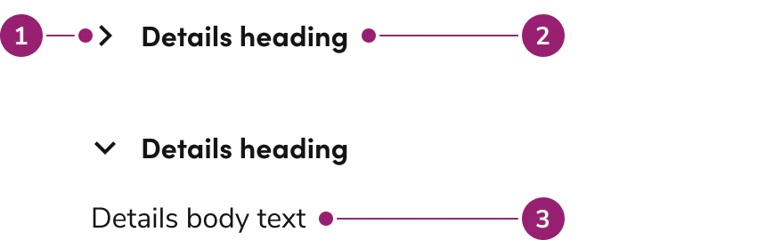
By default, individual Details open and close independently of each other. Configure them to work like an accordion, where only 0 to 1 individual Details is open at once.
Long headings will wrap when there is not enough room for it to be on one line.The chevron indicator will be vertically centered with the height of the heading.
Details are used to show additional information around a sub-topic on a page, while a Tab categorizes information. The context of Details is small, non-essential information, while Tabs can categorize both small and large, essential and non-essential information.