
Anatomy
The Details consists of three primary elements that work together to show or hide information when clicked.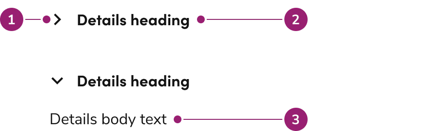
- Chevron
- Heading
- Body content
Options
The Details supports flexible content configurations to accommodate various accordion scenarios.Behavior
The Details responds to user interaction with flexible opening and closing behaviors while handling content overflow.Closed by default
Details are closed until clicked by default. Configure them to open by default when showing this content immediately.Opening behavior
By default, individual Details open and close independently of each other. Configure them to work like an accordion, where only 0 to 1 individual Details is open at once.Heading overflow
Long headings will wrap when there is not enough room for it to be on one line. The chevron indicator will be vertically centered with the height of the heading.Content overflow
Body content for Details will display in full unless a specific height is set. When a height is set, the body content will appear with a scrollbar.Usage Guidelines
Use the Details when showing or hiding additional information in a collapsible accordion format.When to Use
Details are a collapsible accordion for showing or hiding additional information. They are also helpful in contexts where vertical space is limited.Provide additional context
Details should be used as supplementary information that is not critical to completing a task.When not to use
Details should not be used to hide information essential for the user to complete a task. It should also not be used to conceal lengthy content. It is recommended to use Tabs in this case.Alternatives
Details vs Tab
Details are used to show additional information around a sub-topic on a page, while a Tab categorizes information. The context of Details is small, non-essential information, while Tabs can categorize both small and large, essential and non-essential information.How to Use
In a group with other Details
Use Details as supplementary information that is not critical to completing a task.Content
Content within the Details should provide supplementary information that enhances understanding without being critical to task completion.Keyboard Interaction
Users can navigate the Details using standard keyboard controls.| Key | Description |
|---|---|
| Tab | Move to the next tab-able element within the Details or the page. |
| Space or Enter | Opens/Closes the Details component |