Anatomy
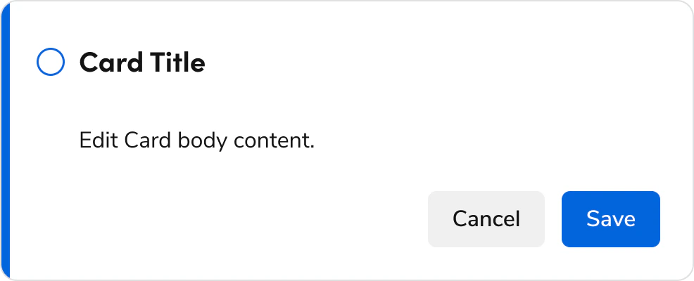
The Edit Card consists of five primary elements that work together to group related controls and information for viewing and editing.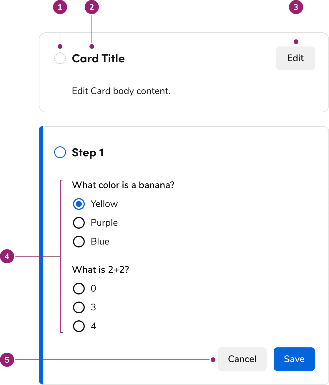
- Status Icon
- Title
- Header action
- Body content (presented as form actions)
- Footer actions
Options
The Edit Card supports multiple status states, action configurations, and flexible body content to accommodate various editing scenarios.Status
Not Started
In Progress
The editing state uniquely contains footer actions and no header actions.Error
Complete
Actions
In the not started, completed, and error statuses, a single action is used in the header region. In the in progress status, a cancel and call-to-action are used in the footer region. The copy is modifiable and each action can be disabled. The actions cannot be modified beyond this.Body content
Edit Card supports any type of content below the title. This is typically represented as text in non-editing statuses and as form elements in the in progress status.Behavior
The Edit Card responds to state changes and content overflow while maintaining consistent editing interactions.Overflow handling
Usage Guidelines
When to Use
Use an Edit Card when a set of actions and information should be chunked in the UI, while also needing the ability to toggle an editing state. Edit Cards serve as a form of progressive disclosure, showing a summary of configurations without also showing all the underlying UI controls.When not to use
Edit Cards create friction to accessing controls. Avoid using an excess number of them. When using Page-level save controls, Edit Cards cause confusion and unnecessary friction. In these cases, group UI controls another way.Alternatives
Edit Card vs Stepper
Steppers move through a linear progression of steps. Edit Cards support both linear and unrelated blocks of content. Steppers are typically scoped to the whole view, e.g. a fullscreen Dialog, while Edit Card can be scoped within smaller sections of a view, e.g. part of a Drawer screen. Steppers only give summaries of the flow indirectly, typically on the final step of a flow, while Edit Card shows a summary in most of its states. Steppers and Edit Cards work together for complex flows.How to Use
Summarize user selections
The incomplete, success, and error state of Edit Cards show a summary of the user’s configuration in its body section. Customize this to fit the context of the Edit Card controls.Number of controls in the Edit Card
No specific rule exists for how many controls exist in Edit Card.- Avoid having only one control in Edit Card. This creates excessive friction in the UI.
- Avoid having excessively long Edit Cards. Tall editing states push the Save controls out of view. Break up the content into multiple Edit Cards, or omit Edit Card in favor of a page-level flow.
Unordered set of Edit Cards
Edit Cards work together without being dependent on other Edit Cards.- Multiple Edit Cards can be in the editing state at once
- Avoid disabling any edit or save actions across Edit Cards
Ordered set of Edit Cards
Edit Cards work together to create a sequential flow, where each step builds on top of each other. Edit Cards do not provide any additional interactions for this scenario.- When a user clicks on the Next/Save action within one Edit Card, have the subsequent card automatically open.
- Disable any edit actions on Edit Cards that aren’t ready to be interacted with.
- Factor in downstream effects, e.g. when a user returns to an early step and modifies a setting that impacts already completed steps.
Saving Edit Cards
- When in the editing state, the footer action has either an explicit Save or Next/Finish.
- When Edit Card has an explicit Save action, the system remembers this save in some way.
- If Edit Card uses Next/Finish instead of Save, changed content doesn’t get preserved until another save occurs.
Guidance for Edit Cards and Page-level saves
- In general, avoid having both Edit Card and page-level save at once.
- If there’s both an Edit Card save and page-level save, saving Edit Card but not saving the page-level save produces a draft state that preserves Edit Card’s new content.
- If this cannot be done, use the Next/Finish copy, or make major UI revisions to avoid the scenario entirely.
- Edit Card and page-level saves work simultaneously. In usability testing multiple save scenarios, users correctly utilized the contextually relevant save every time.
Recommended spacing between Edit Cards
Use a 24px / 1.5rem / size-6 gap between stacked Edit Cards.Content
Content within the Edit Card should clearly communicate the current state and provide appropriate summaries or editing controls.Keyboard Interaction
Users can navigate the Edit Card using standard keyboard controls.Accessibility
Suggested focus management
Consider these factors when handling Edit Card’s focus behavior between state changes.- When entering the ‘In progress’ state, focus goes to the first focusable element in its body content.
- When leaving the ‘In progress’ state, focus placement varies:
- If Edit Cards are not part of an ordered flow, return focus to the element that triggered the state originally, if still available. If not, place it on the next tabbable element.
- If Edit Card is part of a set of ordered Edit Cards, focus goes to the next focusable element within the next Edit Card, assuming it is not the last Edit Card. If it’s the last Edit Card in the flow, bring focus to the most logical place.