Anatomy
The List View consists of five primary elements that work together to display a selectable list with customization options.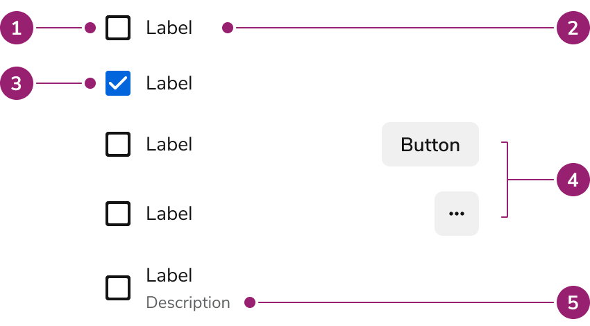
- Unselected
- Label
- Selected
- Secondary Actions
- Description
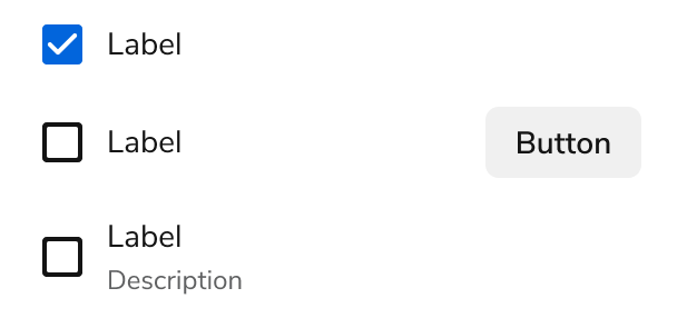
ListViews display a selectable list that can be customized, including displaying secondary actions and information.