Anatomy
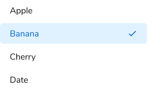
The Listbox consists of four primary elements that work together to allow users to select one or more items from a list of options.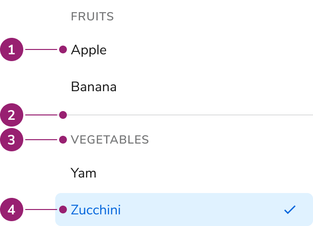
- Option
- Group divider
- Group header
- Selected option
Options
The Listbox supports grouping and multiple selection configurations to accommodate various selection scenarios.Grouping
Multiple selection
Behavior
The Listbox responds to user interaction with typeahead focus functionality and overflow handling.Typeahead focus
When the Listbox is in focus, a user can type a character to move focus to the next item that starts with that character. If typed quickly (750ms), focus will move to the next item that matches the string of characters typed.Overflow handling
Visual States
Usage Guidelines
Use the Listbox when providing a set of selectable items in an overlay.When to Use
Listboxes are used as a set of selectable items in an overlay. It is most commonly used for the options in a Combobox or when building a custom menu.Alternatives
Listbox vs List View
Use Listbox when using simple selections that do not require any customization. Use List View when requiring customized styling or secondary actions. List View may also be used when emphasizing to users that multi-selection is possible.Listbox vs Radio
For simple selection lists in a form, use a Radio. For selection lists that need to be an overlay, use a Listbox with a Combobox.Content
Content within the Listbox should clearly communicate each option through descriptive labels.Keyboard Interaction
Users can navigate the Listbox using standard keyboard controls.| Key | Description |
|---|---|
| Tab | Moves to the next tab-able element outside of the Listbox. |
| Arrow keys | Navigates through the available list items |
| Space | Activates or deactivates the focused Listbox item. |
| Home | Moves focus to the first item in the Listbox. |
| End | Moves focus to the last item in the Listbox. |
| Printable character | Moves focus to the next item that has the character typed. If multiple characters are typed quickly (<750ms), focus moves to the next item with that combination of characters. If the next character takes longer than 750ms, focus is moved to the next item that starts with the new character typed. |