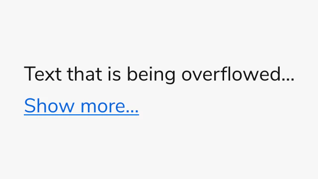
Anatomy
The OverflowText consists of two primary elements that work together to manage text content with row-based truncation.
- Content area - The text container that holds the content with row-based truncation
- Expand button (Optional) - A button that appears when expandable is enabled and content exceeds the specified row limit
Options
The OverflowText supports the following configurations to accommodate various text truncation scenarios.Rows
OverflowText limits text content to a specified number of rows, defaulting to one row. Set the rows prop to control how many lines of text are visible before truncation. Use “unlimited” to display all content without row restrictions. When expandable is enabled, content exceeding the row limit displays an expand button.Expandable
When expandable is enabled, OverflowText displays a “Show more…” button when content exceeds the specified row limit. Users can expand to view full content or collapse to return to the truncated view. Custom expand and collapse text can be configured, along with optional callbacks for expand and collapse events.Usage Guidelines
When to Use
Use the OverflowText when you need to:- Truncate text content to a specific number of rows
- Provide expandable text sections with row-based limits
- Display text previews that expand to show full content
- Control text truncation with precise line counting
When not to use
Avoid using the OverflowText for:- Non-text content - Use Overflow for complex content with multiple elements
- Content requiring scrolling - Use Overflow when you need scrollable areas instead of expandable sections
- Single-line text - Simple text truncation may not require the full OverflowText component
Alternatives
OverflowText vs Overflow
OverflowText provides row-based truncation specifically for text content, while Overflow provides scrollable areas for any content type with height or width-based constraints. Use OverflowText when you need precise control over text line limits and row-based expansion. Use Overflow for complex content, horizontal scrolling, or when you need shadow indicators.Content
OverflowText works best with text content wrapped in Text components. The component automatically handles line breaks and text wrapping based on the specified row limit. Ensure that important information appears in the first few rows when expandable is enabled, as users may not expand to view all content.Keyboard Interaction
Users can navigate the OverflowText using standard keyboard controls.| Key | Description |
|---|---|
| Tab | Moves focus to the next focusable element |
| Space or Enter | Activates the expand/collapse button when expandable is enabled |