


Anatomy
The Progress Bar consists of four primary elements that work together to visually represent the completion of a task.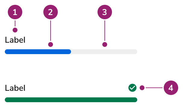
- Label
- Fill
- Track
- Status Indicator
Options
The Progress Bar supports the following configurations to accommodate various progress representation scenarios.Status
Value
A numeric value visually changes the progression. Use this when the actual percentage of completion can be determined.Indeterminate
Set an indeterminate value when it isn’t well known how long an operation will take.Label
Label
More Info
No Label
Description And Error Text
Behavior
The Progress Bar responds to content overflow by wrapping text labels while maintaining consistent visual representation.Overflow
The text label of a Progress Bar will wrap when not enough space is provided.Usage Guidelines
Content
Content within the Progress Bar should clearly communicate the task being completed and its current status.Keyboard Interaction
Users can navigate the Progress Bar using standard keyboard controls.Accessibility
Provide ARIA labels when a visual label is not used
When using a Progress Bar without a label, provide one through the usage of anaria-label.
For more guidance on progress indicators and status updates, see changing content best practices.