Anatomy
The Select Card consists of six primary elements that work together to create a card-like checkbox or radio with customizable inner content.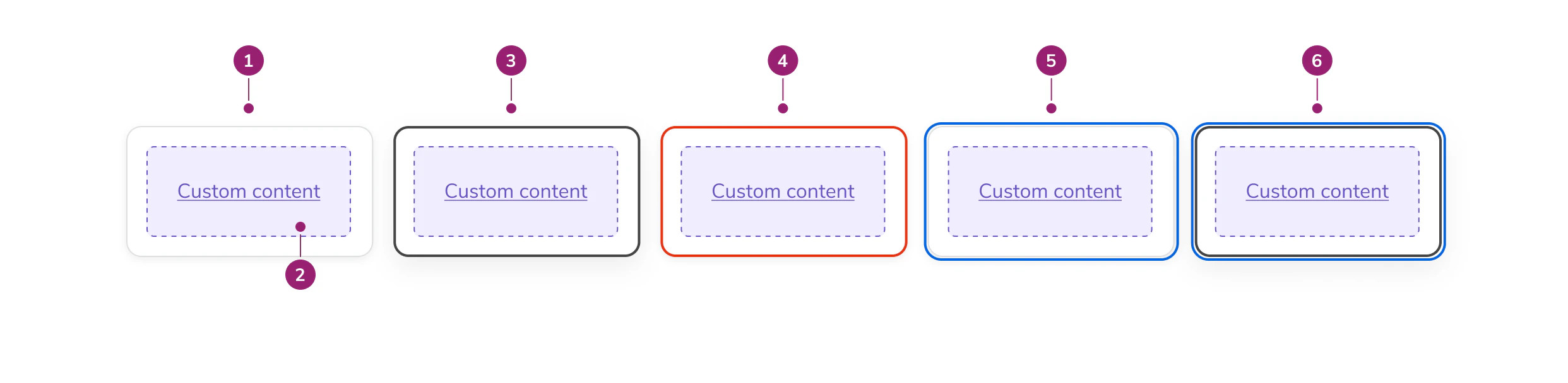
- Card surface - The interactive container that responds to user selection
- Inner contents - Customizable content area for labels, descriptions, chips, or other elements
- Selected state - Visual indicator showing the card is currently chosen
- Errored state - Visual treatment indicating validation or selection errors
- Focused state - Visual indicator showing keyboard focus
- Focused & selected state - Combined visual treatment for focus and selection
Options
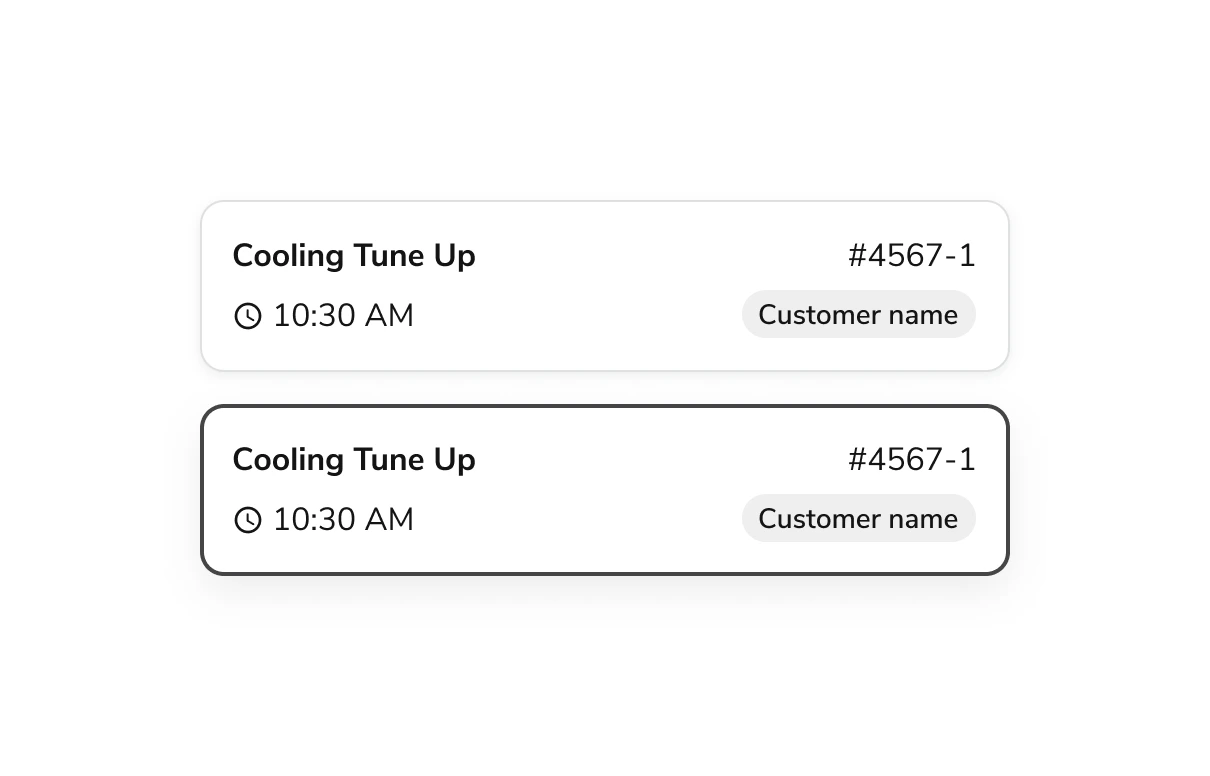
The Select Card supports the following configurations to accommodate various selection scenarios.States
Default
Selected
Disabled
Errored
Drop Shadows
SelectCard has a drop shadow by default. You can optionally remove it for use in galleries and other dense layouts where shadows may create visual noise.Select Indicator
Display a checkbox or radio indicator in a separate column on the left side of the card. The indicator type is automatically determined by the selection mode of the parent group.Behavior
The Select Card responds to user interaction with distinct visual states for selection, error, and focus.Usage Guidelines
Use the Select Card when providing card-like checkbox or radio options with customizable inner content.When to Use
As Checkbox Group
Use Select Cards within a checkbox group when users can select zero to many options.As Radio Group
Use Select Cards as options in a radio group where users must make a single selection from mutually exclusive options.Alternatives
Select Card vs Radio
Use Select Card when options require rich content like descriptions, images, or chips. Use Radio for simple text-only options in compact layouts.Select Card vs Checkbox
Use Select Card when individual options need visual prominence and additional context. Use Checkbox for simple lists where space efficiency is important.How to Use
Default Selection in Radio Group
Provide a default option when using Select Card within a Radio Group. Default selections:- Signal that a selection is required
- Expedite task completion
- Guide users toward a particular option
Content
Content within the Select Card should clearly communicate the option being selected. Keep inner content concise and scannable. Use labels, descriptions, chips, or other elements that help users quickly compare options.Using Drop Shadows
- In galleries and dense layouts, remove the drop shadow
- In other contexts, keep the drop shadow for visual separation
Keyboard Interaction
Users can navigate the Select Card using standard keyboard controls.| Key | Interaction |
|---|---|
| Keyboard arrows | Move between Select Cards when implemented as a Radio Group |
| Tab | Move to the next Select Card when implemented as a Checkbox Group |
| Shift Tab | Move to the previous Select Card when implemented as a Checkbox Group |
| Space | Select card with focus when implemented as a Checkbox Group |
Accessibility
- Include Select Cards in a group with a descriptive legend
- Provide clear, distinct content for each card to help users differentiate options
- When a Select Card group has an error, include helper text to describe the error