Anatomy
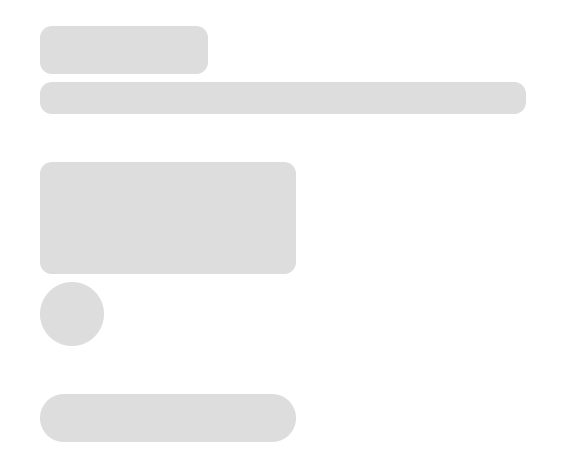
The Skeleton consists of two primary elements that work together to create placeholders for content which hasn’t yet loaded.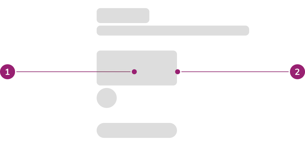
- Fill
- Container
Options
The Skeleton supports text and shape configurations to accommodate various content placeholder scenarios.Text
Headline
Use the headline option to indicate loading of a title.Body Text
Use the body text option to indicate loading of a sentence, string of text, or a paragraph.Shape
Rectangle
Use the rectangle option to indicate loading of card, button, image, or sectional content.Circle
Use the circle option to indicate loading of an avatar.Pill
Use the pill option to indicate loading of a chip.AI
Use the AI option to indicate loading of AI-generated content. All Skeleton variants support an AI style that replaces the default gray gradient with blue gradient colors.Usage Guidelines
Use the Skeleton when the implementation knows the approximate UI that is to be loaded.When to Use
- When the implementation knows the approximate UI that is to be loaded
- When loading page initially
- When loading content through pagination, filtering, or searching
- When loading dynamic content initially
- Dynamic content requires an external service to provide the content
- Examples include:
- Combobox items
- Table
- Card grid
When not to use
- Do not show Skeleton or any loading state if loading takes less than 1 second. Content loading in less than 1 second keeps the user’s flow of thought seamless.
- Use Spinner for loading additional content, for example in infinite scrolling experiences
How to Use
Skeletonized UI should be an approximation of the UI that is loading and not meant to recreate every element that will load.Scope of skeleton
Apply Skeleton to everything in the same scope. In this context, scope refers to component that is awaiting for the data to be fetched.- Full Skeleton
- Fetching data to render grid of cards → everything inside the Card is skeletonized
- Fetching table data → table is skeletonized everything inside the Table is skeletonized
- Partial Skeleton
- Card as a section containing title and content that requires fetch
- Title is not part of the fetch scope, so this is static and not to be skeletonized
- Example of fetch content: Listbox with dynamic options, data visualization, score card (label + data number)
- Note that if there is higher level fetch that affects other sibling, this Card can also be fully skeletonized. Example: Jira ticket type of page level loading
- Card as a section containing title and content that requires fetch
Repeated content
For repeated content, use skeleton to fill up 3/4 of the available space. For example, even if a grid of Cards are expected to overflow, only fill 3/4 of the available space with the skeleton.Non-repeated content
For non-repeated content, keep it above the fold as much as possible- This is to reduce unnecessary scrolling of the page while contents are still loading in
- Approximation of the UI can be minified to keep things above the fold
- Example: Even if we expect a long blog post, it can be reduced to a two-paragraph skeleton to keep it above the fold.