Options
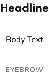
Text supports body text, headline, and eyebrow configurations with multiple sizing options to accommodate various typography scenarios.Body Text
Body Text sizing
| Value | Size |
|---|---|
| Small | 0.875rem / 14px |
| Medium (Default) | 1rem / 16px |
| Large | 1.25rem / 20px |
| Extra Large | 1.5rem / 24px |
Styling
Headline
Headline sizing
| Value | Size |
|---|---|
| Small | 1rem / 16px |
| Medium (Default) | 1.25rem / 20px |
| Large | 1.5rem / 24px |
| Extra Large | 2rem / 32px |
Eyebrow
Eyebrow sizing
| Value | Size |
|---|---|
| Small | 0.625rem / 10px |
| Medium (Default) | 0.75rem / 12px |
| Large | 1rem / 16px |
Behavior
Text responds to different style and size requirements while maintaining consistent typography.Usage Guidelines
The text component should be regularly used to convey text throughout a page. Each of the major text styles used in the design system are options within Text.When not to use
Text is not directly used in most components. In those cases, the built-in type opinions of the component are used instead.How to Use
Type pairing and sizing
Refer to the typography foundations for suggested type pairing and size configurations.Apply heading levels to headline text
The headline variant of Text should apply an appropriate HTML section heading (e.g.,h1, h2). This value is independent of the size option applied to headlines.