

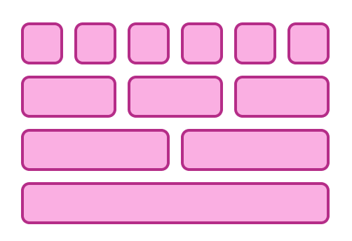
Anatomy
The Layout consists of two primary elements that work together to define page structure and columns.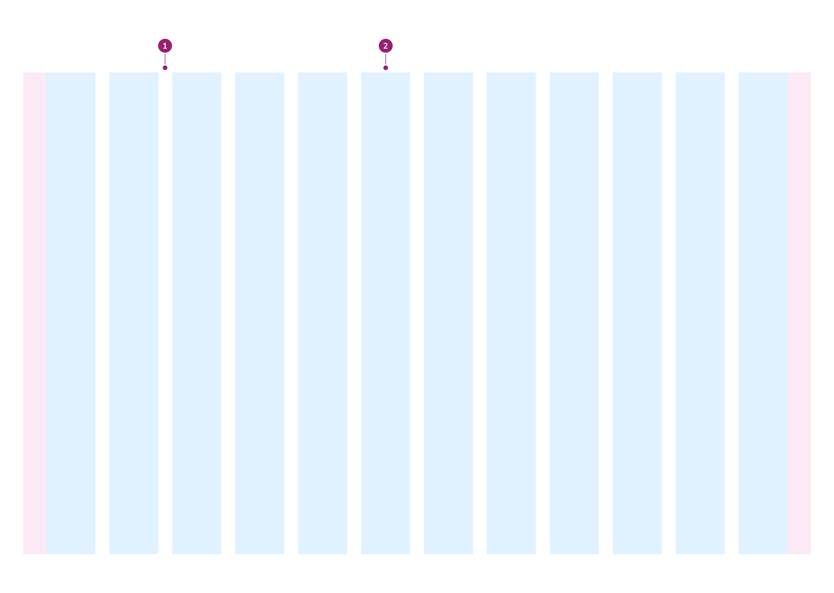
- Gutter
- Column
Options
The Layout supports responsive column configurations, width options, and gutter variants to accommodate various page structure scenarios.Columns per breakpoint
Width
There are two width options available: Default (fixed) and Fluid.Default
By default, Layout is fixed: it has a max width of 1280px and centers on the page. Below 1280px, it fills the available width.Fluid
When Layout is fluid, Layout removes the 1280px max width and fills the available area at every screen size.Variants
There are three variants of Layout: Default, Wide, and Narrow. Each variant has different gutter values. Gutters are the spacing between columns.Default
Wide
Narrow
Behavior
The Layout responds to different breakpoints and content requirements while maintaining consistent column structure.Usage Guidelines
Use the Layout to construct the overall structure of a page. It is not used for organizing elements within other containers. Place section content directly in each Layout Item; a Layout Item does not need a Card. Use a Card inside a Layout Item only for a peer tile, a chart, or an isolated group without a section heading.Fluid or Fixed Width
Start with the default fixed layout. Choose fluid only when the page’s primary content needs more than 1280px of width on large screens.Fixed Layout
Use the default fixed layout for most pages, including dashboards, forms, detail pages, and list pages. Fixed layouts optimize readability on larger screens by limiting line lengths and provide greater design control. Both widths are responsive: below 1280px, a fixed layout fills the available width just like a fluid one.Fluid Layout
Use a fluid layout when the primary content is wide enough to use the space beyond 1280px, such as a data table with many columns, a scheduling board, or a map. Fluid layouts maximize available screen space on large monitors.Considerations
A dense page doesn’t need a fluid layout on its own. Density sets how much content a page shows, while width sets how far that content stretches on large screens. When you use a fluid layout, setfluid on both the Page.Header layout prop and the Layout inside Page.Content so their edges align.