
Anatomy
The Card consists of two primary elements that work together to group related content together.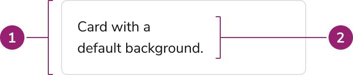
- Container
- Content
Options
The Card supports flexible content, padding, and background configurations to accommodate various grouping scenarios.Content
Padding
| Padding option | Value |
|---|---|
| 0 | 0px / 0rem |
| xSmall | 4px / 0.25rem |
| Small | 8px / 0.5rem |
| Medium (default) | 16px / 1rem |
| Large | 24px / 1.5rem |
AI Mark
Use the AI Mark withText variant="headline" when the card title should indicate AI-generated content.
Backgrounds
Behavior
The Card responds to interactivity requirements while maintaining consistent content grouping.Usage Guidelines
Use the Card when grouping related content and actions inside of a container.When to Use
Use a Card when grouping related content and actions inside of a container.Alternatives
Interactive Card vs Card
Use Interactive Card when the card itself needs an interaction. If no interaction is needed, or only an inner element needs an interaction, use Card instead.How to Use
Group related content
Group related content and actions within a single container. Don’t add unrelated content to a card.Do
Nesting cards within cards
Don’t nest cards within cards. Use headings, body text, and actions to provide structure to your layout.Don’t
Adding interactive elements to a Card
Inner content of a Card can add interactive elements. Do not make the Card itself interactive, use the Interactive Card component instead.Content
Content within the Card should be clearly organized and focused on a single purpose.- Use a Heading to make a card’s purpose clear. Following heading structure for the page.
- Avoid too many call-to-actions in a single card.
- Cards should have an intentional focus, avoid overloading a single card with too much or unrelated information.
- Cards of similar importance should be structured in the same way.