
Anatomy
The Divider consists of two primary elements that work together to separate content.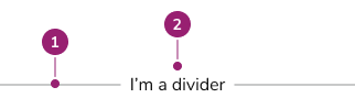
- Divider line
- Content
Options
The Divider supports spacing, orientation, and content alignment configurations to accommodate various separation scenarios.Spacing
| Spacing option | Value |
|---|---|
| 0 | 0px / 0rem |
| half | 2px / 0.125rem |
| 1 | 4px / 0.25rem |
| 2 | 8px / 0.5rem |
| 3 | 12px / 0.75rem |
| 4 | 16px / 1rem |
| 5 | 20px / 1.25rem |
Vertical
Divider supports vertical orientation for separating content horizontally.Content
Divider supports content to provide additional information to users.Content Alignment
Content aligns to start, end, or center.Behavior
The Divider responds to spacing and orientation requirements while maintaining consistent visual separation.Usage Guidelines
Use the Divider when separating content that needs visual distinction.When to Use
Group related content
Dividers reinforce grouping between elements while contrasting them against other elements on the page. Use dividers on high-density UIs and lists where whitespace alone does not provide sufficient grouping.Do
When not to use
Overuse of dividers can create a cluttered UI. White space is often sufficient at creating separation between elements. Dividers should not be used as decoration within already grouped content.Don’t
How to Use
Spacing considerations
Divider supports multiple spacing configurations. Follow these general principles:- If used within a Form, spacing conforms to the Form pattern.
- Maintain internal consistency within the product area for spacing choices.
- When interactive elements exist near Dividers, use more spacing to meet WCAG guidance on touch target size minimums.