Beta FeatureThis feature is currently in beta, and needs to be imported from
@servicetitan/anvil2/beta.While we hope to minimize breaking changes, they may occur due to feedback we receive or other improvements. These will always be documented in the changelog and communicated in Slack.Please reach out in the #ask-designsystem channel with any questions or feedback!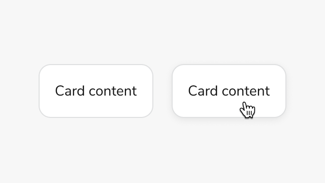
Anatomy
Interactive Card consists of three primary elements that work together to create clickable cards with nested interactive elements.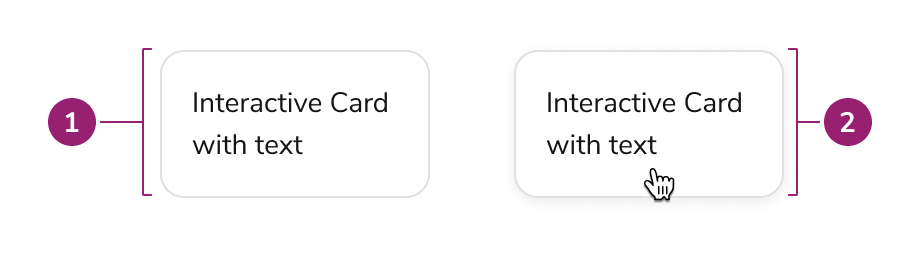
- Card - Interactive card is a Card under the hood.
- Card (hover) - Interacting with the card enables clickable behavior
Options
Interactive Card uses a Card under the hood to provide the base styling and layout. Refer to the Card design docs for all available options.Simple interactive card
Behavior
Interactive Card responds to user interaction with distinct visual feedback while maintaining support for nested interactive elements.Hover, focus, and disabled states
Disabled state does not apply disabled styling to nested interactive elements. Apply disabled styling manually to nested elements when needed.Nested interactive elements
Interactive Card can support nested interactions within the card layout itself. This can be useful when both the Card itself and nested interactive elements have different behaviors.Usage Guidelines
Use Interactive Card when you need clickable cards that contain nested interactive elements such as buttons or links.When to Use
Use Interactive Card when you need:- Clickable cards with nested interactive elements
- Cards that trigger actions (button variant)
- Cards that navigate to other pages (link variant)
- WCAG AA 2.2 compliant clickable card implementations
When not to use
Avoid using Interactive Card when the card itself does not need an interaction.Alternatives
Interactive Card vs Card
Use Interactive Card when the card itself needs an interaction. If no interaction is needed, or only an inner element needs an interaction, use Card instead.Interactive Card vs Select Card
Select Card provides a card-like checkbox or radio input for selection scenarios. Use Select Card when users need to select one or more options from a group of cards, such as choosing services or items. Use Interactive Card when the card triggers an action or navigates to another page, especially when the card contains nested interactive elements like buttons or links.Content
Content within Interactive Card should be clearly organized and include required ARIA labels for accessibility.Content organization
- Use a heading to make the card’s purpose clear, following heading structure for the page
- Avoid too many call-to-actions in a single card
- Cards should have an intentional focus - avoid overloading a single card with too much or unrelated information
- Cards of similar importance should be structured in the same way
Keyboard Interaction
Users can navigate Interactive Card using standard keyboard controls.| Key | Description |
|---|---|
| Tab | Moves focus to the card or nested elements |
| Enter | Activates the card action (button variant) |
| Space | Activates the card action (button variant) |