

When to use each mark
Atlas. A brand moment. The user is choosing to engage
with Atlas, such as the nav entry point, opening the window, or a button
like “Ask Atlas.” Use the full Atlas logo. That logo is the primary or
monochrome mark.
AI Mark (Sparkle). A utility moment. AI helps inside a
task the user is already doing, such as a table summary, a sorted list,
or an AI-filled field. Use the sparkle, even when Atlas powers it. In
smaller or inline places, the sparkle stands in for Atlas. Users do not
need to know which system is behind the feature.
Atlas mark
The Atlas mark is the full logo for a brand moment, when the user chooses to engage with Atlas.Styles
The Atlas mark has two styles with specific rules for when to use them.Primary
Monochrome
Sizes
The Atlas mark has two sizes.24×24
16×16
Placement
Only actions like buttons receive the mark on the left. Buttons inside a summary card do not carry a mark. The card already shows the Atlas mark or the AI Mark, and the button relies on that indicator. See Atlas Entry Points.Global navigation states
- Inactive: Use the monochrome mark so the icon matches the other navigation icons.
- Active: Use the primary mark.
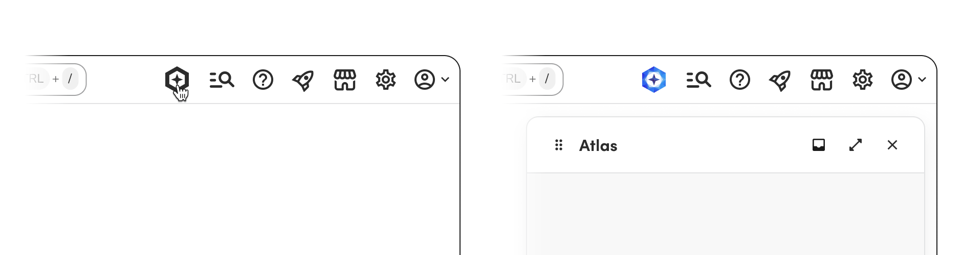
Key locations
- Global navigation. The persistent launcher icon in the top nav. See Atlas Entry Points for details.
- Atlas in conversations. When Atlas the entity converses with the user, the mark is always used as its avatar.
- Buttons that open Atlas. A secondary button uses the primary mark. Every other button variant uses the monochrome mark. For button copy and icon rules, see Atlas Entry Points.
AI Mark (Sparkle)
The AI Mark, a double-star shape represented as a sparkle, is the subtle form of Atlas. Use it for a utility moment, including smaller or inline places. It replaces the single sparkle, the TI logo, and sparkle emoji. For implementation details, see AI Mark component.Styles
The AI Mark has two styles.Primary (gradient)
Monochrome
Sizes
The AI Mark has three sizes, matching the AI Mark component. The component the mark appears in usually determines the size.16×16
24×24
32×32
Placement
Only actions like buttons receive the mark on the left. Otherwise, place the mark to the right.Key locations
- AI-assisted fields and labels. Use the AI Mark to denote that data was AI-provided. See Embedded AI for placement guidance.
- Summary cards. AI-generated summary cards display the AI Mark. See Atlas Entry Points for how the AI Mark and Atlas mark interact on summary cards.
- Headers and drawers. The AI Mark can appear in headers and drawers when appropriate.
Coexistence of marks
A utility moment and a brand moment can sit in the same area. An AI-generated summary card can show the sparkle on the card and the full Atlas logo on a button that leads to Atlas. For detailed rules on how marks interact in summary cards and entry points, see Atlas Entry Points.Related
AI Mark component
Implementation details for the AI Mark component.
Embedded AI
How to use the AI Mark within larger workflows in the product.
Atlas Entry Points
How users get to the Atlas conversation experience.
Atlas Logo (React Native)
The Atlas logo component for React Native apps.