
Anatomy
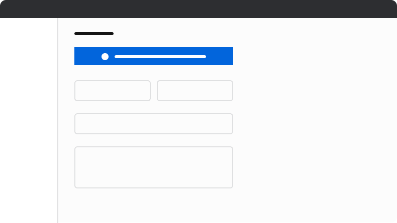
The Announcement consists of five primary elements that work together to communicate app-wide information to users.
- Status background
- Status icon
- Title
- Action (Optional)
- Close action (Optional)
Options
The Announcement supports three status types and flexible action configurations to accommodate various app-wide messaging scenarios.Status
Close
Preserve the close action by default. Remove it only when an announcement must persist, such as in warning or danger scenarios.Action
An optional, single action can be added to the Announcement. All action Buttons should use the"default" or "secondary" appearance to maintain visual hierarchy within the Announcement.
Behavior
The Announcement responds to content overflow by truncating text while maintaining its fixed height.Overflow handling
When space is unavailable, text truncates. The Announcement height remains constant.Usage Guidelines
When to Use
Announcements convey app-wide information. Examples include feature releases, maintenance messaging, and sandbox status.When not to use
Announcements should not be used for specific sections of an app, or to convey normal error messaging.Alternatives
Announcement vs Alert
Announcements are used to convey app-wide information. They are placed as a global element on the page. Alerts are contextual to an area of an app, and are more flexible in scope and layout position.Announcement vs Toast
Announcements are used to convey app-wide messages, such as a new release being available, application maintenance, or sandbox information. Toasts are short pieces of information usually prompted by user action.How to Use
Layout positions
Position announcements above all other elements with sticky or fixed positioning. If top placement is not possible, bottom placement with fixed positioning is an alternative, though not recommended. Do not place announcements in other locations.
Do
Don’t