Anatomy
The Button consists of three primary elements that work together to trigger actions or events.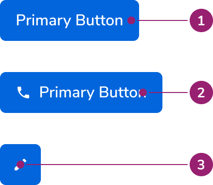
- Container
- Text label
- Icon
Options
The Button supports multiple appearances, sizes, and icon configurations to accommodate various action scenarios.Appearances
Sizes
Extra small buttons should only be used on desktop devices, as they do not meet the 44x44px tap target required for mobile.
Icons
Icons can be placed both before and after the Button’s text label, and can even replace the text label as an Icon Button. See the Button Icon usage guidelines on when to use icons, and accessibility considerations when using icons.Button Compound
A Button Compound is a standalone component that provides button interactivity to another component. This can be useful for components such as anAvatar, which by themselves lack interactivity.Button Compound Option Circular
The shape of the Button Compound can be changed to conform to the shape of the component it’s overlaying, such as an Avatar.Button Link
The Button Link is a specialized Button component that uses an<a> tag under the hood. It gives you the visual style of a button with the correct HTML semantics of a link, making it ideal for actions that navigate to a new page.
The Link Button is its reverse: a Button component styled to look like a simple text link. Use it when an action doesn’t involve navigation but you need a link’s visual appearance, such as for triggering a modal.
Behavior
The Button responds to user interaction with distinct visual states and flexible layout behaviors.Visual States
Primary
Danger Secondary
Secondary
Ghost
Danger Primary
Disabled
The disabled style is consistent across each button variant. This style is useful when preventing user clicks when an action isn’t available or when a submission of some kind is taking place.Text wrap
Buttons fill all available space, wrapping only when no space remains. Text is center-aligned when wrapping.Widths
In general, Buttons should match the width of their text. Container width works well when aligning with specific layout elements. Button Icon width always equals its height.Left-aligned Text
Button text is typically centered. Use left-aligned text when aligning with specific layout elements or when stacking multiple buttons vertically.Usage Guidelines
Use the Button to denote most forms of actions on the page.When not to use
In general, buttons should not be used for navigation. See the Link comparison below for more details related to Links. For other navigational contexts, consider the Tab or Side Nav.Alternatives
Button vs Link
In general, Buttons are used to denote an action, while a Link is used to denote navigation. This distinction in practice can be blurry.When navigating
In general, Links are the preferred choice for navigating. There are a few scenarios when a Button may be used however:- Use a Button when emphasis is needed. Sometimes a page’s call to action is navigating somewhere else.
- Use a Button when navigation is mixed with actions.
With Actions
In general, Buttons are the preferred choice for actions. A Link however may be used when the action priority is low and space is tight.With triggering overlays
Triggering an overlay UI can be treated like navigation.How to Use
Button Pairing
There are 3 levels of emphasis in our Buttons: primary, secondary, and ghost. This corresponds to an emphasis scheme of high, medium, and low emphasis.Recommended pairings
Do
- Be consistent within a product area.
- There should never be more than 1 Primary action. There is no upper limit to how many Secondary or Ghost actions could exist.
- Some components, such as Dialogs, Drawers, and Alerts have Button pairing standards already, and those should be used when possible.
- Icon-only actions are frequently represented as Ghost actions.
- A Cancel action is generally a Secondary action.
Caution when pairing
While these pairings are allowed, caution should be used with them. Three levels of Button hierarchy in one grouping is usually excessive, consider simplifying it to two levels.Don’t use these pairings
Don’t
Icons in Buttons
In general, icons should only be used in Buttons when a user can easily associate the icon with the action.Use caution with Icon-only Buttons
While icon-only buttons can save space on the page, the meaning behind icons is not universally understood. Often, this requires users to explore and later recall what each icon does to understand the action.Always include a Tooltip with Icon-only Buttons
All Icon-only buttons should include a Tooltip that appears on hover and focus, describing what the Button would do.Button Alignment
Refer to the Button alignment guidance from the Form pattern.Left-aligned Buttons
In scenarios where you have several Buttons stacked vertically, use the Secondary variant and left-align the text. Each button should have the same width.Do
Don’t
Content
Content within the Button should clearly communicate the action it will perform.Button name should describe what it does
A user should be able to use the button name to predict what will happen when they click it. Buttons should be action-oriented, pairing a verb and a supporting noun, and be 2 to 3 words long. Common actions like “Save”, “Close”, “Cancel,” or “OK” don’t require a supporting noun.Do
Don’t
Be concise and consistent
Avoid unnecessary words and articles such as the, an, or a. Never include punctuation in button text and avoid button text that requires punctuation. Always write button text in title case. Capitalize the first word, the last word, and all major words in between. Never use emoji or exclamation points.Do
Don’t
Button name should match destination
When a button opens a modal or takeover, the destination’s title should match the button text.Keyboard Interaction
Users can navigate the Button using standard keyboard controls.
Buttons using an href will also use this keyboard combination.