Anatomy
The Avatar consists of three primary elements that work together to visually represent an entity.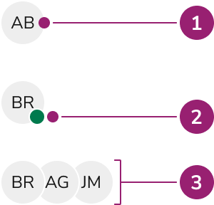
- Avatar body
- Status indicator (Optional)
- Avatar Group
Options
The Avatar supports multiple content types, sizes, and grouping configurations to accommodate various representation scenarios.Image
Initials
When an image is not used, the avatar displays initials derived from the name, calculated based on specific rules. When two or more words are used, the first letter of the first two words is used. When only one word is provided in the name, the first two letters are used. On ‘small’ Avatars, only the first letter is used regardless of what name is used.Custom background colors
Avatars provide one color by default. They accept any color or Token value. Text color auto-calculates to achieve the highest available contrast. Use a Token value that supports theming.Sizes
| Type | Dimensions |
|---|---|
| Small | 24px / 1.5rem |
| Medium | 32px / 2rem |
| Large | 48px / 3rem |
Status
Avatars can also convey an online or offline status.Grouping
Avatars can be grouped together in a condensed form. The specific spacing depends on the size of individual Avatars. Grouping also allows for a max count of Avatars, where a +X will be displayed in place of additional Avatars. This cutoff is configurable to any number.Status in groups
Usage Guidelines
When to Use
Avatars are appropriate when referencing a person. They also represent other entities such as businesses. Follow local standards for business entity representation.When not to use
Avatars should be avoided to display icons or emojis, and an element such as a Button may be more appropriate.How to Use
Optionally add text labels to Avatars
Text labels are not provided directly with an Avatar, but are recommended when space allows. Customize labels as needed.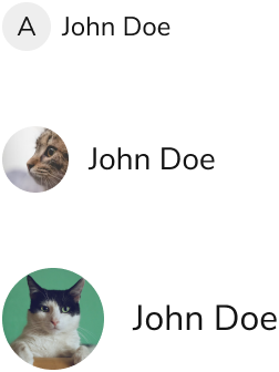
Adding interactivity to an Avatar
Combine an avatar with a Button Compound to add interaction. This provides interactive states and accessibility.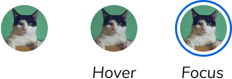
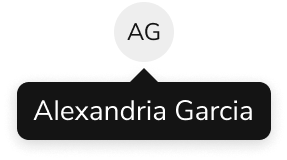
Only use a Tooltip when also adding interactivity
Since an Avatar is non-interactive by default, use a Tooltip when the Avatar is focusable by addingtabIndex={0}. A text label next to the Avatar is still the preferred option.
Don’t make isolated changes to an Avatar’s shape
Shape is consistent when representing a category of entities. Deviating from this confuses users.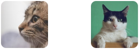
Don’t