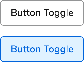
Anatomy
The Button Toggle consists of three primary elements that work together to let users alternate between two states with a single click.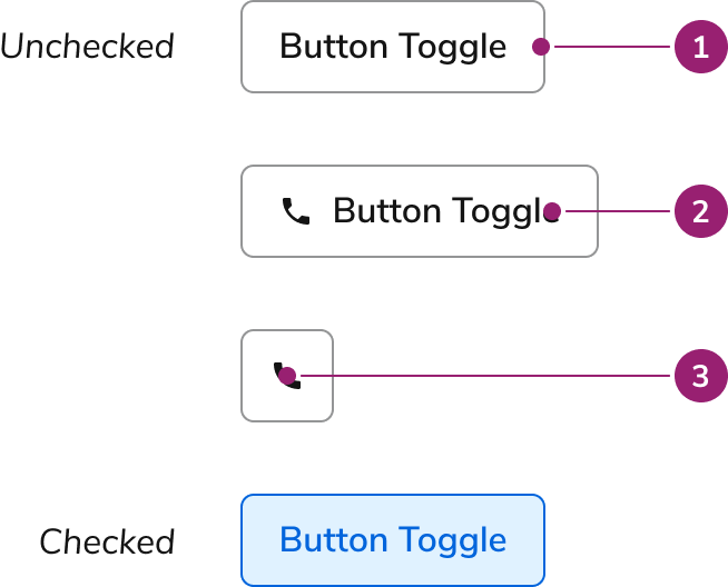
- Container
- Text label
- Icon
Options
The Button Toggle supports multiple size configurations to accommodate various toggle scenarios.Sizes
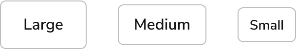
| Size | Height |
|---|---|
| Large | 48px |
| Medium | 40px |
| Small | 32px |
Behavior
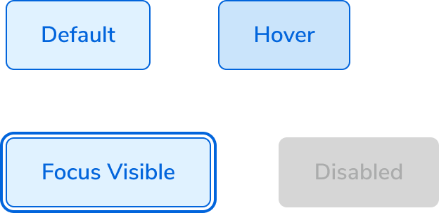
The Button Toggle responds to user interaction with distinct visual states and flexible layout behaviors.Visual States
Default
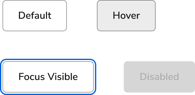
Checked
Text wrap
Button Toggles fill all available space, wrapping only when no space remains. Text is center-aligned when wrapping.Widths
In general, Button Toggles should match the width of their text. Container width works well when aligning with specific layout elements. Button Toggle Icon width always equals its height.Usage Guidelines
Use the Button Toggle to control the binary state of a Button.When to Use
Button Toggles control the binary state of a Button. They can contain text, text with an icon, or just an icon.How to Use
Button Toggles work well when selecting multiple options from a set of available options.Do
Content
Content within the Button Toggle should clearly communicate the toggle state through labels and optional icons.Keyboard Interaction
Users can navigate the Button Toggle using standard keyboard controls.| Key | Interaction |
|---|---|
| Space or Enter | Toggles checked state |