Anatomy
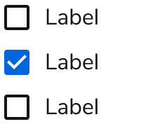
The Checkbox consists of two primary elements that work together to allow users to select one or more options.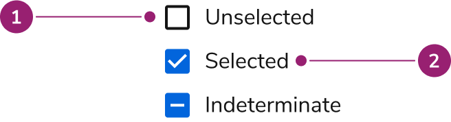
- Checkbox
- Label
Options
The Checkbox supports selection states and description configurations to accommodate various form scenarios.Selection
Checkboxes can be unselected, selected, or indeterminate. Indeterminate checkboxes represent selected and non-selected values.Description
Descriptions provide information to help the user avoid errors.Behavior
The Checkbox responds to user interaction with distinct visual states and flexible overflow handling.Visual States
Default
Disabled
Error
Overflow
When a Checkbox label is too long for the available space, it will wrap to a new line.Usage Guidelines
Use the Checkbox when allowing users to make zero, one, multiple, or all selections from a range of options.When to Use
Checkboxes give users a way to make zero, one, multiple, or all selections from a range of options.Alternatives
Checkbox vs Combobox
Checkbox groups and the Combobox both allow multi-selection of a set of items. Checkbox groups should be used when there are only a few options. For larger options, Checkbox groups can still be used when there is space available and discovery of options is important. Comboboxes are good for 8 or more options and also when conserving space.Checkbox vs Switch
Switches are used for making a selection between two mutually exclusive options and have an immediate effect. Checkboxes allow users to make zero to many choices from available options and changes are not immediate.Checkbox vs Radio vs Switch
Radio buttons are used to select a single option from a set of mutually exclusive options. Checkboxes are best used to make zero to many selections from available options.| Checkbox | Switch | Radio | |
|---|---|---|---|
| When is the selection executed? | After a user clicks a submit button | Immediately | After a user clicks a submit button |
| How many options are available? | 1 or more | 1 | 2 or more |
| Must an option be reducible to an on or off context? | No, it can be other things. | Yes | No, it can be other things. |
| If I had a group of this UI, what is the relation of each item in the group? | Independent of each other | Independent of each other | Mutually exclusive |
| Indeterminate state possible? | Yes | No | No |
How to Use
Checkbox Groups
Sets of related Checkboxes should be grouped together in a Checkbox Group. In most cases, a Checkbox Group should have a label. Checkbox Groups allow users to see all available options that are related to each other.Content
Content within the Checkbox should clearly communicate the option being selected and provide necessary context.Give a descriptive, action-oriented label
The user relies on the label to provide context and identify what the checkbox controls. Use positive and active wording for checkbox labels. Include a verb to prompt the user to take action. Use sentence case (capitalize only the first word and proper nouns) so control labels are easy to scan. Do not use periods for short phrases or single sentences. Checkbox labels should follow the content guidelines for labels.Do
Don’t
Give the user the information they need to make an informed decision
When the checkbox label doesn’t provide enough information and context for users to make an informed decision, use inline help. Inline help works best because it requires no user interaction and is always visible. Keep inline help to 1-2 sentences. Use the content guidelines for inline help. Avoid using a tooltip to communicate this kind of information about an option. It’s an additional step for users to mouse over the tooltip to reveal its information, and users can’t refer to the tooltip content and take action at the same time.Do
Keyboard Interaction
Users can navigate the Checkbox using standard keyboard controls.| Key | Interaction |
|---|---|
| Space | Enables the selected Checkbox |
| Tab | Navigate between Checkboxes |
Accessibility
- Checkboxes should have a visible label.
- Checkbox groups must have a legend that describes the group.
- If a Checkbox has an error, Helper Text must be present to describe the nature of the error.