Anatomy
The Dialog consists of five primary elements that work together to temporarily block interactions within the main view.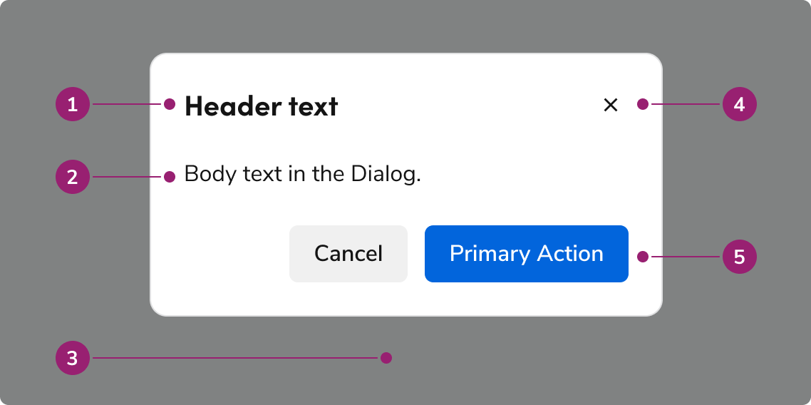
- Header
- Body content
- Backdrop
- Close action
- Footer actions
Options
The Dialog supports flexible content, footer actions, and sizing configurations to accommodate various modal scenarios.Body content
Add any type of content into the body of a Dialog.Footer actions
Sizing
The Dialog has 4 sizing options: medium (default), large, extra large, and fullscreen.Default
Large
Extra Large
Fullscreen
Sizing table
| Sizing | Width | Height | Max Height |
|---|---|---|---|
| Medium (default) | 22.5rem / 360px | auto | 100% - (1rem * 2) |
| Large | 35rem / 560px | auto | 100% - (1rem * 2) |
| Extra Large | 70rem / 1120px | auto | 100% - (1rem * 2) |
| Fullscreen | 100% | 100% | – |
Behavior
The Dialog responds to content overflow and scrolling requirements while maintaining focus management.Overflow handling
Content in the Dialog will wrap, rather than truncate. Header content will avoid colliding with the close action, while footer actions will wrap to the right, with the right-most actions being at the bottom. Footer actions can have a custom overflow behavior if needed.Scrolling
The body region of the Dialog will scroll when space is not available. The Dialog’s height will fill the height of the browser window (minus 1 rem top and bottom margins), and scroll past that point.Usage Guidelines
Use the Dialog to bring focus to important tasks that require user action before continuing.When to Use
Use Dialogs to bring focus to important tasks. Situations that require user action before continuing, confirmations, and quick, infrequent tasks are among the most common use cases. Dialogs are interruptive UIs by design. They limit what users can do and may disorient users when used mid-flow. Use Dialogs only as needed.Use Dialogs to confirm important user actions
Use Dialogs to confirm important, higher-risk actions. Destructive, hard to reverse decisions particularly benefit from Dialog usage. Not all actions require a confirmation; use only as needed.Do
When not to use
Don’t overuse Dialogs
It is easy to overuse Dialogs in flows, particularly in complex UIs. In general, it is better to reduce Dialog usage to only what is needed, and find alternatives to surface information on the page. Dialogs have many downsides. They:- Restrict a user’s ability to perform other tasks.
- Block other content on the screen.
- Can be difficult for users to find and relocate.
- Are difficult to directly link to.
- Add additional interaction steps to both open and close.
Don’t use Dialogs to communicate errors
Using a Dialog to convey errors is an anti-pattern. It requires a user to actively remember its contents once the Dialog is closed. See the error pattern for alternatives.Don’t
Alternatives
Dialog vs Alert
Dialogs are interruptive by design, while an Alert is non-disruptive. Prefer using an Alert when information needs to be conveyed, only using a Dialog when there is a clear need to interrupt a flow, such as a confirmation of destructive or irreversible actions.Dialog vs Drawer
| Dialog | Drawer | |
|---|---|---|
| Complete a secondary task | Simple, one step tasks | 1-3 steps at most. Tasks with more steps should be on a separate page |
| Display additional information related to the context in the main page | Yes, ideal for short content | Yes, ideal for longer, more complex information |
| Confirm user actions | Yes | No |
Dialog vs Popover
Both Dialogs and Popovers overlay elements on the page. Dialogs are preferable when a situation requires user attention and for more complicated flows.| Popover | Dialog | |
|---|---|---|
| Content allowed in the container? | Any content | Any content |
| Complexity of content? | From simple to a few interactions | From simple to high complex |
| Backdrop applied to page? | No | Yes |
How to Use
Multi-step Dialogs
Dialogs of all sizes may involve multiple steps. We recommend using the footer arrangement shown for user navigation. Adjust the final step’s primary action copy as needed.Do
Do
Forms in Dialogs
A form can exist within a Dialog. Beyond the standard usage guidance to Forms, small Dialogs should especially keep form length low, and make use of multi-steps when needed. Fullscreen Dialogs may use forms as complex as an ordinary page.Do
Avoid stacking smaller Dialogs together
Don’t
Stacking a Dialog with a fullscreen Dialog
Since a fullscreen Dialog mimics a standard page, stack a smaller Dialog as needed.Do
Content
Content within the Dialog should be concise, actionable, and clearly communicate the task or information.Write titles as verbs
Titles should have a clear verb + noun question or statement.Do
Don’t
Make body content concise and actionable
Use imperative verbs when telling users what they need to know or do. Don’t use permissive language like “you can”.Do
Don’t
Buttons should be clear, predictable, and action-oriented
Users should be able to predict what will happen when they click a button. Lead with a strong verb that encourages action. Use a verb/noun pair on actions in most cases. Common actions like Save, Close, or Cancel do not require an accompanying noun.Do
Don’t
Keyboard Interaction
Users can navigate the Dialog using standard keyboard controls.| Key | Interaction |
|---|---|
| Tab | Cycles through tab-able elements within the Dialog |
| Escape | Closes the Dialog |
Accessibility
Focus management
There are a few different things to keep in mind with the Dialog’s focus / keyboard behavior.Trap focus within the Dialog
By default, the Dialog will trap focus within itself. Elements outside of the Dialog would not be accessible by keyboard, unless another element itself took the focus.First focus management
What element the Dialog focuses on open is dependent on a few factors:- If the body content has a focus-able element, the Dialog will focus on the first of these elements.
- If the body does not have have an element, then the following is the preferred first-focus element:
- With no actions at all, focus first on the close action.
- When a primary action exists, focus first on the primary action.
- When a primary destructive action exists, focus first on the secondary cancel action.