Anatomy
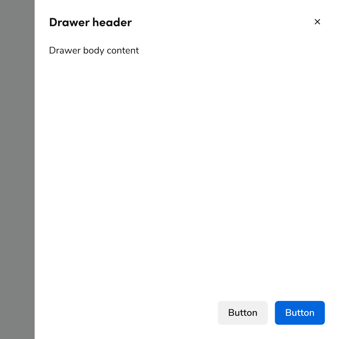
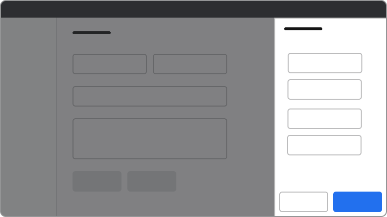
The Drawer consists of five primary elements that work together to slide content onto the page from the right.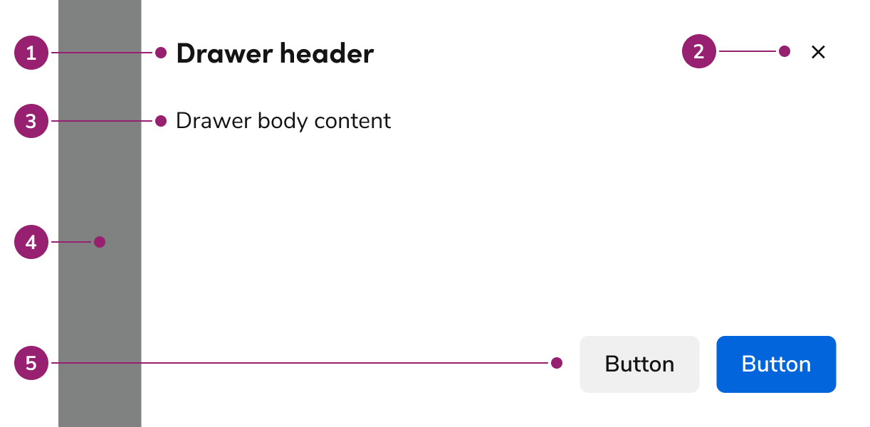
- Header
- Close action
- Body content
- Backdrop
- Footer actions
Options
The Drawer supports flexible content, footer actions, and sizing configurations to accommodate various flyout scenarios.Body content
Drawer supports any type of content in the body.Footer actions
Drawer supports several types of action groupings. These typically include one primary action and may include elements such as links or destructive actions.Sizing
Drawer supports 4 sizing options: small, medium (default), large, and extra large.| Sizing | Width | Height |
|---|---|---|
| Small | 22.5rem / 360px | 100% |
| Medium (default) | 35rem / 560px | 100% |
| Large | 48rem / 768px | 100% |
| Extra Large | 70rem / 1120px | 100% |
Behavior
The Drawer responds to content overflow and scrolling requirements while maintaining focus management.Overflow handling
Header and footer content in Drawer wraps rather than truncates. Footer actions support custom overflow behavior when needed.Scrolling
The body region of Drawer scrolls when space is not available. The footer can be configured to scroll with the body but is typically sticky.Usage Guidelines
When to Use
Use Drawer to show information or a task without navigating to another page.Consider placing content on-page over a Drawer
Directly integrating content that would be in a Drawer on the page allows users to continue to both see and interact with the rest of the content on the page.When not to use
Don’t use for exclusive, essential flows
Drawers should not be used for steps essential to a flow. The exception is if the Drawer is acting as a supplemental, redundant place for those steps.Don’t use to communicate page errors
Using a Drawer to convey errors is an anti-pattern. It requires a user to actively remember its contents once the Drawer is closed. See the error pattern for alternatives.Don’t use to confirm actions
Use the Dialog for confirmations instead.Alternatives
Drawer vs Dialog
| Dialog | Drawer | |
|---|---|---|
| Complete a secondary task | Simple, one step tasks | 1-3 steps at most. Tasks with more steps should be on a separate page |
| Display additional information related to the context in the main page | Yes, ideal for short content | Yes, ideal for longer, more complex information |
| Confirm user actions | Yes | No |
How to Use
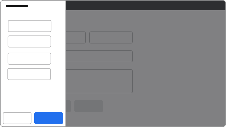
Position the Drawer on the right
Drawers always appear on the right side of the page.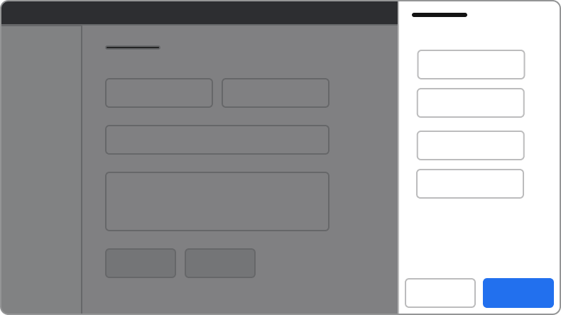
Do
Don’t
Always use a backdrop
The backdrop reinforces the focused nature of Drawer and prevents de-synced states. If side content must not have a backdrop, integrate the content directly on the page instead.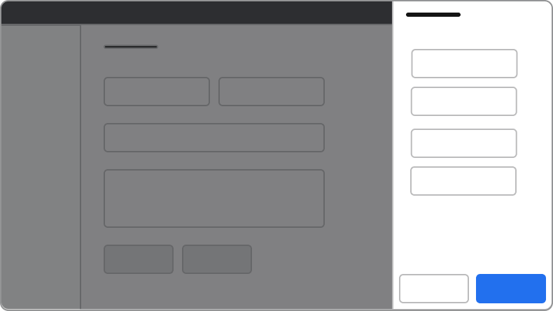
Do
Don’t
Always extend the Drawer to the screen’s full height
Drawers will always extend to 100% the height of the browser window. Don’t offset the Drawer to fit below other elements on the page.Do
Don’t
Dialogs on top of Drawers
Avoid stacking overlay elements. A confirmation message through a Dialog is an exception. If a confirmation Dialog is needed within a Drawer, use an alternative to Drawer.Content
Content within the Drawer should be clear, organized, and support the task or information being displayed.Keyboard Interaction
Users can navigate the Drawer using standard keyboard controls.| Key | Interaction |
|---|---|
| Tab | Cycles through tab-able elements within the Drawer |
| Escape | Closes the Drawer |
Accessibility
Focus management
There are a few different things to keep in mind with the Drawer’s focus behavior.Trap focus within the Drawer
By default, the Drawer will trap focus within itself. Elements outside of the Drawer would not be accessible by keyboard.First focus management
What elements Drawer focuses on open depends on a few factors:- If the body content has a focusable element, Drawer focuses on the first of these elements.
- If the body does not have a focusable element, the following is the preferred first-focus element:
- With no actions at all, focus first on the close action.
- When a primary action exists, focus first on the primary action.
- When a primary destructive action exists, focus first on the secondary cancel action.