Anatomy
The Number Field consists of seven primary elements that work together to accept numerical input.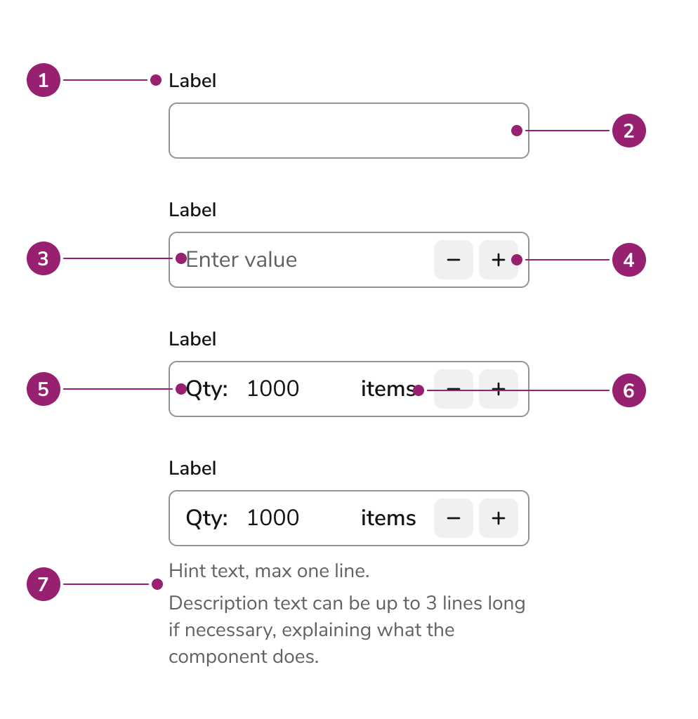
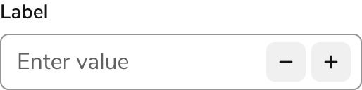
- Label
- Field
- Placeholder
- Increment/Decrement buttons
- Prefix
- Suffix
- Helper texts
Options
The Number Field supports the following configurations to accommodate various numerical input scenarios.Sizes
| Size | Height |
|---|---|
| Small | 2rem (32px) |
| Medium (default) | 2.5rem (40px) |
| Large | 3rem (48px) |
Prefix
Suffix
Behavior
The Number Field responds to user interaction with distinct visual states and flexible width behaviors.Overflow
For long number entries, the content within a Number Field will scroll horizontally. The visible portion of the text will automatically follow the cursor, ensuring the user can always see what they’re typing.Visual States
Widths
Number Fields should generally be sized to the expected length of the value a user will enter. Unless a specific width is set, the field will automatically fill all available horizontal space.Usage Guidelines
Use the Number Field when accepting numerical input that doesn’t have a dedicated component.When to Use
Number Field is the standard component for any numeric input that doesn’t have a dedicated component. It’s designed for general-purpose numeric values and allows you to use decimals, define step values, and set boundary limits. Use it for:- Quantity: The number of items, for example.
- Measurements: Values for height, weight, or distance.
- IDs and Codes: Numerical identifiers, such as account numbers.