Anatomy
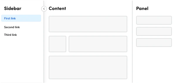
The Page consists of five primary elements that work together to create page layouts in Anvil2.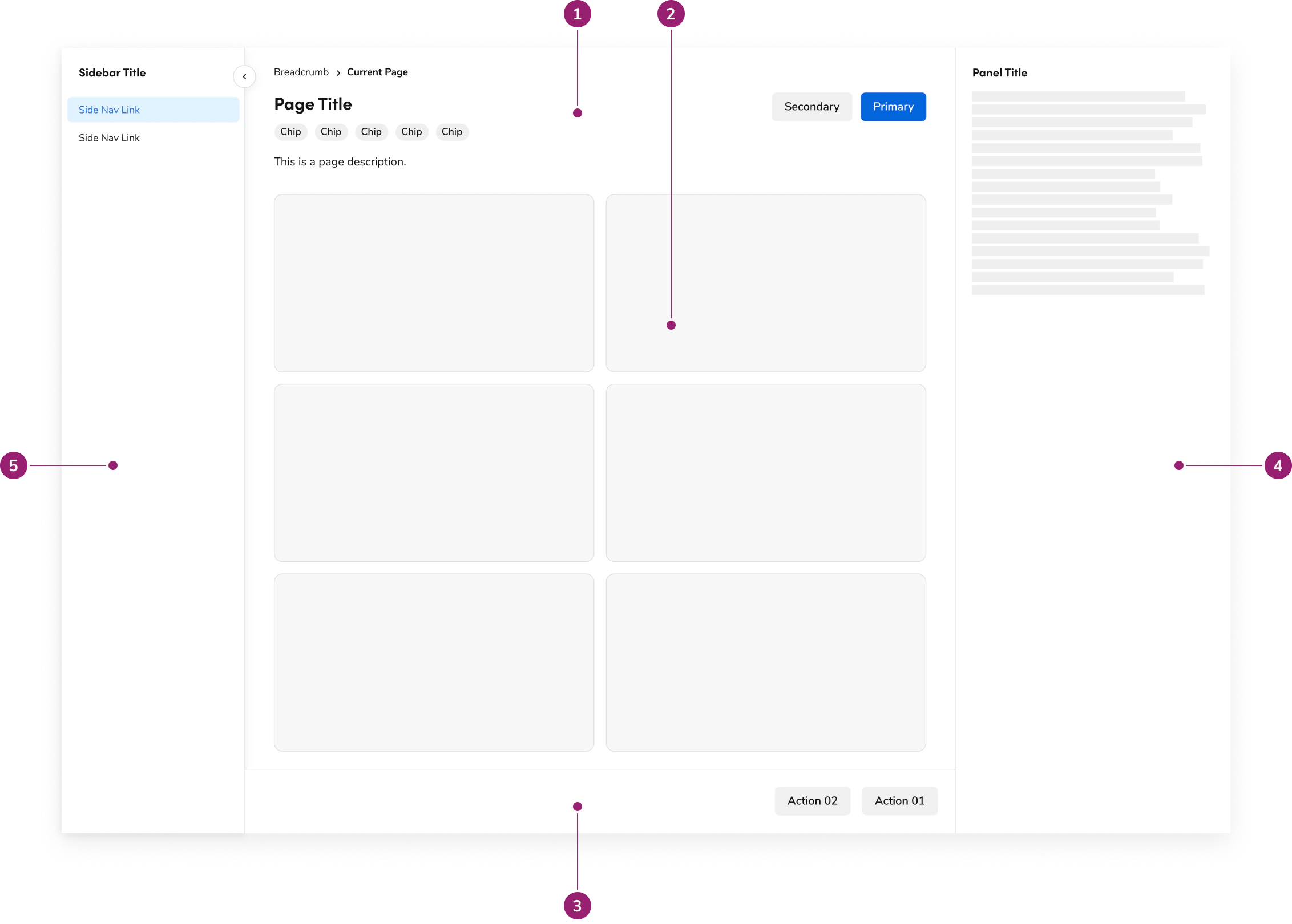
- Header
- Main content
- Footer
- Panel
- Sidebar
Options
The Page supports the following configurations to accommodate various page layout scenarios.Header
Title
With description
With breadcrumb
With chips
With actions
Main content
The main content area handles your primary content and, on its own, doesn’t have any specific options. You’ll always use it with a Layout component to get that consistent design you’re looking for. Plus, its padding dynamically adjusts based on available space for the best experience.Footer
The Footer is designed as a sticky element, ensuring it’s always at the bottom of your page’s main content for a consistent user experience. Keep in mind, it doesn’t come with any individual options.Panel
The Panel offers two distinct choices: a persistent option and a toggleable option. Each is designed for different use cases and should be implemented according to specific guidelines. It’s also important to note that the Panel behaves differently based on responsiveness.Sidebar
The Sidebar itself doesn’t have individual options, but you can configure its openness. This is done by using its own state, which is stored with alocalStorageKey. It’s designed specifically to house SideNav components.
Behavior
The Page responds to different screen sizes with responsive behaviors for header, panel, and sidebar while maintaining consistent layout structure.Header responsiveness
The Header is designed to conform to the width of your page content, typically using amax-width of 1280px or a fluid setting from the Layout component. It will always fit within the padding provided by the Page component.
On larger screens, if content overflows, each section of the header will wrap as needed, but this happens after reaching a maximum of 6 columns.
Panel responsiveness
The Panel behaves differently in responsive mode depending on the option you choose. In persistent mode, the Panel moves below the main content, becoming a sequential part of the flow. However, in toggleable mode, its content shifts into a Dialog that appears on top of the page.Sidebar responsiveness
On smaller screens, the Sidebar adapts by transforming into a dropdown that appears at the top of the page.Usage Guidelines
Use the Page as the foundation for all ServiceTitan application pages.When to Use
The Page component is the foundation for all ServiceTitan application pages, ensuring a unified look and feel across the entire platform. With built-in features like a collapsible Sidebar for SideNavigation, and both toggleable and persistent panels, it gives you the functions needed to create robust applications while maintaining that consistent, unified design.Header
The PageHeader component is a required element for all ServiceTitan application pages with a header. It was created to eliminate inconsistencies and ensure a uniform appearance. At its core, the PageHeader requires a title. However, it also includes various features to cover common use cases, such as:- A description to provide additional context.
- Breadcrumbs for easy navigation.
- Chips to display statuses.
- Action sets to house primary and secondary page actions.