Anatomy
The Side Nav consists of five primary elements that work together to display a list of links to move between pages.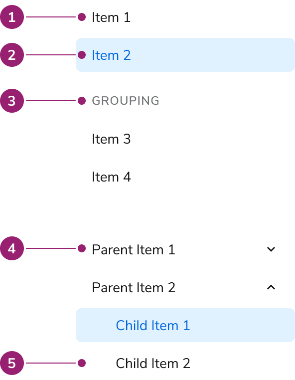
- Item
- Selected item
- Group section
- Collapsible parent item
- Nested item
Options
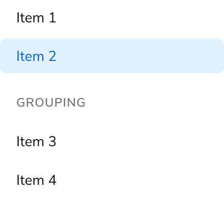
The Side Nav supports flat list, grouping, and collapsible configurations to accommodate various navigation scenarios.Flat List
Grouping
Collapsible
Parent items are purely accordions, and are not links themselves.Behavior
The Side Nav responds to user interaction with distinct visual states and text overflow handling.Visual States
Text Overflow
Each item in the Side Nav will wrap when not enough space is available.Usage Guidelines
Use the Side Nav to display a list of links for moving between pages.When to Use
Use the Side Nav based on how the larger app organizes its navigation structure. In some cases this means the Side Nav is the top-level navigation tool, in others it may be a secondary system.Use a collapsible Side Nav when users understand the hierarchy
Use a collapsible Side Nav when users understand the categorization, helping them find items more effectively. Avoid this structure if there’s no clear parent-child relation in the nav, especially if users cannot perceive it.Use a flat Side Nav for fewer or semi-related items
Use a flat Side Nav when items in a group lack a clear hierarchy. A flattened Side Nav is easier for users to navigate in this situation.Alternatives
Side Nav vs Tab
Side Navs and Tabs perform similar tasks of organizing content. In most situations, Side Navs are a higher level of the navigation structure compared to Tabs. Side Navs are also able to organize less related items together compared to Tabs.How to Use
Pair subheaders and collapsible in complex navs
Navigations with nuanced levels of hierarchy can use both subheaders and nesting at once. Simpler navigations should consider using only one grouping method.Parent nav items can only be collapsible actions
The Side Nav’s parent item can never be a link. If a parent item link is needed, a child item at the top may be used in its place, e.g., Overview.Don’t use multi-nested Navs
The Side Nav does not support deep navigation. Simplify the navigation structure first. If it cannot be simplified, a custom solution is needed.Don’t
Don’t add secondary actions
The Side Nav does not support secondary actions for accessibility reasons. Consider placing these actions elsewhere, such as on the page the Side Nav item goes to.Don’t
Showing metadata with Chips
A Chip can be paired with the Side Nav. It can be used to provide metadata such as beta or new status, or a numerical value related to the Side Nav item.Content
Content within the Side Nav should clearly communicate navigation destinations through descriptive labels.Keyboard Interaction
Users can navigate the Side Nav using standard keyboard controls.| Key | Interaction |
|---|---|
| Down Arrow | Moves focus to next item |
| Up Arrow | Moves focus to previous item |
| Enter or Space | Selects item, expands/collapses. Focus stays on that item. |