Anatomy
The Segmented Control has three elements that work together to switch the presentation view of current or filtered content.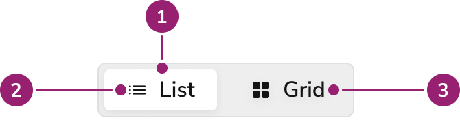
- Selected segment
- Icon
- Label
Options
The Segmented Control supports multiple sizes, fill options, and icon configurations for different use cases.Sizes
Fill
By default, Segmented Control will hug its content. But it can also fill available width.Icons
Place icons before the segment’s text label, or use them to replace the text label as an icon-only segment. Use icon-only segments with Tooltip to provide an accessible label.Behavior
The Segmented Control responds to user interaction with distinct visual states and selection behaviors.Visual States
Default
Default segments do not have a focus-visible state because only the selected segment receives focus.Selected
Selected segments do not have hover or active states because users cannot interact with them when selected.- Only one segment remains selected at all times
- At least one segment remains selected at all times
Focused
Only the selected segment receives focus.Usage Guidelines
Use the Segmented Control when switching the presentation view of current or filtered content.When to Use
Use Segmented Control for 2-5 selections. Currently it lacks native overflow handling, so test for mobile responsiveness when using this component.Alternatives
Segmented Control vs Radio
Radios are form controls that users must explicitly submit. Use Segmented Controls for selections that affect the UI immediately.Segmented Control vs Tab
Segmented Control allows users to change the presentation format of displayed content or to filter it. Tabs change the view to show new content.How to Use
Switching presentation mode
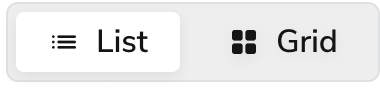
Use Segmented Control to toggle between different presentation modes such as grid vs list.Filtering content
Use Segmented Control to filter data into segments, providing users with a smaller set of data to engage. Including a number helps indicate how many items are in each filtered segment.Sorting content
Use Segmented Control to allow users to sort a list or display by different criteria (e.g., “Newest,” “Oldest,” “Most Popular,” “Alphabetical”). The core content remains the same, but its order changes.Switching Data Granularity/Time Ranges
Use Segmented Control to toggle between different temporal views of the same data or different interpretations of the same data. Another example includes switching between a percentage (%) or dollar amount ($).Toggling Sub-Categories
Use Segmented Control when a section has closely related, but distinct, sub-sections.Selecting an Option in a Form
Use Segmented Control for a small number of mutually exclusive choices within a form. It provides a visually appealing and efficient alternative to traditional radio buttons, especially when space is a concern.Content
Use labels and icons to clearly communicate each segment option.Keyboard Interaction
Users can navigate the Segmented Control using standard keyboard controls.| Key | Interaction |
|---|---|
| Arrow Right | While focused, selects the Segment on the right |
| Arrow Left | While focused, selects the Segment on the left |
Accessibility
- Icon-only segments require an accessible name via
aria-labeloraria-describedby.