Anatomy
Select Trigger consists of two primary elements that work together to display and manage selections.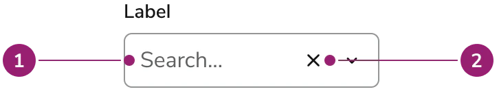
- Trigger - Identifies the field and its purpose
- Clear button (Optional) - Removes all selections when clicked
Options
Select Trigger supports the following configurations to accommodate various selection scenarios.Single and multiple selection
Select Trigger supports both single and multiple selection modes. In single selection mode, the component displays the selected item as text. In multiple selection mode, selected items appear as Chips that users can remove individually.Opening of custom overlays
Clicking the Select Trigger’s input area opens up a custom overlay element. This is typically a Dialog. This is not explicitly part of the Select Trigger, an implementor will need to customize what content is in the overlay component.Field properties
Field properties follow the same options as the Combobox. This includes, but not limited to, field sizes, prefixes, suffixes, Chip color customization, and max rows.Behavior
Select Trigger responds to user interaction with distinct visual feedback while maintaining consistent interaction patterns.Selection display
Selected items appear as Chips in multiple selection mode. Each Chip includes a close button that removes that specific item. The component displays a placeholder when no items are selected.Clear selection
A clear button appears when items are selected, allowing users to remove all selections at once. The clear button is hidden when the component is disabled or read-only, or whendisableClearSelection is set to true.
Usage Guidelines
Use Select Trigger when you need to display selections in a field-like component without using a Popover, especially for complex selection scenarios that require Dialog interfaces.When to Use
Use Select Trigger when you need:- Complex selection interfaces that require Dialog components
- Selection scenarios with secondary actions, tabs, or multiple steps
- Selection interfaces that need more space than a Popover provides
- Integration with components like ListView, CheckboxGroup, or custom selection UIs
When not to use
Avoid using Select Trigger when:- Simple selection needs - Use Combobox for basic single or multiple selection with a Popover
- Dropdown or Popover selection - Use Combobox instead.
- No selection interface needed - Use TextField if you don’t need a selection interface
Alternatives
Select Trigger vs Combobox
Combobox provides a complete selection interface with a Popover, including search and filtering capabilities. Use Combobox for standard selection scenarios. Use Select Trigger when you need a Dialog for complex selection interfaces with tabs, secondary actions, or custom layouts.Select Trigger vs Select Field
Select Field displays options in a built-in Popover or Dialog with integrated search and filtering. Select Trigger opens a custom overlay — typically a Dialog — that the implementor fully controls.How to Use
Basic multiple selection
Use Select Trigger with a Dialog containing a ListView or CheckboxGroup for selection. Maintain separate state for the Select Trigger’s selected items and the Dialog’s temporary selection state. Use Select Trigger with Dialog for complex selection scenarios that require more space and flexibility than a Popover.Selection with secondary actions
Use Select Trigger with Dialog when selection items need secondary actions like editing or additional information. Use Select Trigger with Dialog when selected items require secondary actions or additional context.Tabbed selection interface
Use Select Trigger with Dialog containing Tabs to organize selection options, such as showing all items in one tab and selected items in another. Use Select Trigger with Dialog containing Tabs to organize complex selection scenarios with multiple views.Content
Content within Select Trigger should clearly communicate the selection state and provide appropriate labels and hints.Labels and hints
- Use clear, descriptive labels that explain what users are selecting
- Provide hint text when the selection behavior or options need clarification
- Use required indicators when selection is mandatory
- Include moreInfo content when additional context is helpful
Placeholder text
- Use placeholder text to guide users on what to select
- Keep placeholder text concise and actionable
- Avoid using placeholder text as the primary instruction
Keyboard Interaction
Users can navigate Select Trigger using standard keyboard controls.| Key | Description |
|---|---|
| Tab | Moves focus to the Select Trigger input area |
| Enter | Opens the selection interface (Typically a Dialog) |
| Space | Opens the selection interface (Typically a Dialog) |