Anatomy
The Switch consists of three primary elements that work together to toggle between two states.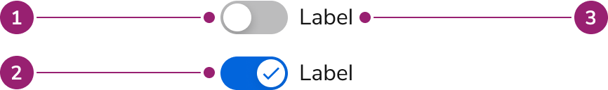
- Unselected
- Selected
- Label
Options
The Switch supports label and selection configurations to accommodate various toggle scenarios.Label
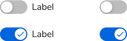
Selection
Behavior
The Switch responds to user interaction with distinct visual states for different selection states.Visual States
Default

Selected

Disabled

Usage Guidelines
Use the Switch when allowing users to choose between two mutually exclusive options with immediate results.Alternatives
Switch vs Checkbox
Switches are used for making a selection between two mutually exclusive options and have an immediate effect. Checkboxes allow users to make zero to many choices from available options and changes are not immediate.Switch vs Radio
Where the Switch is used to toggle between two options, Radio buttons can be used to choose from two or more options. Additionally, a Switch is primarily used for enabling or disabling features or settings and has an immediate effect. Radio buttons are common in form layouts when selecting between multiple options.Switch vs Checkbox vs Radio
Radio buttons are used to select a single option from a set of mutually exclusive options. Checkboxes are best used to make zero to many selections from available options.| Checkbox | Switch | Radio | |
|---|---|---|---|
| When is the selection executed? | After a user clicks a submit button | Immediately | After a user clicks a submit button |
| How many options are available? | 1 or more | 1 | 2 or more |
| Must an option be reducible to an on or off context? | No, it can be other things. | Yes | No, it can be other things. |
| If I had a group of this UI, what is the relation of each item in the group? | Independent of each other | Independent of each other | Mutually exclusive |
| Indeterminate state possible? | Yes | No | No |
How to Use
Labels
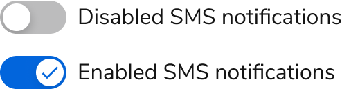
Switch labels should describe the effect when the Switch is “on,” e.g., “Enable notifications”. The text label for a Switch should never change based on the state of the Switch. For example, you would not change a label from “Enabled” to “Disabled” or vice versa. Additionally, a Switch can also have no label when the context of what it turns on or off can be clearly understood. A tooltip can also be applied to describe the toggle’s current state.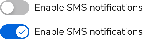
Do
Don’t
Immediate Effect
Switches should have an immediate effect when its state changes and not require a save action.
Do

Don’t
Form usage
Assuming that your Switch still matches the pattern of an off/on, it can be used in a Form to disclose additional options.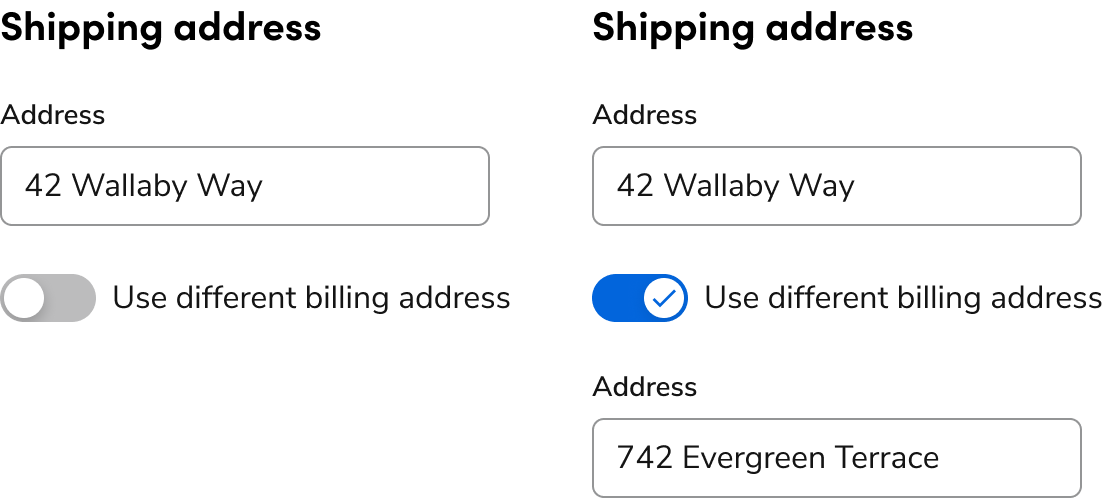
Content
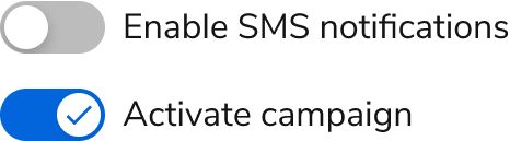
Content within the Switch should clearly communicate the effect when the Switch is turned on.Give a descriptive, direct label
The toggle switch label should describe what the control does when it is turned on. Rule of thumb: say the label name and add an “on/off”. Use sentence case (capitalize only the first word and proper nouns) so control labels are easy to scan. Do not use periods for short phrases or single sentences.
Do
Don’t
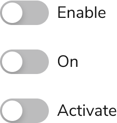
Positive label wording
Labels in general should be positive. Since the label and Switch are generally thought of as turning something on, labels should reinforce this. Examples include: “Show”, “Hide”, “Activate”, “Group [by]”, “Track”, and “Activate”. Negative labeling can be used with caution, if it makes sense to a user to perform a negative action.
Do

Don’t
Give the user the information they need to make an informed decision
When a toggle switch label does not provide sufficient information and context for users to make an informed decision about the option, use inline help. Inline help is the best option for this situation because it requires no user interaction and is always visible. Keep inline help to 1-2 sentences. Use the content guidelines for inline help. Avoid using a tooltip to communicate this kind of information about an option. It’s an additional step for users to mouse over the tooltip to reveal its information, and users can’t refer to the tooltip content and take action at the same time.
Keyboard Interaction
Users can navigate the Switch using standard keyboard controls.| Key | Description |
|---|---|
| Space | Enables or disables the selected Switch |
Accessibility
The label should clearly describe the Switch intentSwitch Labels
Don’t