Color Guidelines
Our Principles
Use our experience principles to help guide your thinking of color as you’re designing:
Intentional use of color allows a user to focus on the task at hand, achieving business goals quicker. Prescriptive color use helps users understand what to expect when seeing and interacting with certain hues. This consistency helps users navigate the product with ease.

Tailored use of color ensures that the colors in the UI do not compete with each other. Color throughout the UI is integrated, creating a connected visual system, helping users easily recognize important elements, reducing confusion, and making navigation more intuitive.

Color choices have an intentional hierarchy and clear point of view. Users are efficiently guided to the most important aspect on every page.

As designers, we use color when and where it makes the most sense and avoid using color in situations where it does not provide meaningful value.

Consistent color use in the product creates a trustworthy experience as our user’s navigate throughout. Our user’s can trust that the software call’s their attention accordingly.

As our product evolves quickly, the color system in our UI is easy to adjust for quick updates to meet industry, customer, and design trends without disrupting the larger design system.

When we use intentional color guided by our principles above, the outcome is a polished, professional UI.
Purposeful
Our palettes are used to convey meaning to the information they present.Brings Attention
Color, when used with purpose and sparingly, brings attention to the important elements in the UI.
Functional vs Decorative Color
There are two types of color in the product: functional color and decorative color. Functional color is the color we mainly see in the UI, color that has meaning and communicates meaning to our users. This color use in the product should be accessible, intentional, and impactful. The consistent use of color throughout conveys stability, builds trust, and reinforces reliability of our product. Decorative color should be used carefully and sparingly. A rule of thumb for decorative color is that it can be swapped to any color and the meaning and impact would not change. When designing with decorative colors, less is more. They shouldn’t compete with functional color. As designers, we have the responsibility to use color in an intentional way to guide our users to the most important aspects of the product. Color use is a delicate balance, as too little color creates a one dimensional experience, and too much color causes confusion and increases cognitive load. Functional color example: Toast message
Accessibility and Contrast
Colors should be readable and supplement the presentation of information. Learn more about Color Accessibility When using color, it is required to meet minimum contrast ratios with text and background colors. At minimum, text contrast should meet the WCAG 2.2 AA Large guidelines (4.5:1).Do
Don’t
Semantic Colors
Foreground Colors
Background Colors
Border Colors
Status Colors
Interaction States
Hover
Hover states are typically one shade lighter on dark background colors, and one shade darker on light background colors.Focus
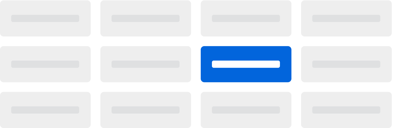
A blue border is typically used to indicate focus states.Active
A button is in it’s active state when it’s being pressed. The treatment is to give it a darker or lighter shade depending on appearance.Disabled
In general, disabled states typically utilize neutral colors with a 40% or 60% opacity applied to the element.Emphasis
Emphasis is a design tool we use to highlight hierarchy and importance with hues. When deciding on which color to use, think about the hierarchy of the element you are looking to highlight. If the element is of high importance, you’ll want to use a color of high contrast and emphasis. If the element is of low importance, pick a color of less prominence and contrast. To select a color for high emphasis, use a color in the 500 or 600 color ramp.To select a color for medium emphasis, use a color in the 200-400 color ramp.
To select a color for low emphasis, use a color in the 100 color ramp. High emphasis examples Medium emphasis examples Low emphasis examples