Beta FeatureThis feature is currently in beta, and needs to be imported from
@servicetitan/anvil2/beta.While we hope to minimize breaking changes, they may occur due to feedback we receive or other improvements. These will always be documented in the changelog and communicated in Slack.Please reach out in the #ask-designsystem channel with any questions or feedback!Anatomy
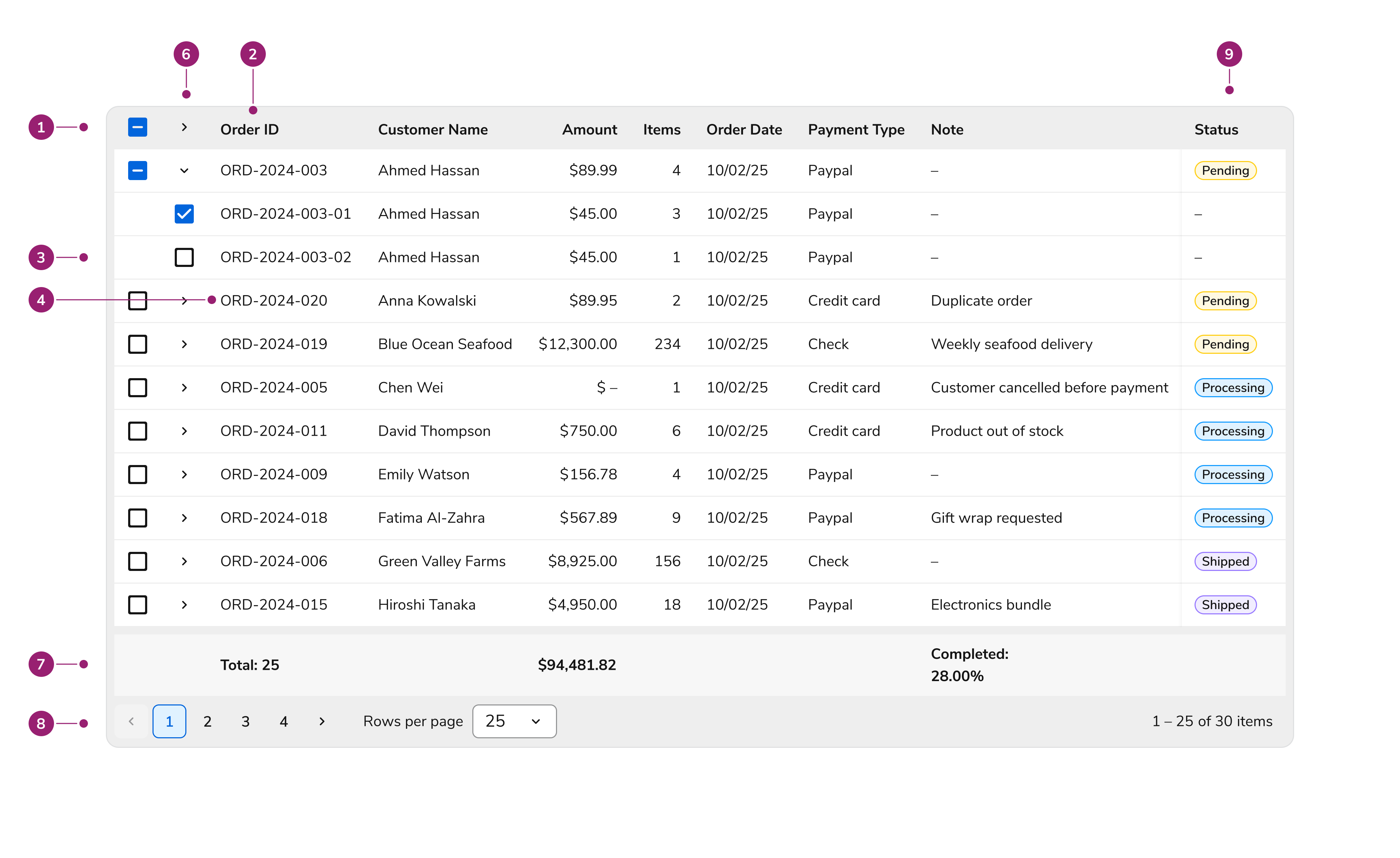
- Header row – Contains column labels with optional sort indicators
- Header cell – Individual column header with label and optional sorting control
- Body rows – Data rows containing cell content
- Body cells – Individual data cells with formatted content
- Selection column – Optional checkbox column for row selection
- Expansion column – Optional expand/collapse control for sub-rows or sub-components. Shifts with content
- Footer row – Optional summary or aggregate data
- Pagination controls – Navigation for paginated data sets
- Pinned/locked column – Column that stays in place as user scrolls
Options
Sortable Columns
Enable sorting on columns to let users click the header and sort data in ascending or descending order. A sort indicator shows the current sort direction. Clicking a sortable column header cycles through: ascending → descending → unsorted. Only one column can be sorted at a time.| Sort State | Indicator |
|---|---|
| Ascending | Arrow up |
| Descending | Arrow down |
| Unsorted | No indicator |
Resizable Columns
Columns can optionally be made resizable. When this is turned on, users can resize columns by dragging the column border. Configure minimum and maximum widths to constrain resizing.Pinned Columns
When tables have many columns requiring horizontal scroll, pin essential columns (like row identifiers or action columns). Pinned columns stay in place during horizontal scrolling, keeping important data visible.| Pinning | Behavior |
|---|---|
| Left | Column sticks to left edge during horizontal scroll |
| Right | Column sticks to right edge during horizontal scroll |
Grouped Columns
Group columns under a parent header to create a two-level header structure. Use this to organize related data. Please note that grouped columns cannot be pinned.Pagination
When enabled, pagination controls display at the bottom of the table showing:- Current page range (e.g., “1-25 of 100”)
- Navigation buttons for first, previous, next, and last page
Cell Types
The DataTable provides the following cell types:| Image | Type of Cell | Alignment |
|---|---|---|
 | Actions cell | Left |
 | Cell with chip/chips | Left |
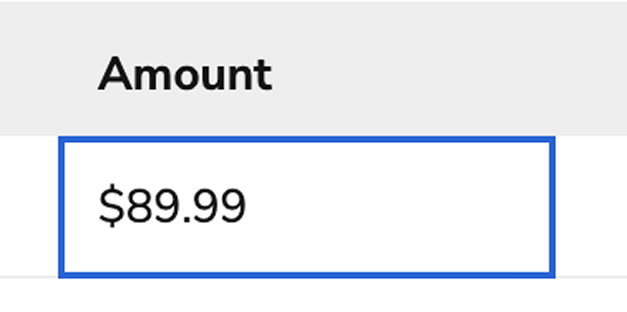
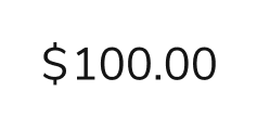 | Cell with currency | Right |
 | Custom cell | Left |
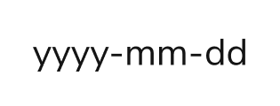 | Cell with date | Right |
 | Cell with date-time | Right |
 | Empty cell (used to represent an empty or missing cell value) | Left |
 | Cell with number | Right |
 | Cell with percentage | Right |
 | Cell with text | Left |
 | Cell with time | Right |


Behaviors
Editing
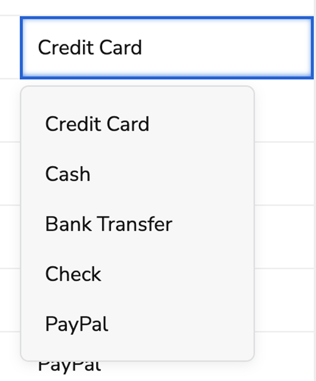
Columns can be made editable, which enables edit on hover per cell.Row Selection
When selection is enabled, a checkbox column appears as the first column. Users can select individual rows or use the header checkbox to select all visible rows.| Selection State | Appearance |
|---|---|
| Unselected | Empty checkbox |
| Selected | Checked checkbox |
| Indeterminate | Dash in checkbox (headers only, when some rows selected) |
Row Expansion
Expand rows to show additional content in two ways:- Sub-rows: Nested rows with the same column structure as the parent
- Sub-components: Custom content rendered below the parent row
Visual States
Header Cell States

| State | Description |
|---|---|
| Default | Normal header appearance |
| Sorted (ascending/descending) | Indicates active sort with direction indicator |
Body Cell States

| State | Description |
|---|---|
| Default | Normal cell appearance |
| Focused | Focus ring when cell is keyboard-focused |
| Edit hover | Pencil icon visible to demonstrate an editable cell |
| Editing | Input or dropdown visible for editable cells |
Error States
DataTable supports two types of error indicators to highlight validation issues:| Error Type | Description |
|---|---|
| Cell error | Error icon and styling on individual cells with validation issues |
| Row error | Error icon in the first column indicating row-level issues |
When setting errors, prefer using a descriptive string message over simply marking the cell or row as having an error. Messages provide accessible context that screen readers announce, helping all users understand why a cell or row is in an error state.
Warning States
DataTable supports two types of warning indicators for non-blocking advisory issues:| Warning Type | Description |
|---|---|
| Cell warning | Warning icon and styling on individual cells with advisory issues |
| Row warning | Warning icon in the first column indicating row-level advisory issues |
When both an error and a warning exist on the same cell or row, the error takes priority and the warning is not displayed. Errors represent blocking issues that must be resolved, while warnings are advisory.
When setting warnings, prefer using a descriptive string message over simply marking the cell or row as having a warning. Messages provide accessible context that screen readers announce, helping all users understand why a cell or row is in a warning state.
Keyboard Interactions
Users can navigate the DataTable using the following keyboard controls:| Key | Interaction |
|---|---|
| Tab | Move focus between interactive elements |
| Arrow Up/Down | Navigate between rows when focused on table |
| Arrow Left/Right | Navigate between cells in a row |
| Space | Toggle row selection (when on checkbox) |
| Enter | Activate sort (on header), enter edit mode (on editable cell) |
| F2 | Enter edit mode for editable cells |
| Escape | Exit edit mode, discard changes |
Accessibility
The DataTable implements accessibility features to ensure all users can interact with tabular data effectively:- Proper semantic HTML table structure (
table,thead,tbody,tr,th,td) - ARIA attributes for row and column counts
- Sortable headers announce sort state to screen readers
- Selection checkboxes include descriptive labels
- Expand/collapse buttons include
aria-expandedandaria-controls - Loading states announced via
aria-liveregions - Focus management maintains logical keyboard navigation
- Editable cells announce their editable state
Usage Guidelines
When to Use
Use the DataTable when displaying structured tabular data that requires any of the following:- Sorting – Users need to reorder data by different columns
- Pagination – Data sets are too large to display all at once
- Row selection – Users need to select rows for batch operations
- Row expansion – Additional details need to be shown for individual rows
- Inline editing – Users need to modify cell values directly
- Column pinning – Key columns should remain visible during horizontal scroll
When Not to Use
Avoid using DataTable in these scenarios:Column Organization
Do
Don’t
Batch Operations
Use row selection when users need to perform batch operations on multiple rows, such as:- Bulk delete
- Bulk status changes
- Export selected items
Do
- - Provide clear feedback about how many items are selected
- - Use the selection state to enable/disable batch action buttons
- - Consider providing a “Select All” option in the header
Don’t
- - Enable selection without providing actions that use the selection
- - Hide the selection column after users have made selections
Sorting
Enable sorting only on columns where it provides value to users.Do
- - Enable sorting on text columns users might want to alphabetize
- - Enable sorting on numeric columns for ranking or comparison
- - Enable sorting on date columns for chronological ordering
- - Provide default sorting when the data has a natural order
Don’t
- - Enable sorting on columns with identical values
- - Enable sorting on complex composite columns where sort order isn’t intuitive
Pagination
Choose Appropriate Page Sizes
Do
- - Use 25 rows as the default
- - Enable users to change page size with Pagination
- - Match page size to typical use cases (smaller for quick scans, larger for detailed review)
Don’t
- - Use very small page sizes (like 5 or 10) that require excessive navigation
- - Use very large page sizes that cause performance issues
Row Expansion
Sub-Rows vs Sub-Components
| Use Sub-Rows | Use Sub-Components |
|---|---|
| Child data has same structure as parent | Child content differs from table structure |
| Hierarchical data relationships | Detail views, additional context |
| Grouped data (e.g., items in an order) | Custom layouts (tabs, forms, lists) |
Keep Expanded Content Focused
Do
- - Show only relevant additional information in expanded areas
- - Keep expanded content scannable and organized
Don’t
- - Put entire page layouts in expanded rows
- - Require users to expand rows to see essential information
Custom Body Cells
When none of the existing body cell types fit a use case, render custom components to body cells.Alternatives
DataTable vs ListView
| DataTable | ListView |
|---|---|
| Structured columns with headers | Single-column list of items |
| Built-in sorting by columns | No built-in sorting |
| Pagination for large datasets | Typically shows all items |
| Row selection with checkboxes | Item selection with checkboxes |
| Best for complex data relationships | Best for simple lists of actions or selections |