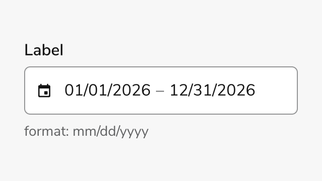
Anatomy
Date Field Range consists of six primary elements that enable users to select a start and end date through a single input field with calendar picker support.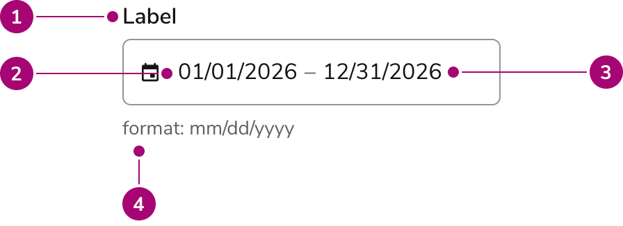
- Label - Identifies the field and its purpose
- Start date input - Text input for manual start date entry with format mask
- End date input - Text input for manual end date entry with format mask
- Helper text (Optional) - Description, format hint or error message
Options
Date Field Range supports the following configurations to accommodate different use cases and regional preferences.Date Format Modes
Date Field Range supports two date format modes to match regional conventions. The default format ismm/dd/yyyy for US audiences, while dd/mm/yyyy is available for international users.
| Mode | Format | Use Case |
|---|---|---|
| mm/dd/yyyy | Default | US date format |
| dd/mm/yyyy | Optional | International date format |
Sizes
Three size options accommodate different layout densities and visual hierarchies.| Size | Height |
|---|---|
| Small | 32px |
| Medium | 40px |
| Large | 48px |
Behavior
Date Field Range responds to user interaction with distinct visual states and validation feedback.Visual States
The component displays different visual states to communicate field status and interactivity. Default state shows the field ready for input. Focus state highlights the active field. Error state displays validation messages when date ranges are invalid, start dates are after end dates, or required fields are empty. Disabled state prevents interaction while maintaining visual context.Calendar Interaction
Clicking the input field opens a popover calendar. Users can navigate months and select date ranges directly from the calendar. The calendar highlights the selected range and closes automatically after both dates are selected. Selected dates populate the input field with a separator between start and end dates.Validation
Date Field Range validates input in real time. The component checks for parseable dates, required field completion, date constraints (min/max dates), unavailable dates or days of the week, and logical range validation (start date must be before or equal to end date). Error messages appear below the field when validation fails.Usage Guidelines
When to Use
Use Date Field Range when you need to:- Capture a date span with both start and end dates
- Provide calendar visual context for range selection
- Support both manual entry and visual selection
- Validate date ranges against constraints like minimum or maximum dates
When not to use
Avoid using Date Field Range for:- Single dates - Use Date Field Single instead
- Recurring date ranges without year - Use Date Field Yearless Range for seasonal ranges or annual periods
- Time selection - Use Time Field for time-only inputs
Alternatives
Date Field Range vs Date Field Yearless Range
Use Date Field Range when the year is essential to the date range selection, such as project timelines or reporting periods. Use Date Field Yearless Range when the year is irrelevant, such as recurring seasonal periods or annual date templates.How to Use
Labeling and Range Validation
Provide clear, descriptive labels that communicate the purpose of the date range selection. Labels should indicate what the range represents and establish the relationship between start and end dates. Implement validation that ensures logical date ranges and provides immediate feedback when constraints are violated.- Write labels that clearly communicate the purpose of the date range selection
- Include format hints to guide users on expected input format
- Set appropriate date constraints (min/max dates) to prevent invalid selections
- Validate that start date is before or equal to end date
- Display validation errors immediately when they occur
- Use the calendar picker to provide visual range selection when helpful
Anti-pattern: Ambiguous Context and Invalid Ranges
Avoid creating confusion by omitting format guidance or allowing invalid date ranges without clear feedback.- Use Date Field Range for recurring annual periods where year doesn’t matter
- Omit format hints when the date format might be ambiguous to users
- Hide validation errors until form submission
- Allow start dates to be after end dates without clear error messaging
- Use placeholder text to show date format instead of format hints
- Create labels that don’t clearly indicate what date range is being selected
Content
Content within Date Field Range should be clear, concise, and actionable.- Labels should clearly indicate what date range is being selected
- Error messages should explain why a date range is invalid and how to fix it
- Format hints should match the selected mode (mm/dd/yyyy or dd/mm/yyyy)
- Descriptions should provide context without overwhelming the user
Keyboard Interaction
Users can navigate Date Field Range using standard keyboard controls.Input Field
| Key | Description |
|---|---|
| Tab | Moves focus to the next element |
| Shift + Tab | Moves focus to the previous element |
| Arrow Down | Opens the calendar picker when focused |
| Esc | Closes the calendar picker |
Calendar Picker
| Key | Description |
|---|---|
| Arrow Left | Moves focus to the previous day |
| Arrow Right | Moves focus to the next day |
| Arrow Up | Moves focus to the same day in the previous week |
| Arrow Down | Moves focus to the same day in the next week |
| Page Up | Moves focus to the same day in the previous month |
| Page Down | Moves focus to the same day in the next month |
| Shift + Page Up | Moves focus to the same day in the previous year |
| Shift + Page Down | Moves focus to the same day in the next year |
| Enter | Selects the focused date (for range selection) |
| Space | Selects the focused date (for range selection) |
| Esc | Closes the calendar picker |