Anatomy
The Icon consists of two primary elements that work together to act as visual aids.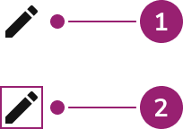
- Icon
- Bounding area
Options
The Icon supports multiple sizes, SVG support, and color configurations to accommodate various visual aid scenarios.Sizes
| Size | Height | When to use |
|---|---|---|
| Small | 12px | For high dense pages. Not recommended for interactive Icons. |
| Medium | 16px | Used within Buttons. |
| Large | 24px | For supplementing information on the page, such as status. |
| Extra Large | 32px | For low density, expressive pages. |
SVG support
Icon accepts SVGs. This typically involves using Anvil’s provided icon library but also supports custom SVGs.Color
Icons inherit a color provided to them. When providing a color, use a token value.Behavior
The Icon responds to different size and color requirements while maintaining consistent visual representation.Usage Guidelines
Use the Icon to enhance the understanding of a concept or in places where space is a premium.When to Use
Icons enhance the understanding of a concept. They also work well in places where space is a premium.When not to use
Avoid using Icons for the sake of having icons. Most icons have ambiguous meaning and result in confusion and an overwhelming visual design.How to Use
Provide a label for Icons
An Icon’s label takes two forms: as a text label next to an icon, or as a Tooltip. A text label is generally preferred as most icons do not have an obvious meaning.Do
Do
Do
Provide information without action
Icon provides indication for users and can be focused or hovered to convey more details. In these use cases, addtabIndex={0} to make icon focusable and use Tooltip with it.
Consistent icon usage
Consistent icon usage of status and actions brings familiarity. Use the standard that a product has adopted.Don’t
Use semantic token colors for Icons
When using color for Icons, use a semantic token value. This ensures an icon is both themeable and internally consistent with other UI’s color usage.Avoid custom icon resizing
Icons have a consistent set of dimensions. Resizing breaks the internal consistency and creates awkward vector scaling.Content
Content within the Icon should be clear and recognizable, helping users understand the concept being represented.Keyboard Interaction
Users can navigate the Icon using standard keyboard controls.Accessibility
Non-interactive Icons
Pair Icons with a text label when possible. When using an Icon without text, provide anaria-label to the Icon directly, describing what the icon is.
For more guidance on icon accessibility, see accessible icon usage best practices.