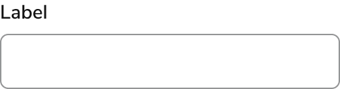
Anatomy
The Text Field consists of six primary elements that work together to allow users to enter custom strings of text.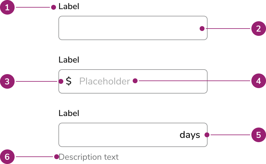
- Label
- Field
- Prefix
- Placeholder
- Suffix
- Description
Options
Text Field supports multiple sizes, prefix, suffix, description, and required configurations to accommodate various text input scenarios.Sizes
| Size | Height |
|---|---|
| Small | 32px |
| Default | 40px |
| Large | 48px |
Prefix
Text that can be used to clarify the format for the input. Most common use case is to represent a form of currency.Suffix
Suffixes are units of measurement, e.g., days, weeks, months, etc.Description
Descriptions provide information to help the user avoid errors.Required
A visual indicator applied to the label.Behavior
Text Field responds to user interaction with distinct visual states, flexible width behaviors, and overflow handling.Visual States
Widths
Text Fields should generally be as wide as the expected value entered. Unless specified, Text Fields will fill all available horizontal space.Overflow
If the text content within a Text Field is long, the content will scroll horizontally inside of the container. The visible portion of the content will follow the cursor within the container.Usage Guidelines
Use the Text Field when you want a user to type a single line of text. If you want to allow for multiple lines of text, use a Text Area.How to Use
Labels and Help
For guidance on labels and help text, check out our Labels and Help pattern.Text Field Validation
For form validation guidance, check out our Form Errors and Validation pattern.Content
Content within Text Field should clearly communicate the expected input through labels, prefixes, suffixes, and descriptions.Keyboard Interaction
Users can navigate Text Field using standard keyboard controls.Accessibility
- If a form field requires a specific format (e.g., state abbreviation), place that information in the label.
- Placeholder text is not a substitute for a label.