


Anatomy
Text Field consists of six primary elements that work together to collect a single line of text.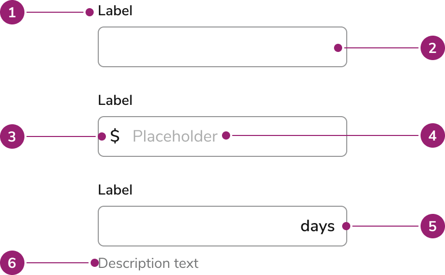
- Label - Names the field. A required field adds an asterisk and a screen-reader “Required”. An info button can follow the label when extra context belongs in a tooltip.
- Field - The single-line input. Focus draws a ring. An error turns the border critical. A loading spinner can sit inside the field, after the value.
- Prefix (Optional) - Short text before the value, such as @ on a username. It is visual only and is not announced.
- Placeholder (Optional) - A low-contrast prompt inside an empty field. It disappears as soon as the user types and does not replace the label.
- Suffix (Optional) - A unit or short marker after the value, such as “days”. It is visual only and is not announced.
- Messages (Optional) - Copy under the field. The diagram marks description. Messages stack in this order: hint, description, error, then warning. A character counter sits with those messages when the counter is enabled. Hint stays visible even when an error or warning is showing.
Options
Text Field supports the following configurations to fit different single-line inputs.Sizes
Medium is the default. Choose a size that matches the surrounding fields. Do not mix sizes in the same form group.
Prefix
Prefix shows a fixed marker before free text, such as @ on a username. Currency and other numeric amounts belong on a Number Field. Because the prefix is not announced, repeat that meaning in the label or hint.Suffix
Suffix shows the unit of the value, such as days, weeks, or months. Keep it to one short word or symbol. Repeat the unit in the label or hint so screen-reader users hear it.Hint, description, error, and warning
Hint is the persistent instruction. It stays on screen when validation messages appear. Description adds secondary context under the hint, such as who will see the value. Error marks the field invalid, turns the border critical, and states what to fix. Warning cautions the user without marking the field invalid. Error and warning can appear together. The error is announced immediately. The warning is announced politely.Required
Required adds an asterisk on the label and announces “Required” to screen readers. The input is also marked required, so an empty field fails native form validation on submit.Character limit
A character limit stops further typing at the maximum for text-like types. Browsers do not enforce it when the type is number. Use Number Field when the value itself must stay inside a numeric range. The counter shows how many characters are entered out of that maximum. Show the counter when the limit is easy to hit, such as a short name or a note. The visible counter is hidden from assistive technology. While the user is typing, the remaining count is announced instead.Highlighted
A highlighted field uses a subdued primary background to draw attention, for example a value that needs review. Highlight does not mean invalid. Pair it with a hint or warning when the user needs to know why the field stands out.Visually hidden label
Hide the label only when the accessible name is repeated nearby, such as a pair of name fields in a tight row. The label string is still the accessible name. Placeholder text repeats it visually and disappears while typing.Behavior
Text Field responds to focus, typing, and validation with the states below.Visual states
- Enabled — The field accepts input. Focus shows a ring.
- Disabled — The field is dimmed and cannot be focused, edited, or copied.
- Read-only — The value can be focused, selected, and copied. The background is subdued so it does not look editable. Use read-only to display a value the user should review. Use disabled only when the control is unavailable.
- Error — The border turns critical and the message under the field states the problem. An error with no message still styles the field as invalid.
- Loading — A spinner appears inside the field, after the value. The field stays editable unless it is also disabled.
Widths
Size the field to the value you expect. A ZIP code field should be short. A note field can use the full row. Unless the parent sets a width, Text Field fills the available horizontal space.Overflow
A value longer than the field scrolls horizontally inside the input. The visible portion follows the cursor. The field does not grow in height and does not wrap onto a second line.Usage Guidelines
How to Use
For guidance on labels and help text, check out our Labels and Help pattern. For form validation guidance, check out our Form Errors and Validation pattern.Content
Content within the Text Field should tell the user what to enter, in the label, and how to enter it, in the hint.Labels
Write a label of one to three words in sentence case, usually a noun: “Job name”, “Email”. Do not use the label as a call to action, and do not put the format rules in the label when a hint can carry them.Placeholder
Placeholder text has low contrast, disappears while typing, and is a poor accessible name. Use it only to echo a hidden label or to show an example value. Put requirements in the hint.Hint and description
Hint states a format or constraint that must stay visible: “Use the address on the work order”. Description adds outcome or context: “Customers see this note”. Do not repeat the label in either one.Prefix and suffix
Keep prefix and suffix to a symbol or one word. Put the same meaning in the label or hint, because prefix and suffix are not read aloud.Errors and warnings
An error tells the user how to fix the value: “Enter an email address”. A warning flags a risk that does not block submit: “This name is already used on another job”. Do not use a warning as a second error.More info
More info is a short tooltip, one phrase or sentence, for context that does not fit the hint. Do not repeat the label. For anything longer, use the description or link out.Keyboard Interaction
Users can navigate the Text Field using standard single-line text controls.- Tab moves focus to the more-info button when that button is present, then to the input. Without the button, Tab moves focus directly to the input.
- Character keys, arrows, Home, and End move and edit the caret inside the value. The field does not accept a newline.
- Focus or hover on the more-info button opens its tooltip. Escape closes it, and so does moving focus away.
- Prefix and suffix are not in the tab order. Activating them focuses the input.