
Anatomy
Four elements work together in the Search Field: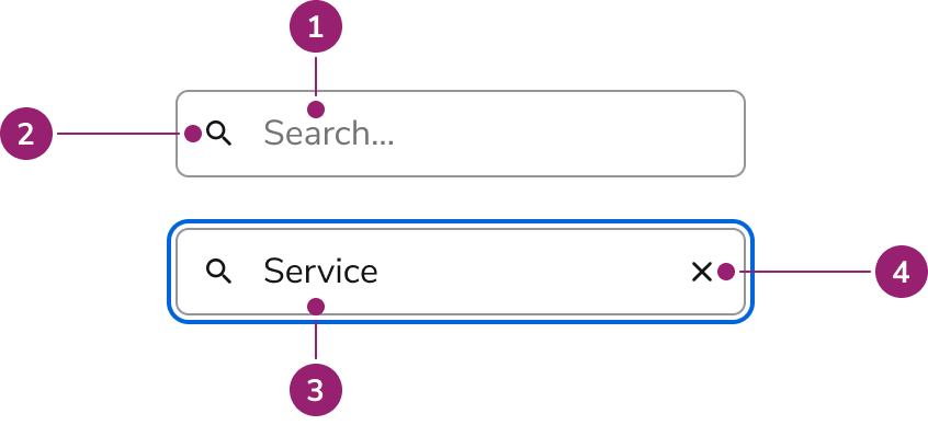
- Placeholder text
- Search icon
- Search value
- Clear button
Options
Configure Search Field for different scenarios:Sizes
| Size | Height |
|---|---|
| Small | 32px |
| Medium | 40px |
| Large | 48px |
Behavior
Search Field has distinct visual states and handles clearing and overflow.Visual States
Clearing
The clear button follows web standards:- Shows when there is an input value
- Not focusable, only clickable
Overflow
Long text scrolls horizontally within the container. The visible portion follows the cursor.Usage Guidelines
Use Search Field for search or filter experiences.When to Use
Use Search Field for search or filter experiences.- As part of a Table
- For a catalog of items
- As part of the complex Dialog selection pattern
When not to use
Avoid search for small datasets or content easily found on the page.Alternatives
Search Field vs Combobox
Use Combobox when users select from an overlayed list of options, typically in a form field. Use Search Field for traditional search experiences, filtering lists on the page, tables, large datasets, or results that need additional filtering.How to Use
Combine Search Field with other UI elements for a complete search experience. Customize it to fit your needs.General search results guidance
- Keep the search term present after running search
- Show the number of results when possible
- Show filters when possible
- Leverage Skeleton loaders when waiting for results to populate
- Include a “no results” empty state when possible
Show the number of results when possible
Dropdown with results
- Consider creating sections to organize results.
- Consider adding filters to narrow down results.
- If there are additional results that are not shown, consider adding a link to a page with all available results.
- If the results become too complicated, consider using a Dialog over a Popover.