Anatomy
The Badge consists of two primary elements that work together to indicate attention requirements on interactive elements.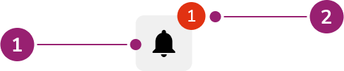
- Parent element
- Badge
Options
The Badge supports default and value-less configurations to accommodate various notification scenarios.Default
By default, show the number of alerts or notifications on the Badge so users see them without diving deeper.Without value
When the number of alerts or notifications is not available, use an empty Badge.Behavior
The Badge responds to value limits and positioning requirements while maintaining consistent visual indication.Max value
Do
Don’t
Offset
When using Badge with components like Link, overlap may not be ideal. Set offset to resolve this issue.Do
Don’t
Usage Guidelines
When to Use
Use a Badge to indicate to users that something requires attention.When not to use
Badges should not be used to label or organize information, instead use a Chip. Badges should also not be used to indicate the count of items within (e.g., the number of items inside of a Tab or folder). Use a Chip for these cases.Alternatives
Badge vs Chip
Chips are used to categorize, label, and add context to items whereas Badges are used to indicate something requires attention, such as a notification. Additionally, Chips can be interactive while Badges are not.How to Use
Add Badge to interactive elements
Attach Badges to interactive elements, such as icon buttons, to indicate a count (e.g., the number of notifications).Without a count
Use Badges without a value to denote an unread notification or message.Do not change the color of the Badge
Don’t
Only use numbers inside of a Badge
Don’t
Content
Content within the Badge should clearly indicate the count or presence of items requiring attention through numerical values.Keyboard Interaction
Users can navigate the Badge using standard keyboard controls. For accessibility,aria-label should be defined to match the context.
With the example above, there are 2 methods:
- Adding
aria-label="Cases with 6 items to review"to the Button- This will read as “Cases with 6 items to review, button”
- Adding
aria-label="with 6 items to review"to the Badge only- This will read as “Cases, button, with 6 items to review”