moreInfo tooltip behaves across Anvil2 field components to fix several accessibility issues and lay the groundwork for upcoming AI-powered field annotations.
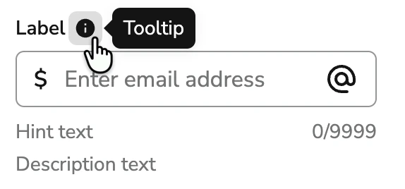
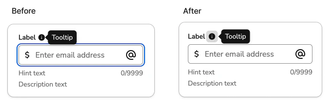
Previously, the moreInfo tooltip opened automatically whenever the user focused the input field. The info icon in the label had no independent keyboard access — it was purely decorative, and the tooltip’s open state was driven entirely by the input’s focus and blur events.
Latest Behavioral Updates
- The info icon is a proper keyboard-focusable button — it is in the tab order and has an accessible name (“More information”)
- The tooltip opens on hover or focus of that button, not on interaction with the input
- A visually-hidden copy of the
moreInfocontent is associated with the input viaaria-describedby, so screen reader users hear the description when they focus the field — without the tooltip visually opening - The
moreInfoOpenprop onFieldLabelhas been deprecated and no longer has any effect
Why we made this change
The previous pattern had several interconnected problems:- The info icon wasn’t keyboard accessible. There was no way to reach or activate it without a mouse, violating WCAG 2.1.1 (Keyboard).
- The tooltip was attached to the wrong element. Opening on input focus meant WCAG 1.4.13 (Content on Hover or Focus) — which requires tooltip content to be dismissible, hoverable, and persistent — was being evaluated against the input rather than the info button.
- Users had no choice. The tooltip appeared any time someone focused a field, even if they just wanted to type. There was no way to dismiss it without blurring the field.
- On small screens, the tooltip could cover the input. Auto-opening on focus with no reliable way to prevent obscuring the field itself.
- It wouldn’t scale to multiple tooltips. Upcoming work will introduce AI-generated annotations on form fields, potentially adding a second info button to a label. The old single-state model tied to input focus couldn’t support that without the two tooltips conflicting.
What this means for you
No API changes are required. ThemoreInfo prop on Anvil2 field components works exactly as before.
The updated interaction model:
Interaction tests may need updates. If you have interaction tests that relied on tab order behavior when a
moreInfo tooltip was present — for example, tests that tab through a form and expect the info icon to be skipped — those tests will need to be updated. The info button is now a focusable element in the tab order, so any assertions about which element receives focus after tabbing past a field label may be off by one step.
Please share your feedback if you run into any issues with the updated behavior.