Anatomy
The Multi Select Field consists of eight elements that work together to allow users to search and select multiple values from a list of options.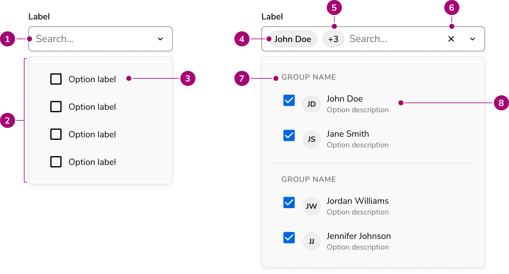
- Placeholder text
- Popover
- Option
- Selected value
- Clear button (Optional)
- Section header
- Selected optio
- Rich content option
Options
The Multi Select Field supports the following configurations to accommodate a wide range of selection scenarios.Selection options
Search
By default, Multi Select Field provides a searchable text input that filters options as users type.Select-only
When search adds no value — such as with short, well-known option lists — disable it to present a simpler select-only trigger. The select-only mode uses the listbox ARIA pattern instead of combobox.Menu display options
Multi Select Field displays options in a popover by default on desktop and a dialog on mobile. Override this adaptive behavior by setting the display mode explicitly to always use a popover or always use a dialog.In a Popover
In a Dialog
Sections
Sections divide options into labeled groups, helping users scan and identify related items. Every section requires a label.Pinned sections
Sections can be pinned to the top of the list. Pinned sections are useful for surfacing frequently used options, recent selections, or AI-powered suggestions without requiring the user to search for them.Rich content
Options support rich content including titles, descriptions, avatars, icons, and chips. Rich content helps users distinguish between similarly named items or convey additional metadata at a glance.Lazy loading options
For large datasets, options load on demand as users scroll through the list. Three pagination strategies are supported: page-based, offset-based, and group-based. Results are cached by default to avoid redundant requests.Select All
Multi Select Field can include a Select All action at the top of the options list, allowing users to toggle all options at once. When combined with search filtering, the Select Filtered action selects only the currently visible results.Field Options
Sizes
Three sizes are available: small, medium, and large. Choose a size that aligns with the surrounding form layout and density.Prefix and suffix
Add content before or after the input to provide additional context, such as currency symbols or units.Behavior
The Multi Select Field responds to user interaction with search filtering and distinct visual states.Visual states
Multi Select Field supports standard form field states. Disabled prevents all interaction. Read-only allows viewing selected options without changing the selection. Error highlights validation issues with a message.Max rows
The Select Field can grow in size to fit many selected options. A max row configuration limits how large the field can grow. Set a low max row count when space is tight, and a larger max row when displaying all the options is prioritized.Usage Guidelines
When to Use
Use the Multi Select Field when you need to:- Select multiple options from a medium-to-large set of options
- Provide typeahead search to help users narrow results
- Load options from a server with pagination support
- Organize options into groups or pinned sections
- Provide a Select All action to toggle all options at once
- Display selected values as removable chips
When not to use
Avoid using the Multi Select Field for:- There is only a single item to be selected. Use Select Field instead.
- There are only a few items to choose from. A checkbox group may be more appropriate.
- When a particularly complex selection interaction is needed, in which case a Listbox in a special layout may be preferred.
Alternatives
Multi Select Field vs Combobox
Multi Select Field is the eventual replacement for the Combobox component. Use Select Field when looking for features such as Dialog viewing, standardized content display, secondary actions, sectioning, or lazy loading. Consider using the Combobox if needing a stable component in your application.Multi Select Field vs Select Trigger
MultiSelect Field displays options in a built-in Popover or Dialog with integrated search and filtering. Select Trigger opens a custom overlay — typically a Dialog — that the implementor fully controls.How to Use
Labels and help
For guidance on labels, placeholders, and help text, refer to the Form pattern.Sorting options
Multi Select Field does not prescribe how options are sorted. Common sorting strategies include alphabetical, time-based, and categorical. Choose a sort order that matches user expectations for the data.Content
Content within the Multi Select Field should clearly communicate available options and help users identify the correct selections.- Use clear, concise option labels that users recognize immediately
- Add descriptions to rich content options when labels alone are insufficient to distinguish items
- Use pinned sections to surface frequently used or contextually relevant options