Demo
Usage Guidance
Peeks are triggered by hovering over an element such as text or an icon. That element should be an action or link that drives the user to where they can see the information contained in the Peek. Peeks should be thought of as an enhancement for mouse-users. As a result they shouldn’t display information that is integral to understanding the Peek target or for taking actions on the target. Peeks are a “peek” into what the user will see if they click on the action/link.Peeks should never convey exclusive information.
Any action or information contained in a Peek should be accessible elsewhere to the user, either on the current page or on the page that clicking the target would navigate them to.Peeks content should be brief.
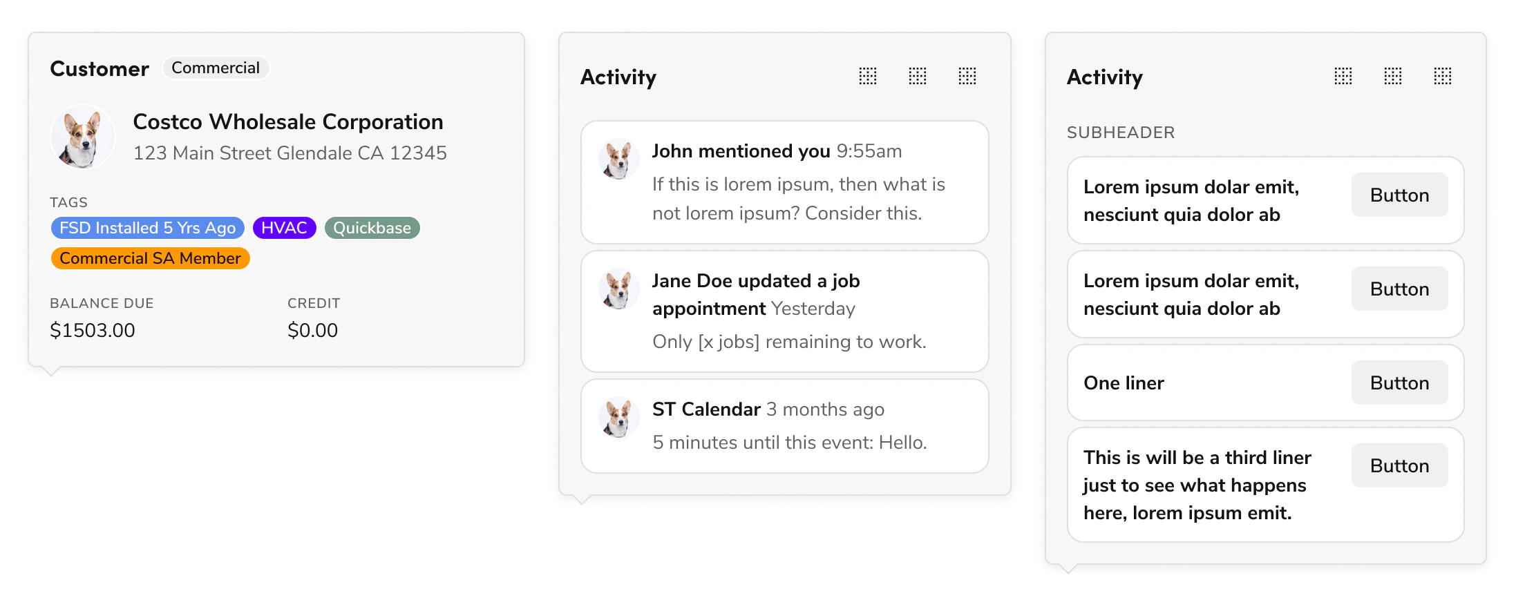
The larger your Peek is, the more it blocks other content on the page. Try and keep it small, even if there is more content that could be shown, such as here where you could display many more events.Prioritize important information.
Peeks should only have a summary or quick actions relevant to its target, such as here where a user can call, email, or message the associated client.Avoid complex interactions in the Peek.
If a more complex interaction is necessary, direct users to something that’s better for handling interactions: traditional filtering, text fields, or drilldown flows. Another example of could be using a Dialog, or navigating the user to the page the target is related to. Simple actions, like the button clicks illustrated here for calling, messaging, or emailing the client, are fine.Peeks should be enhancements.
Think of Peeks like an enhancement: they are a preview of the extra information the user gets if they click through the button or link, such as here where you can see the information you’d see if you clicked through to the next page.Options
Open on Hover (default)
Peeks appear on hover over a trigger element by default. They do not trigger on element focus.Delay
Peeks use the Popover default delay, which can be modified with thedelay prop. See Popover documentation for more. We don’t recommend setting this to 0ms.
Open on Click
An alternative interaction for Peek when its inner content has exclusive interactions (meaning a user can only perform a step through a Peek). This option is considered an edge case.Other Additional Layouts
Find some other possible options for peek below:Activity Feed with Action Buttons
An example that demonstrates a sensible maximum height for a peek.Empty Peek
An example empty peek that hints at the type of information the peek would have if there were content.Behaviors
Trapping focus
By default Peeks do not trap focus, but this can be enabled on Popover with themodal prop.
Suggested max-width, max-height
By default Popover lacks a max-height and max-width. For Peek, we suggest limiting the Popover (excluding the caret) to 360px wide and 540px tall.Keyboard Navigation and Accessibility
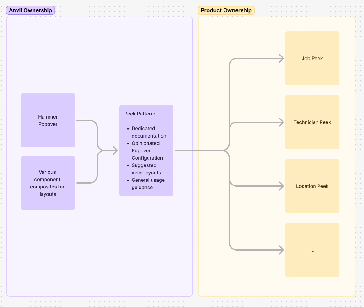
For detailed information on how keyboard interactions and accessibility work for Peek, refer to the Popover documentation.Peek Ownership
Peek is provided as a pattern, meaning that it isn’t as prescriptive as a component. The suggested layouts are intended as grab-and-go options for your product team to use based on your products’ needs.