Getting Started
Getting data visualization right starts with determining the goal of your visualization and selecting a suitable chart type. The purpose of data visualization is to transform complex information into clear, actionable insights. Charts are the most effective tool for this purpose. Selecting the right chart depends on the data you’re working with and the message you want to communicate. Common chart types with their appropriate use cases are outlined below to help you present data clearly, accurately, and with maximum impact.Engineers can check out our documentation for our extended charting library here.
Chart Types & Usage Rules
A Quick Guide
| Chart Type | Usage | Design Guide |
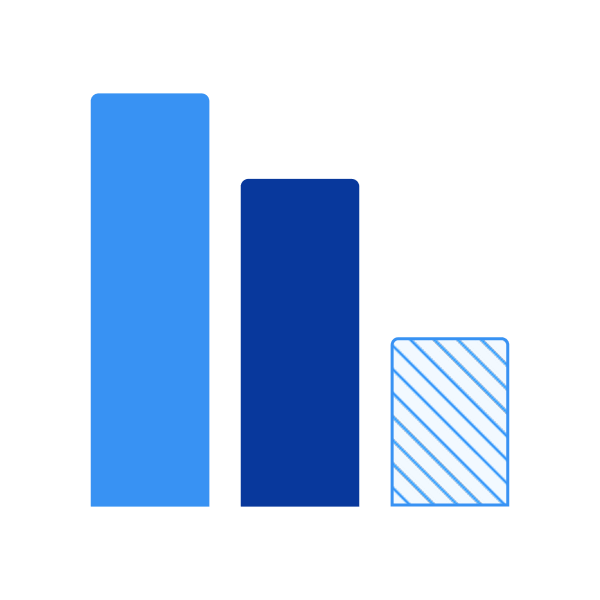
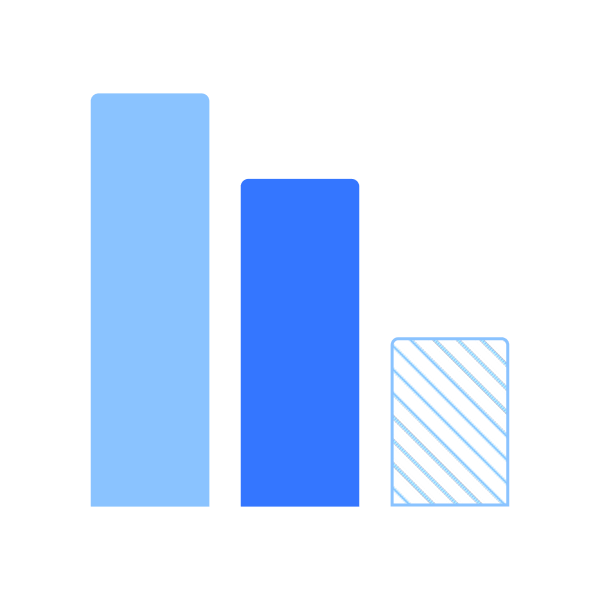
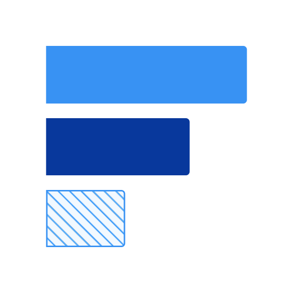
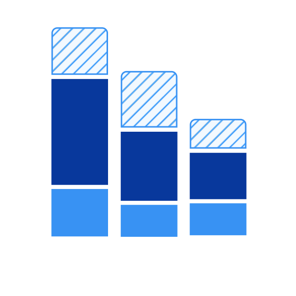
| Bar Chart |
|
|
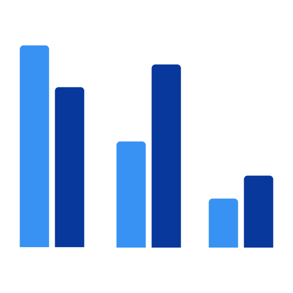
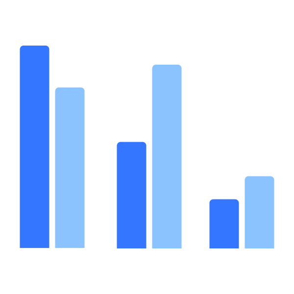
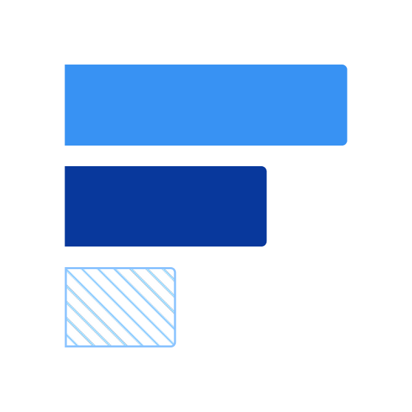
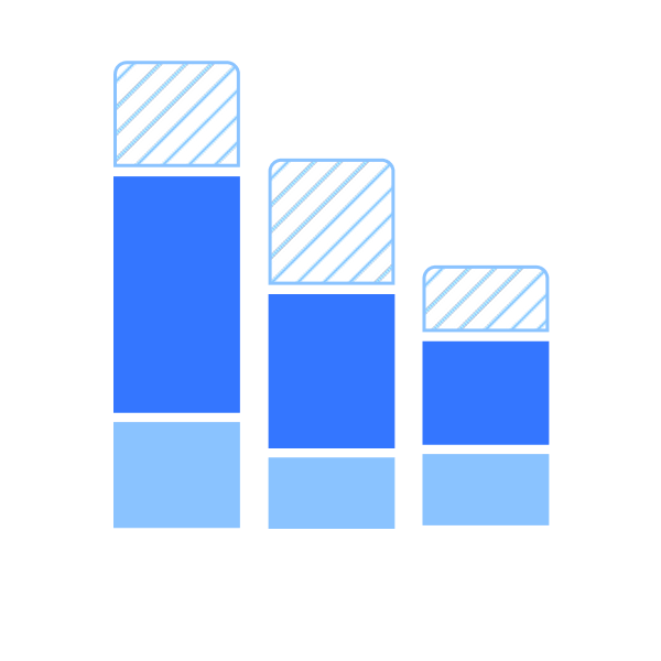
| Grouped Bar Chart |
|
|
| Stacked Bar Chart |
|
|
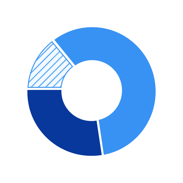
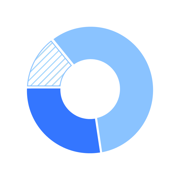
| Donut Chart |
|
|
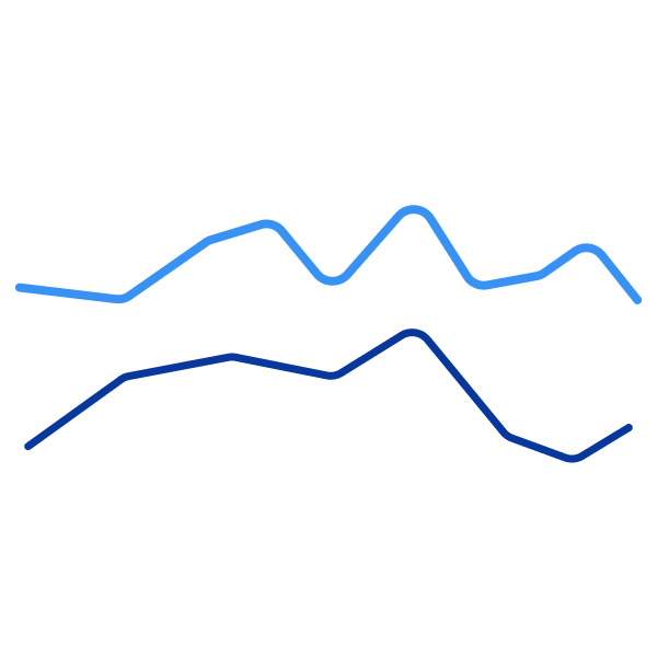
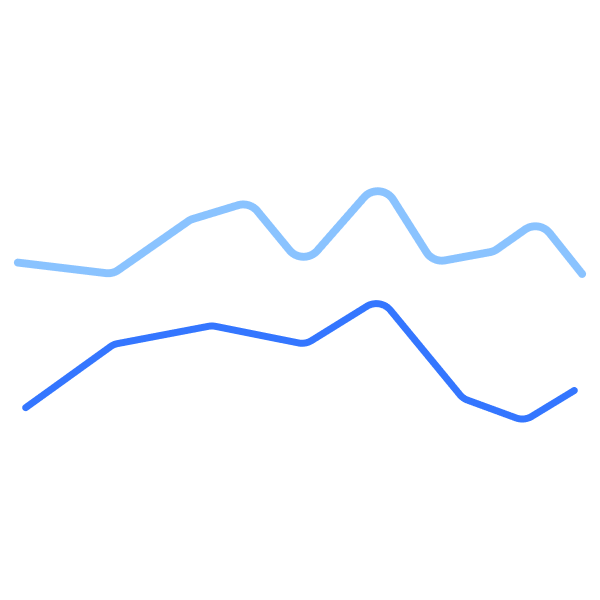
| Line Chart |
|
|
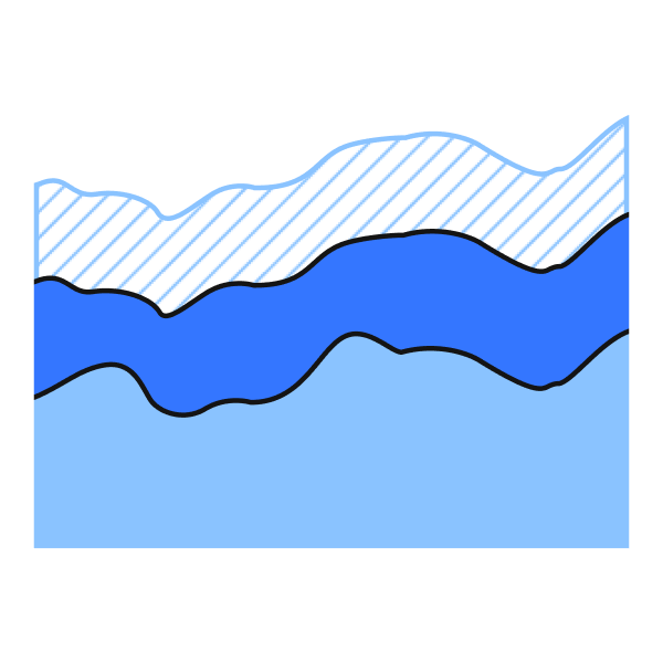
| Area Chart |
|
|
- Utilize the defined color palettes and patterns for contrast requirements
- Use hover states using a tooltip or popover and/or contextual labeling showcasing data required
- Follow all labeling requirements ex: title, axis, legend, etc.
Category Comparison (Including Ranking)
This category is used to evaluate and contrast values across distinct groups to highlight differences, similarities, or order of magnitude.Bar
Grouped Bar
Horizontal Bar
Trends (Over Time)
This category is used to display how data changes over time, helping to reveal patterns, growth, decline, or cyclical behavior.Line Chart
Part-to-Whole
This category shows how individual segments contribute to a total, allowing audiences to understand proportions and overall composition.Stacked Chart
Pie/Donut
Stacked Area

Coming soonCurrently in progress
Coming soonCurrently in progress
Questions? Challenges?
Contact the Visual Design team on the #ask-vizd channel