Use when:
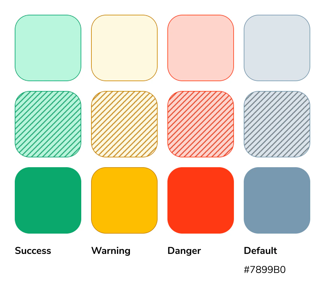
Semantic, or status, colors show the condition of data relative to a baseline. Red indicates danger or error, yellow signals a warning, and green represents normal or successful performance. These colors help users quickly understand status at a glance.Light mode
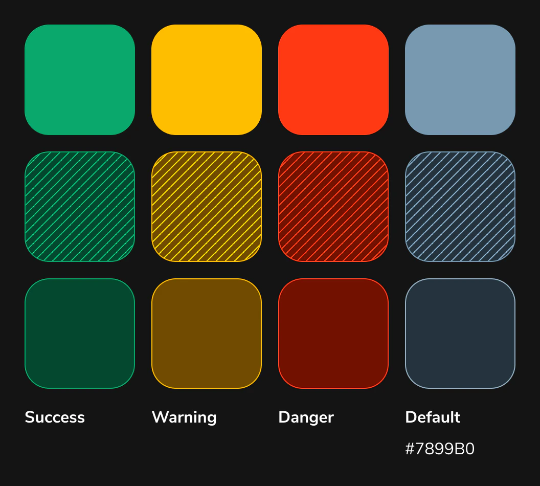
Dark mode
Application Guidance
Green = success Yellow = warning Red = danger Blue/grey = default Start with tier 1 colors for all semantic needs, if your specific instance needs more nuance use the other tiers to illustrate importance by using saturation. See example below:Real Example
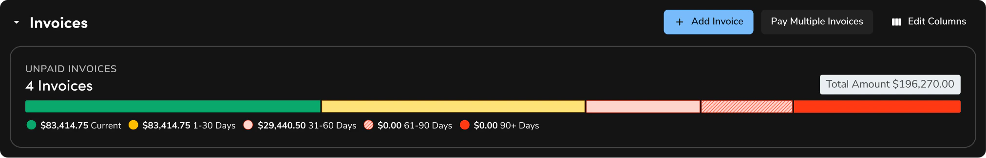
See the invoice chart below. Both scenarios should signal a warning state. Use the tier 3 color for the variable with lower urgency. If an additional variable needs to be introduced, apply the patterned treatment as the intermediate option to indicate moderate urgency. Use this pattern structure for success, warning, and default.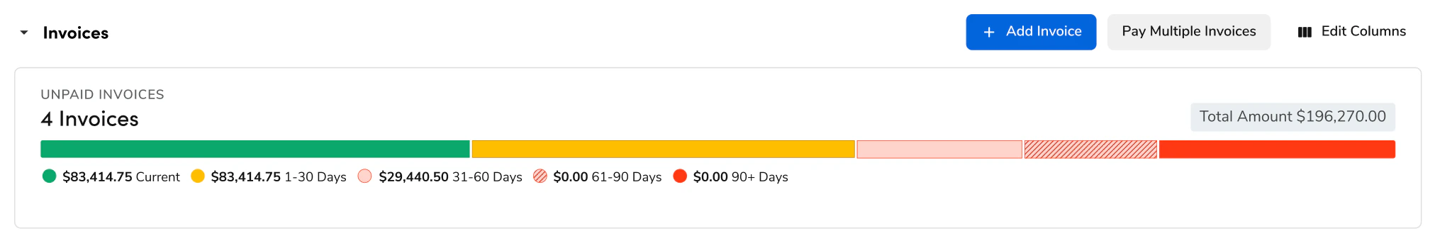
How to Use
The following Do’s and Don’ts illustrate best practices and common mistakes to help guide effective use of the diverging color palette in data visualizations.Questions? Challenges?
Contact the Visual Design team on the #ask-vizd channel