Note: Use only when data points are continuous; the chart assumes a logical progression and meaningful connection between all points.
- Headline
- Axis label
- Legend label
- Direct labeling
- Hover state tooltip
Variable ordering
| 1 Variable | 2 Variables | 3 Variables | 4+ Variables |
|---|---|---|---|
| If your chart has one variable, start with the default blue hue in the palette. | If your chart has two variables, use the default and dark blue. | If your chart has three variables, add the cyan. | For 4+ variables, continue with the categorical color palette. |
 |  |  |  |
One Variable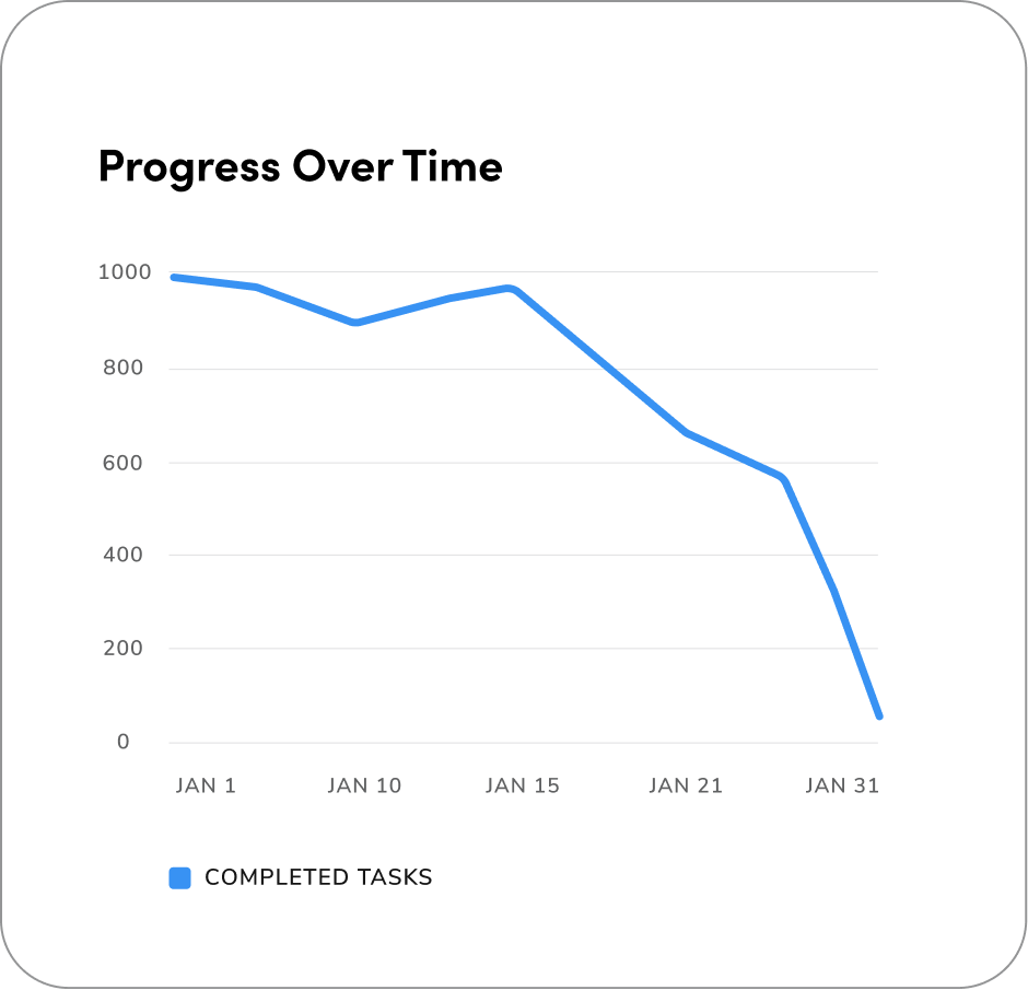
Two Variables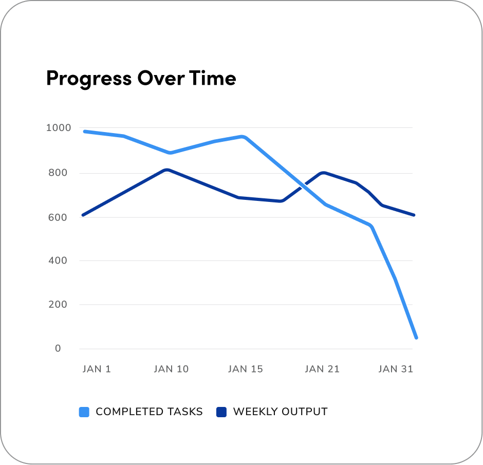
Three Variables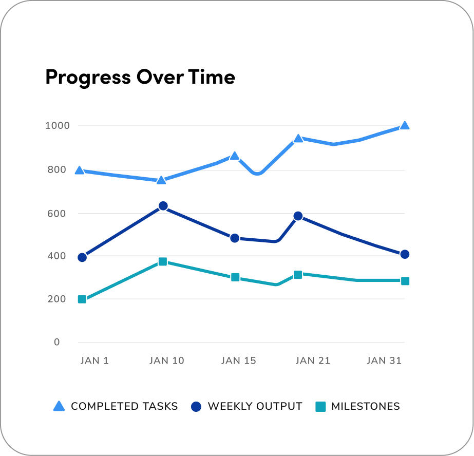
Four Variables
Shapes
Shapes in line charts help tell data series apart. When using 3 or more variables, adding distinct shapes improves accessibility for color-blind or visually impaired users. Make sure the legend uses shapes only to clearly show each series. Follow the shape order as it is displayed below.Note: Working with an edge case and need more shape options? Feel free to reach out in the #askvizd channel, we’re happy to help!


Real Example #1
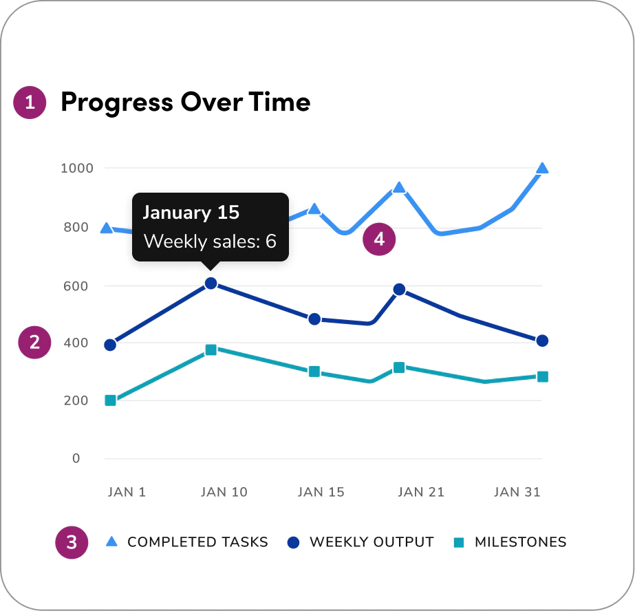
The following is a real-world example from our product. This example displays 3 variables in a single line chart. It uses the first three colors of the categorical color palette and shapes to show the difference between each line.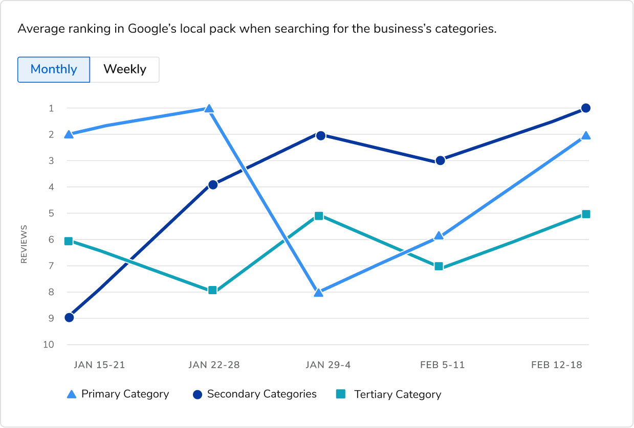
How to Use
The following Do’s and Don’ts illustrate best practices and common mistakes to help guide effective use of line charts in data visualizations.Area of Focus & Hover States
Below is an example of Area of Focus charts that use subtle emphasis of color to highlight key data without losing overall context.In contrast, hover states apply stronger, interactive visual changes to indicate active user engagement and selection.
Area of Focus
To highlight a single variable, use the default blue for the focused variable and grey 600 for all others. In this scenario, there should be no cursor for the area of focus, this represents a focus state, not a hover interaction.Hover State
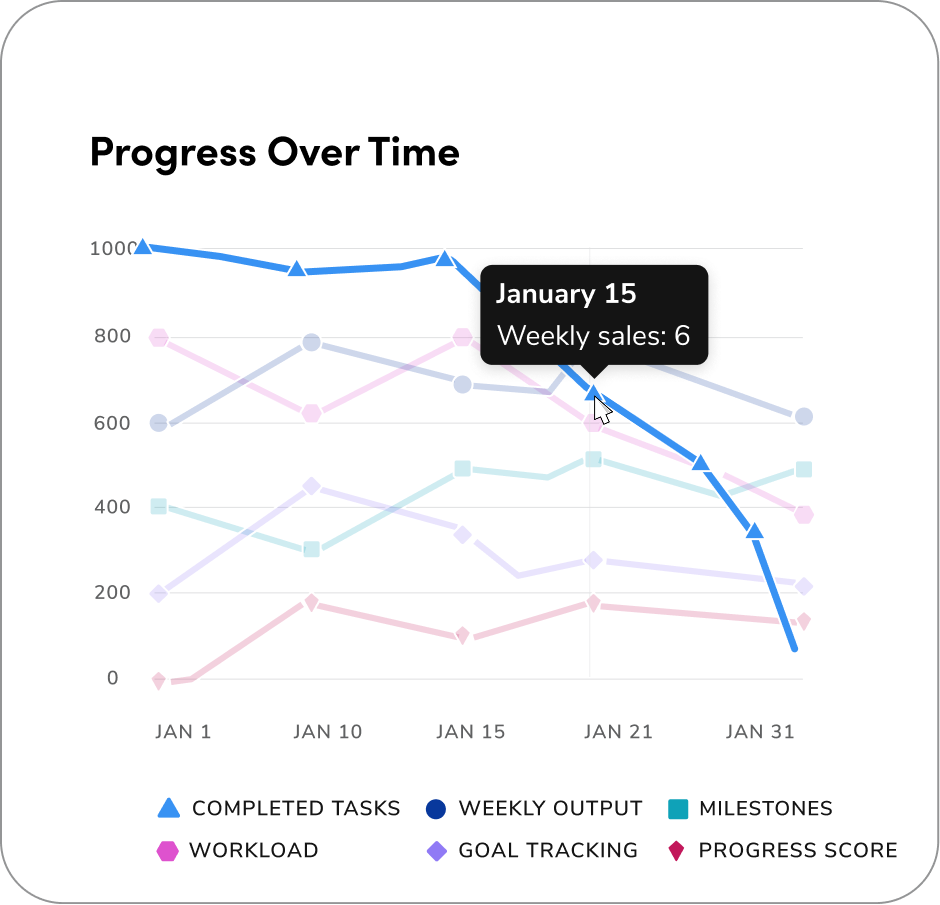
When in hover states, set all non-hovered elements to 20% opacity to keep focus on the highlighted data point, and use Anvil’s Tooltip component to display the value/label on hover.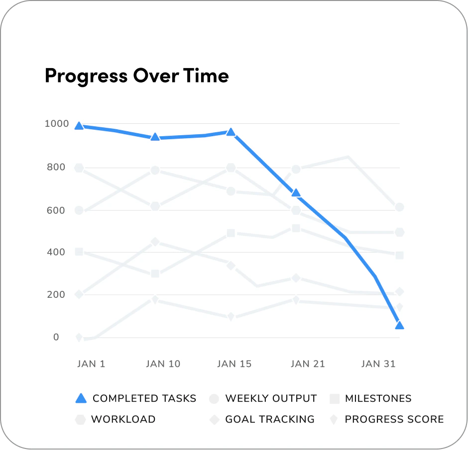
Keep the Content Consistent
On the “Progress Over Time January” line chart below, the viewer can toggle six variables. To ensure each variable keeps its assigned color when toggled: turning a variable off should only hide it, not reassign or shift colors among the remaining series. For example, if Completed Tasks is unchecked, its color remains reserved so the visible lines, legend, and visual mapping stay stable. Do not change the styling or reassign colors (for example, altering color, stroke, or pattern).All checked variables are visible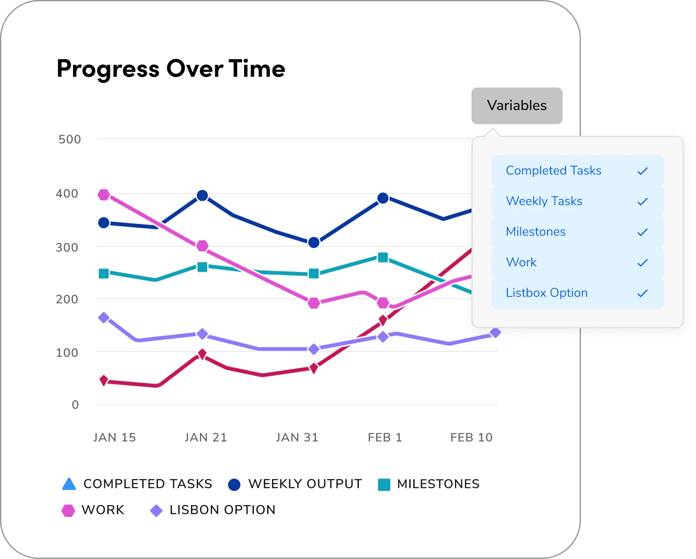
Unchecked, one variable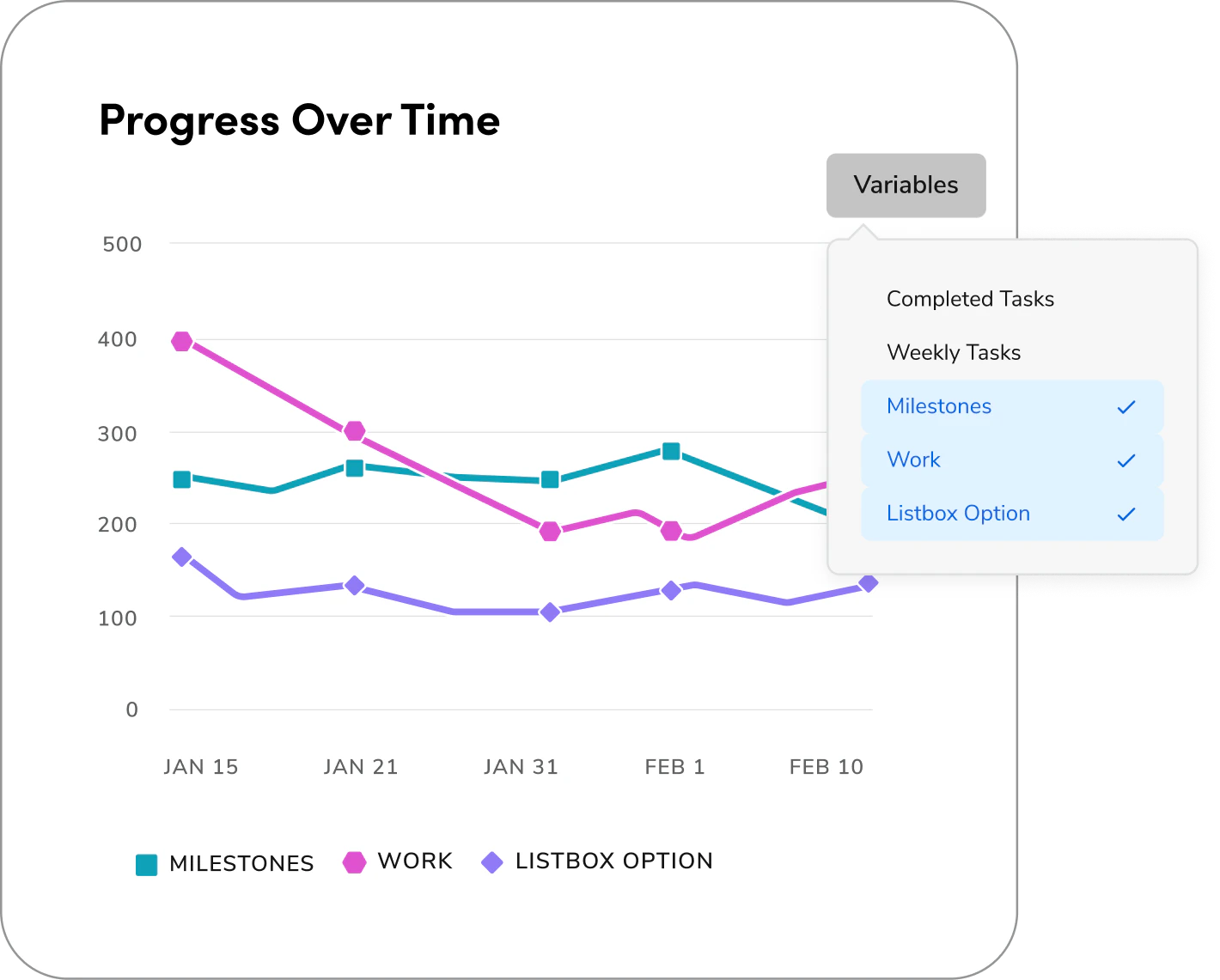
Questions? Challenges?
Contact the Visual Design team on the #ask-vizd channel