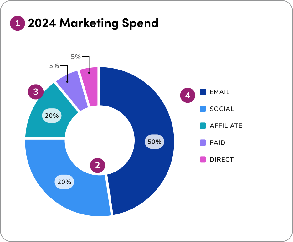
- Headline
- Spacing: The space (1.4px) between donut sections
- Direct labeling
- Legend label
1. Show parts of a whole
Donut charts illustrate proportions of a total and work best for showing how each slice contributes to the whole, not for making detailed comparisons between categories.2. Total must equal 100%
Ensure all slices together represent the full dataset and form a meaningful whole. Donut charts should only be used when all parts add up to 100% and clearly show how each category contributes to the total.3. Group small slices
Combine minor categories into an “Other” slice, and sort the remaining slices logically — either clockwise from largest to smallest, or in a meaningful order like time or category flow. Always place “Other” at the end to keep the chart organized and easy to interpret.4. Use color wisely
Use color wisely in donut charts-apply the extended palette to differentiate categories when more than 5 are required, always ensuring clarity and accessibility.5. Donut vs. Pie
Donut charts are often preferred over pie charts in dashboards, as they provide a cleaner, more streamlined layout, allow for central labeling of key metrics, and help users interpret data proportions more easily at a glance.Questions? Challenges?
Contact the Visual Design team on the #ask-vizd channel